Interactive Dashboards and Data Storytelling: Monitoring, Exploration, and Narrative Clarity
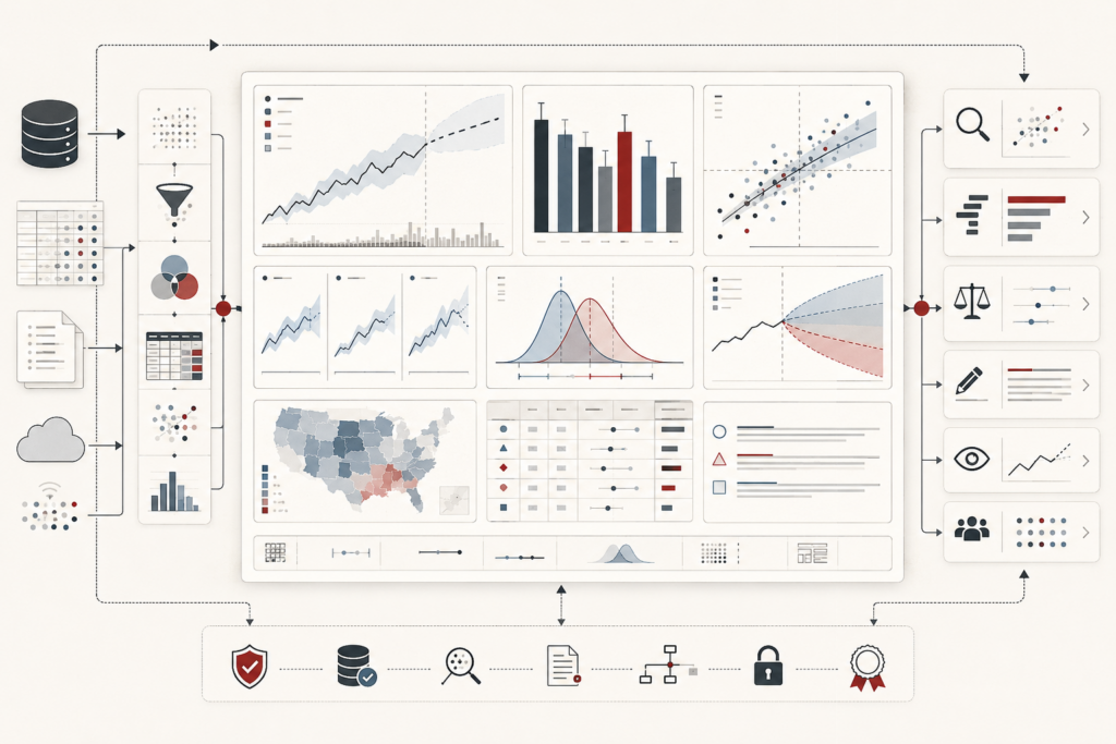
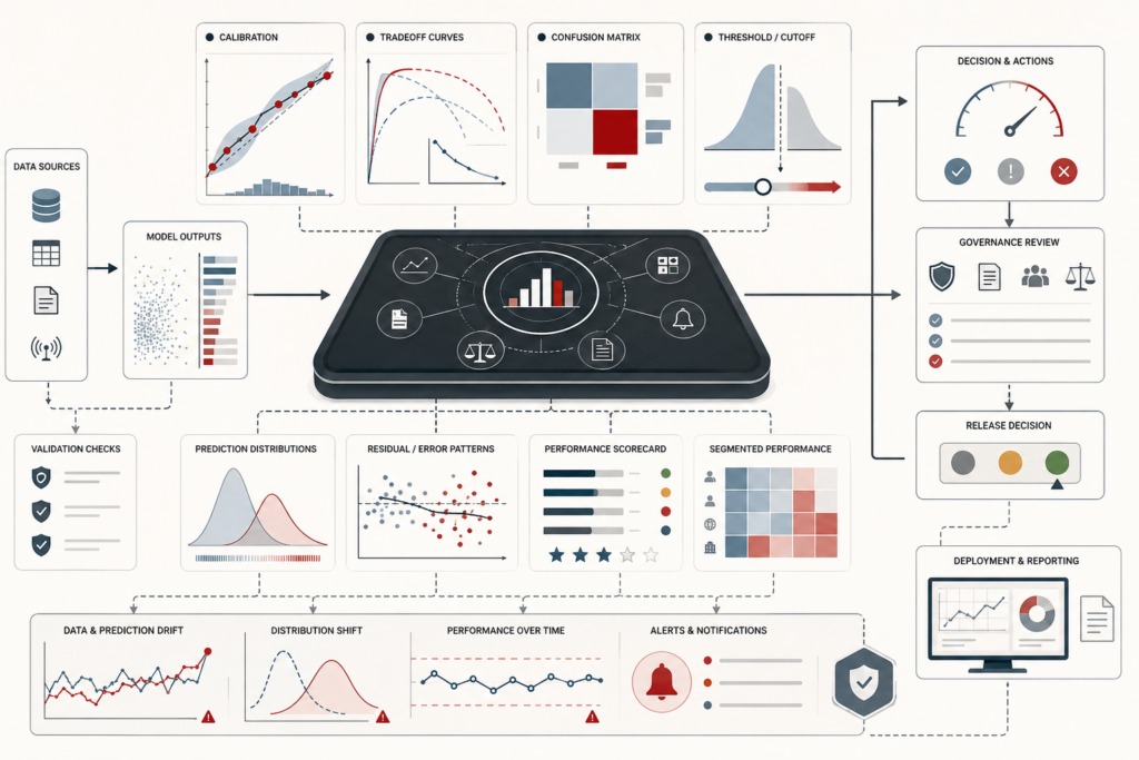
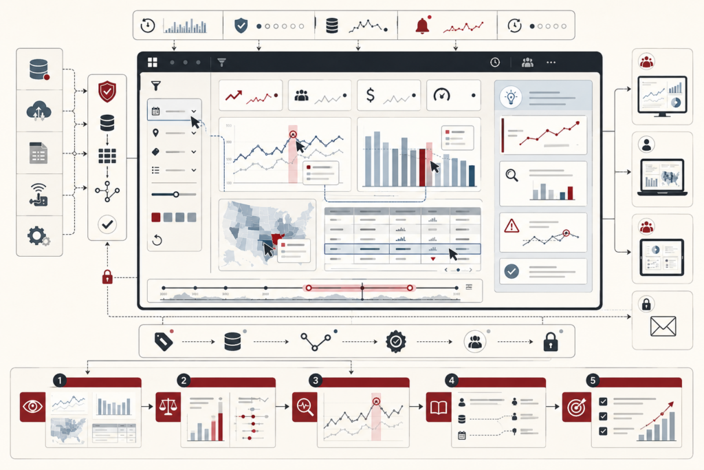
Interactive dashboards and data storytelling make analytical evidence navigable, contextual, and useful for decision support. This article frames dashboards not as collections of charts, but as governed analytical interfaces for monitoring, exploration, filtering, drill-down, and recurring judgment. It explains how data storytelling adds guided interpretation through sequencing, annotation, story points, caveats, and evidence framing. The article examines dashboard modes, KPI context, naked metrics, filter burden, linked views, progressive disclosure, cognitive load, accessibility, governance, metadata, lineage, and responsible interaction design. It also warns against clutter, hidden filter state, tooltip dependency, narrative overreach, and ungoverned dashboard surfaces. A mathematical lens and Python/R workflows show how teams can evaluate dashboard integrity, KPI context, interaction clarity, story coherence, accessibility, governance review, and evidence traceability.