
Last Updated June 18, 2026
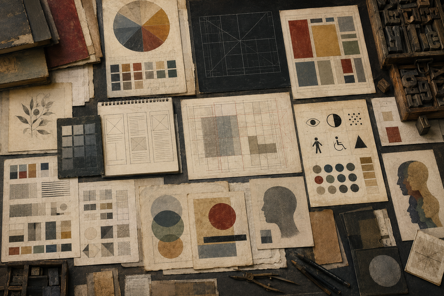
Color Theory, Typography, and Design examines the visual systems through which ideas are organized, communicated, and experienced. This article map explores color, type, layout, grids, visual hierarchy, branding, interface aesthetics, accessibility, and design ethics as parts of a larger study of meaning.
Design is not only decoration. It shapes attention, trust, interpretation, memory, usability, authority, and emotional tone. A color palette can clarify or confuse. A typeface can make a page feel institutional, intimate, scholarly, urgent, or unstable. A grid can create order. A poor layout can bury meaning. Visual form is one of the ways knowledge becomes readable.
This article map sits within the broader Meaning category. Its focus is practical and interpretive: how visual choices become meaningful, how design systems communicate values, and how responsible form can help people understand complex information with clarity, dignity, and care.
Color Theory, Typography, and Design provides the visual communication layer of the Meaning category. It asks how color, type, spacing, layout, hierarchy, imagery, grids, interfaces, and design systems shape the way people encounter knowledge. Every designed surface makes interpretive decisions: what comes first, what feels important, what feels trustworthy, what becomes readable, and what disappears.
This map treats design as both an aesthetic and ethical practice. Visual form can make knowledge accessible, memorable, and dignified. It can also manipulate attention, obscure complexity, exclude users, or create false authority. Responsible design requires more than taste. It requires attention to perception, context, accessibility, culture, medium, and public consequence.
The articles in this map move from foundations of visual communication into color theory, typography, layout, grids, information architecture, branding, interface aesthetics, data visualization, accessibility, design systems, and responsible visual communication. Together, they provide a practical and conceptual framework for understanding how visual form carries meaning.
GitHub Repository
This article map is supported by companion studio-lab scaffolding for color palettes, contrast checking, typography scales, layout grids, visual hierarchy studies, design tokens, accessibility audits, data visualization examples, and reusable visual communication workflows.
Complete Code Repository
The Color Theory, Typography, and Design companion repository includes article-level folders, design notes, color and typography datasets, contrast tools, layout grid examples, visual hierarchy checklists, design token templates, accessibility reports, Python workflows, R summaries, SQL catalogs, notebooks, calculators, Canvas cards, and reproducible studio-lab scaffolding for future website tools.
Color Theory, Typography, and Design as a Field of Meaning
Color theory, typography, and design belong together because they shape how visual information becomes intelligible. A page is not only a container for words. A screen is not only a technical interface. A poster, chart, brand system, book, map, dashboard, or research article becomes meaningful through relationships of color, scale, contrast, spacing, type, image, rhythm, emphasis, and sequence.
Color shapes mood, distinction, urgency, atmosphere, identity, and accessibility. Typography gives language a visible voice. Layout organizes attention and movement. Grids create order and continuity. Hierarchy tells readers where to begin, what to compare, and how to move through complexity. Design systems make visual choices repeatable across institutions, websites, reports, tools, and archives.
This field is therefore not merely practical. It is interpretive. Design decisions carry assumptions about users, context, authority, speed, attention, trust, comprehension, and value. A visual system can welcome readers into knowledge, or it can make knowledge feel inaccessible. It can reveal relationships, or it can conceal them. It can clarify uncertainty, or it can create false certainty.
Color Theory, Typography, and Design studies visual form as a system of meaning. It asks how designed communication works, how visual decisions shape understanding, and how responsible design can support public knowledge.
Why Visual Design Belongs Under Meaning
Visual design belongs under Meaning because form affects interpretation before an argument is even read. People respond to contrast, alignment, density, spacing, rhythm, color, scale, and type before they consciously analyze content. These features influence trust, emphasis, comprehension, and emotional orientation.
A research library depends on design. Article maps, diagrams, data tables, navigation systems, citations, category pages, buttons, image captions, and repository links all use visual form to organize knowledge. Without design, information may exist but remain difficult to use. With poor design, information may mislead, overwhelm, exclude, or lose credibility.
Design also connects aesthetics with responsibility. Accessibility is not separate from visual meaning. A color palette that cannot be read by many users is not simply a technical failure; it is a failure of communication. Typography that looks beautiful but impairs reading creates friction. A hierarchy that hides important caveats changes interpretation. A dashboard that overstates certainty shapes decisions.
Under Meaning, this article map treats visual design as one of the ways human beings create shared understanding. It links perception, symbolism, aesthetics, usability, ethics, and communication.
What This Article Map Studies
This article map studies the visual systems that make information readable, recognizable, and meaningful. It includes foundations of visual communication, color perception, palette systems, typography, layout, grids, composition, visual hierarchy, branding, interface aesthetics, data visualization, accessibility, and design ethics.
At the color level, it examines hue, value, saturation, contrast, harmony, symbolism, cultural meaning, palette systems, and accessibility. At the typography level, it studies type classification, legibility, readability, scale, spacing, hierarchy, rhythm, voice, and institutional identity. At the layout level, it studies grids, alignment, white space, rhythm, balance, editorial structure, information architecture, diagrams, and visual explanation.
At the systems level, it examines brand identity, design systems, reusable components, design tokens, responsive layouts, interfaces, and cross-platform consistency. At the ethical level, it studies accessibility, dark patterns, persuasive design, visual power, data visualization responsibility, and the challenge of making knowledge clear without oversimplifying it.
The goal is to connect craft with interpretation. Design is a practical discipline, but it is also a theory of attention, form, meaning, and responsibility.
Major Themes in Color Theory, Typography, and Design
One major theme is visual hierarchy. Design tells people where to look, what matters, how sections relate, and how to move through information. Hierarchy is created through size, color, contrast, spacing, position, type weight, proximity, repetition, and visual grouping.
A second theme is readability. Typography, line length, spacing, contrast, layout density, and page structure all affect whether readers can comfortably understand content. Readability is not only a stylistic concern. It is a condition of access.
A third theme is visual identity. Colors, typefaces, grids, image styles, spacing systems, and interface patterns create recognizable institutional voices. A visual identity can signal trust, seriousness, openness, warmth, authority, tradition, innovation, or care.
A fourth theme is accessibility. Good design must account for visual impairment, color perception differences, device variation, cognitive load, reading contexts, motor access, screen readers, contrast needs, and responsive layouts. Accessibility is part of aesthetic responsibility.
A fifth theme is systems thinking. Design choices become more powerful when they are repeatable. Design systems, tokens, components, templates, and documentation help maintain consistency across pages, tools, reports, and interfaces.
A sixth theme is ethics. Visual form can clarify, educate, orient, and include. It can also manipulate, distract, obscure, pressure, or exclude. Design ethics asks how visual communication should respect users, context, uncertainty, and public meaning.
Color Theory, Typography, and Design Article Map
The map below organizes the Color Theory, Typography, and Design series into six parts, moving from foundations of visual communication into color theory, typography, layout, systems, interfaces, accessibility, and responsible design.
Part I — Foundations of Visual Communication
- What Is Visual Communication? (planned) — A foundational article on how images, layouts, symbols, colors, type, and visual structures organize attention and meaning.
- Design as Meaning-Making (planned) — An article on how design communicates values, hierarchy, trust, identity, and interpretive priorities.
- Form, Function, and Communication (planned) — A study of the relationship between usefulness, beauty, clarity, expression, and communication.
- Visual Literacy in the Modern World (planned) — An article on why people need to read images, charts, interfaces, layouts, symbols, and design systems critically.
- How Visual Hierarchy Guides Attention (planned) — A focused article on emphasis, scale, position, contrast, grouping, sequence, and attention flow.
- The Ethics of Making Information Visible (planned) — An article on the responsibilities involved in selecting, emphasizing, hiding, simplifying, or visualizing information.
Part II — Color Theory
- Color Perception and Human Vision (planned) — An article on hue, value, saturation, contrast, light, perception, and the biological conditions of color experience.
- Hue, Value, Saturation, and Contrast (planned) — A practical article on the core properties of color and how they shape distinction, emphasis, and readability.
- Color Harmony and Visual Tension (planned) — A study of complementary, analogous, monochromatic, triadic, and contrasting color relationships.
- Color Symbolism and Cultural Meaning (planned) — An article on how colors carry emotional, ritual, political, institutional, and cultural associations.
- Color Systems, Palettes, and Design Consistency (planned) — A practical article on building palette systems for websites, publications, diagrams, brands, and knowledge libraries.
- Color Accessibility and Contrast Standards (planned) — A focused article on contrast ratios, color blindness, readability, inclusive palettes, and responsible visual design.
Part III — Typography
- Typography as Visual Language (planned) — An article on how type gives written language tone, rhythm, authority, mood, and visual identity.
- Legibility, Readability, and Reading Experience (planned) — A study of how type size, line length, spacing, weight, contrast, and structure affect reading.
- Type Classification and Historical Form (planned) — An article on serif, sans serif, script, display, humanist, geometric, grotesque, slab, and transitional type forms.
- Typographic Hierarchy and Information Structure (planned) — A practical article on headings, body text, captions, labels, emphasis, scanning, and content architecture.
- Spacing, Scale, and Typographic Rhythm (planned) — A focused article on type scales, leading, tracking, margins, modular rhythm, and spacing systems.
- Typography, Voice, and Institutional Identity (planned) — An article on how type choices shape the perceived character, credibility, and personality of institutions.
Part IV — Layout, Grids, and Composition
- Composition and Visual Hierarchy (planned) — An article on how arrangement, alignment, contrast, and emphasis guide attention and meaning.
- Grid Systems and Design Order (planned) — A study of modular grids, columns, baselines, alignment, spacing, and repeatable visual structure.
- White Space, Rhythm, and Balance (planned) — An article on how empty space, density, breathing room, and pacing shape visual comprehension.
- Editorial Design and Knowledge Presentation (planned) — A practical article on designing articles, reports, books, research pages, captions, footnotes, and long-form reading experiences.
- Information Architecture and Visual Structure (planned) — A focused article on navigation, grouping, categories, cards, pathways, content hierarchy, and knowledge organization.
- Diagrams, Maps, and Visual Explanation (planned) — An article on how diagrams, maps, flowcharts, visual taxonomies, and explanatory graphics help people understand relationships.
Part V — Branding, Interfaces, and Design Systems
- Brand Identity as a Visual System (planned) — An article on logos, type, color, spacing, imagery, pattern, tone, and institutional recognition.
- Interface Aesthetics and User Trust (planned) — A study of how digital interfaces shape confidence, usability, clarity, legitimacy, and user behavior.
- Design Systems and Reusable Visual Logic (planned) — A practical article on components, templates, tokens, documentation, pattern libraries, and scalable design governance.
- Data Visualization and Responsible Interpretation (planned) — An article on charts, scales, labels, uncertainty, context, visual distortion, and the ethics of visual evidence.
- Digital Layout, Responsive Design, and Reading Flow (planned) — A focused article on mobile layouts, responsive grids, scrolling behavior, breakpoints, and adaptive reading experiences.
- Visual Consistency Across Platforms (planned) — An article on maintaining coherent visual identity across websites, documents, dashboards, social media, video, and repositories.
Part VI — Design Ethics and Responsible Form
- Design Ethics and Visual Power (planned) — A foundational article on how design can inform, manipulate, dignify, exclude, persuade, or mislead.
- Dark Patterns and Persuasive Interfaces (planned) — A critical article on nudges, friction, concealment, urgency, attention capture, consent, and user manipulation.
- Inclusive Design and Accessibility (planned) — A study of designing for varied bodies, abilities, devices, contexts, languages, and reading conditions.
- Designing for Public Knowledge (planned) — An article on how visual systems can support education, civic understanding, research access, and public trust.
- Visual Clarity Without Oversimplification (planned) — A focused article on presenting complex information clearly without flattening uncertainty, conflict, or context.
- Responsible Visual Communication: A Capstone (planned) — A capstone article on clarity, accessibility, evidence, care, beauty, and ethical visual form.
Python Workflow: Color Palettes, Contrast, and Design Tokens
A useful Python workflow for this article map is a color, contrast, and design-token workflow. The workflow can begin with structured palette data: color names, hex values, semantic roles, foreground/background pairings, contrast ratios, accessibility notes, and usage contexts. Python can then generate contrast reports, palette tables, JSON design tokens, Markdown documentation, and reusable visual-system summaries.
This workflow belongs naturally with articles on color theory, accessibility, design systems, brand identity, interface aesthetics, and responsible visual communication. It can help readers understand how design decisions become systematic rather than accidental. A color palette is not just a list of attractive colors. It is a communication system with roles, constraints, accessibility requirements, and interpretive consequences.
The workflow should avoid treating design as a mechanical checklist. Contrast tools, palette exports, and token files support better decisions, but they do not replace judgment about tone, context, culture, hierarchy, and meaning.
R Workflow: Visual Themes, Accessibility Summaries, and Layout Notes
A useful R workflow for this article map is a visual-theme and accessibility-summary workflow. A structured teaching dataset can include article titles, design concepts, accessibility concerns, palette roles, typography categories, layout principles, and ethical questions. R can summarize recurring themes, generate comparison tables, and produce visual reports that help organize the article map.
This workflow belongs naturally with articles on color systems, typography, layout, information architecture, data visualization, and inclusive design. It can help show which articles focus on perception, which focus on type, which focus on accessibility, and which focus on design ethics. It can also support reproducible summaries for teaching, research planning, and future website tools.
As with the Python workflow, the goal is not to automate design judgment. The goal is to make visual communication research more organized, transparent, and reusable.
Ethics, Accessibility, and Visual Responsibility
Design ethics begins with the recognition that visual form affects behavior, access, trust, and interpretation. A layout can guide people toward understanding, or it can push them toward a decision they did not intend to make. A chart can reveal uncertainty, or it can hide it. A type system can support reading, or it can make knowledge harder to access. A color system can clarify categories, or it can exclude users who perceive color differently.
Accessibility is therefore not an optional technical layer added after design. It is part of design itself. Color contrast, readable type, clear hierarchy, responsive layouts, alternative text, semantic structure, and navigable interfaces all shape who can participate in knowledge.
Responsible visual communication also requires humility. Designers choose what to emphasize and what to leave quiet. They compress complexity into forms. They create impressions of order, certainty, authority, and priority. Those choices should be made with care, especially in public knowledge, education, sustainability, policy, health, ethics, and institutional communication.
The ethical goal is not to make all design plain or neutral. The goal is to make design beautiful, clear, accessible, and honest about what it does.
Color Theory, Typography, and Design in a Wider Intellectual Context
Color Theory, Typography, and Design belongs within a wider knowledge architecture because visual communication connects perception, meaning, technology, culture, and action. It sits under Meaning because designed form helps determine how knowledge is interpreted. It also connects to Thinking through perception, attention, memory, and cognitive load; and to Problem Solving through interfaces, systems, public communication, and design practice.
This map also connects to aesthetics and the philosophy of art through beauty, form, judgment, and visual experience. It connects to symbolism through color, iconography, and public meaning. It connects to content frameworks through information architecture, editorial design, and knowledge presentation. It connects to ethics through accessibility, manipulation, dark patterns, and visual responsibility.
By giving color, typography, and design their own article map, the site treats visual form as a serious intellectual field. Design is not merely how knowledge looks. It is one of the ways knowledge becomes usable, trustworthy, memorable, and shared.
Related Reading
- Meaning
- Beauty, Aesthetics, and Meaning
- Aesthetics and the Philosophy of Art
- Music Theory, Form, and Meaning
- Mathematics, Art, Music, and Pattern
- Symbolism, Style, and Cultural Meaning
- Creative Form, Composition, and Interpretation
- Content Frameworks
Further Reading
- Albers, J. (1963). Interaction of Color. New Haven: Yale University Press.
- Arnheim, R. (1974). Art and Visual Perception: A Psychology of the Creative Eye. Berkeley: University of California Press.
- Bringhurst, R. (2012). The Elements of Typographic Style, 4th edn. Vancouver: Hartley & Marks.
- Frascara, J. (2004). Communication Design: Principles, Methods, and Practice. New York: Allworth Press.
- Garrett, J.J. (2011). The Elements of User Experience: User-Centered Design for the Web and Beyond, 2nd edn. Berkeley: New Riders.
- Lupton, E. (2014). Thinking with Type, 2nd rev. edn. New York: Princeton Architectural Press.
- Mijksenaar, P. (1997). Visual Function: An Introduction to Information Design. Rotterdam: 010 Publishers.
- Müller-Brockmann, J. (1996). Grid Systems in Graphic Design. Sulgen: Niggli.
- Norman, D.A. (2013). The Design of Everyday Things, rev. edn. New York: Basic Books.
- Tufte, E.R. (1990). Envisioning Information. Cheshire, CT: Graphics Press.
- W3C Web Accessibility Initiative. (2023). Web Content Accessibility Guidelines 2.2. Available at: https://www.w3.org/TR/WCAG22/.
- Wong, W. (1993). Principles of Form and Design. New York: Wiley.
References
- Albers, J. (1963). Interaction of Color. New Haven: Yale University Press.
- Arnheim, R. (1974). Art and Visual Perception: A Psychology of the Creative Eye. Berkeley: University of California Press.
- Bringhurst, R. (2012). The Elements of Typographic Style, 4th edn. Vancouver: Hartley & Marks.
- Cairo, A. (2016). The Truthful Art: Data, Charts, and Maps for Communication. Berkeley: New Riders.
- Frascara, J. (2004). Communication Design: Principles, Methods, and Practice. New York: Allworth Press.
- Garrett, J.J. (2011). The Elements of User Experience: User-Centered Design for the Web and Beyond, 2nd edn. Berkeley: New Riders.
- Itten, J. (1970). The Elements of Color. New York: Van Nostrand Reinhold.
- Lupton, E. (2014). Thinking with Type, 2nd rev. edn. New York: Princeton Architectural Press.
- Mijksenaar, P. (1997). Visual Function: An Introduction to Information Design. Rotterdam: 010 Publishers.
- Müller-Brockmann, J. (1996). Grid Systems in Graphic Design. Sulgen: Niggli.
- Norman, D.A. (2013). The Design of Everyday Things, rev. edn. New York: Basic Books.
- Samara, T. (2017). Making and Breaking the Grid: A Graphic Design Layout Workshop, 2nd edn. Beverly, MA: Rockport.
- Tufte, E.R. (1990). Envisioning Information. Cheshire, CT: Graphics Press.
- W3C Web Accessibility Initiative. (2023). Web Content Accessibility Guidelines 2.2. Available at: https://www.w3.org/TR/WCAG22/.
- Ware, C. (2021). Information Visualization: Perception for Design, 4th edn. Cambridge, MA: Morgan Kaufmann.
- Wong, W. (1993). Principles of Form and Design. New York: Wiley.