
Last Updated August 6, 2026
Energy systems are networks of flows. Fuels move from extraction to refineries and power plants. Electricity moves through transmission and distribution networks. Heat moves through boilers, industrial processes, district systems, buildings, and the environment. Energy is stored, converted, imported, exported, curtailed, rejected, and ultimately used to provide mobility, thermal comfort, illumination, communication, industrial output, public services, and other forms of useful activity.
Tables can record these quantities, but tables do not always reveal the structure of the system. A national energy balance may contain hundreds of rows and columns while still making it difficult to see which resources dominate, where the largest conversion losses occur, which sectors consume which carriers, or how much primary energy is ultimately converted into useful energy. Sankey diagrams address this problem by representing flows as bands whose widths are proportional to the quantities they carry.
A Sankey diagram is therefore more than an illustration. When constructed carefully, it is a compact accounting model. Every branch should correspond to a defined quantity. Every node should represent a transformation, aggregation, storage point, sector, service, or boundary crossing. Flow widths should be generated from data rather than visual judgment. Inputs, outputs, stock changes, and losses should reconcile within stated tolerances. The diagram should make the accounting logic visible rather than merely making the page attractive.
This article explains how to move from an energy balance to a defensible flow diagram. It examines conservation, system boundaries, transformation losses, sectoral demand, storage, imports and exports, uncertainty, temporal aggregation, data reconciliation, and the design choices that determine whether a Sankey diagram clarifies an energy system or distorts it.
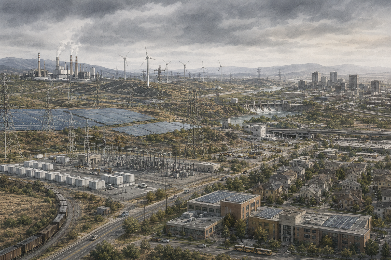
A good energy-flow diagram lets a reader answer several questions quickly. What enters the system? Which conversion pathways dominate? Where does energy change form? Which sectors receive the largest flows? How much energy is lost during transformation and end use? Which flows cross the geographic boundary? How much energy enters or leaves storage? Which parts of the result depend on accounting conventions rather than direct physical measurement?
Those questions connect visual design to system analysis. The aim is not to produce the most complicated diagram possible. The aim is to expose structure while preserving quantitative truth.
Why Flow Visualization Matters
Energy balances are naturally relational. A quantity of natural gas may be supplied directly to buildings, consumed by industry, transformed into electricity, used as feedstock, injected into storage, exported, or consumed by the energy sector itself. Electricity may originate from several generation technologies and then flow through transmission and distribution before reaching many end-use sectors. A single total therefore conceals the pathways that give the total meaning.
Flow visualization makes those relationships visible. Instead of asking only how much energy a country consumes, an analyst can ask how much coal becomes electricity, how much electricity reaches buildings, how much petroleum becomes transport fuel, how much natural gas becomes industrial heat, and how much energy is rejected or lost at each stage.
This matters for transition analysis. A system can reduce primary energy while maintaining services if it replaces inefficient combustion pathways with more efficient electric technologies. A system can increase electricity demand while reducing total final energy. A country can lower territorial fuel use while increasing imported electricity or embodied energy in goods. A sector can appear highly efficient at the point of use while depending on an inefficient upstream conversion chain.
A Sankey diagram compresses these relationships into a visual grammar: source → transformation → carrier → sector → useful output or loss. The representation does not replace the underlying balance. It provides another way to interrogate it.
What Is a Sankey Diagram?
A Sankey diagram is a directed flow diagram in which the width of each connection is proportional to a measured quantity. In energy analysis, the quantity is often energy over a defined period: petajoules per year, terawatt-hours per year, quadrillion British thermal units per year, or another consistent unit. The nodes represent categories or processes, while the links represent transfers between them.
A simplified electricity pathway might contain four nodes:
- natural gas supply;
- gas-fired generation;
- electricity delivered to the grid;
- generation losses.
If 100 units of fuel energy enter the plant and 42 units become electricity, then 58 units leave the conversion node as rejected heat and other losses. A valid Sankey representation should make the incoming band equal to the combined outgoing bands.
Sankey diagrams can operate at many scales. A diagram may describe one engine, one factory, one campus, one electric utility, one city, one country, or the global energy system. The visual form is similar, but the interpretation changes with the boundary. A national diagram may aggregate millions of devices into a few sectors. A plant-level diagram may represent individual boilers, turbines, heat exchangers, and steam headers.
The essential requirement is proportionality. A band that is twice as wide should represent approximately twice the underlying quantity. Once visual width is detached from data, the diagram becomes an illustration rather than a Sankey model.
Flow Widths and Quantitative Meaning
Let a flow between nodes i and j be represented by \(F_{ij}\). A rendering system maps this value to a visual width \(w_{ij}\) using a common scale factor \(k\):
w_{ij}=kF_{ij}
\]
Interpretation: every link in the same diagram should use the same value-to-width scale unless a change in scale is made explicit.
The absolute value of \(k\) depends on the available drawing area. It has no analytical meaning by itself. What matters is consistency. If one flow is 80 PJ and another is 20 PJ, the first should appear four times as wide as the second.
This requirement becomes difficult when a system contains both very large and very small flows. A diagram sized to show tiny hydrogen pilot projects may make national electricity and petroleum flows unmanageably wide. A diagram sized around dominant flows may render smaller categories invisible. The responsible response is not to distort widths. Better options include aggregation, a separate inset, a secondary figure, or an explicitly labeled threshold below which flows are omitted.
Units must also remain consistent. If one dataset is in GWh, another in PJ, and another in million tonnes of oil equivalent, all flows must be converted before visualization. Currency, mass, emissions, energy, and power should never share a single width scale unless the diagram is explicitly multi-metric and uses separate encodings.
Conservation and Node Balance
Sankey diagrams are especially useful because they make balance errors visible. For a steady-state transformation node without storage, the total incoming energy should equal the total outgoing energy when all losses and auxiliary uses are included:
\sum_i F_{i\rightarrow n}=\sum_j F_{n\rightarrow j}
\]
Node balance: energy entering a process must be accounted for in products, useful outputs, exports, own use, or losses.
When storage or inventory changes are present, the balance becomes:
\sum F_{in}-\sum F_{out}=\Delta E_{stored}
\]
Stock-aware balance: positive stock change means part of the inflow remains stored within the boundary; negative stock change means stored energy is being released.
In practical datasets, balances rarely close perfectly. Metering errors, inconsistent reporting periods, differing heating-value conventions, rounding, unallocated consumption, and statistical adjustments can create residuals. These should not be silently hidden. A diagram can include a statistical difference or unallocated flow, or the dataset can be reconciled before visualization using a documented method.
A useful diagnostic is the normalized node residual:
r_n=\frac{\sum F_{in}-\sum F_{out}-\Delta E_{stored}}{\max(\sum F_{in},\epsilon)}
\]
Interpretation: a residual near zero indicates a closed balance; the tolerance should reflect data quality rather than an arbitrary desire for perfect closure.
From Energy Balance to Flow Network
A statistical energy balance is usually organized as a matrix. Rows represent fuels or carriers. Columns represent supply, transformation, energy-industry use, transport, buildings, industry, agriculture, non-energy use, exports, stock changes, and other categories. A Sankey dataset reorganizes the same information as a list of directed links.
| Source node | Target node | Value | Interpretation |
|---|---|---|---|
| Natural gas | Power generation | 500 PJ | Primary fuel entering transformation. |
| Power generation | Electricity | 220 PJ | Secondary electricity produced. |
| Power generation | Generation losses | 280 PJ | Rejected heat and other conversion losses. |
| Electricity | Buildings | 90 PJ | Final electricity delivered to buildings. |
| Electricity | Industry | 80 PJ | Final electricity delivered to industry. |
| Electricity | Transport | 20 PJ | Final electricity delivered to transport. |
| Electricity | Network losses | 30 PJ | Transmission and distribution losses. |
The transformation from matrix to links requires explicit sign conventions. Some energy balances store transformation inputs as negative values and outputs as positive values. Some use separate tables. Some report gross generation while others report net generation. A visualization pipeline should normalize these conventions before generating links.
It is usually better to keep the raw balance unchanged and create a separate transformation layer that produces Sankey-ready data. That makes the visual model reproducible and allows reviewers to trace every band back to its source value.
Nodes, Links, and System Boundaries
A Sankey diagram contains two basic objects: nodes and links. Nodes represent categories or processes. Links carry quantities between them. Most analytical problems arise not from drawing the links but from deciding what deserves to be a node.
A useful node taxonomy for energy systems includes:
- resources: coal, crude oil, natural gas, solar, wind, uranium, biomass;
- transformations: refineries, power plants, electrolysers, district-heat plants, combined heat and power;
- carriers: electricity, gasoline, diesel, hydrogen, district heat;
- networks: transmission, distribution, pipelines, storage;
- sectors: buildings, transport, industry, agriculture, public services;
- end-use technologies: motors, boilers, furnaces, heat pumps, vehicles;
- outcomes: useful energy, energy services, rejected energy, losses.
The system boundary determines which nodes are internal. If the boundary is a country, imports enter from outside and exports leave. If the boundary is a power plant, the fuel supply chain and electricity consumers are outside. If the boundary is a building, grid generation is upstream and indoor thermal comfort is downstream.
The choice of boundary should appear in the title, caption, methods, or metadata. Without it, the same flow can be interpreted as primary, secondary, final, or useful energy depending on where the diagram starts and ends.
Tracing Primary Energy to Services
The most informative system-level Sankey diagrams extend beyond final energy. They trace resources through conversion and delivery into end-use technologies and, where data permit, into useful energy or energy services. This creates a bridge between the accounting stages introduced in the previous article.
A generic chain can be represented as:
E_{primary}\rightarrow E_{secondary}\rightarrow E_{final}\rightarrow E_{useful}\rightarrow \text{service}
\]
Interpretation: each stage can branch by carrier, sector, technology, or service, making the Sankey diagram a visual representation of an energy-conversion network.
The distinction matters because final-energy demand alone can make inefficient technologies look important simply because they consume large amounts of energy. Internal-combustion vehicles, for example, may receive large petroleum flows while converting only a fraction of that energy into useful traction. Electric motors may receive smaller electricity flows but convert a larger fraction into mechanical work. A service-oriented diagram can reveal this difference directly.
Data become less certain as the diagram moves downstream. Primary and final energy are often measured statistically. Useful energy may require equipment-efficiency estimates. Energy services may require additional variables such as vehicle-kilometres, passenger-kilometres, floor area, degree-hours, lumens, tonnes of material, or machine output. The visual should distinguish measured data from modeled estimates when that distinction matters.
Transformation and Conversion Losses
Transformation losses occur when one form or carrier of energy is converted into another. Thermal electricity generation is a familiar example. Fuel energy enters a boiler, combustion turbine, or reactor system; a fraction becomes electricity and the remainder is rejected as heat or consumed by auxiliary equipment.
For a conversion process with input \(E_{in}\) and useful carrier output \(E_{out}\), the gross conversion efficiency is:
\eta=\frac{E_{out}}{E_{in}}
\]
Loss accounting: if no other outputs or stock changes exist, conversion loss is \(E_{in}-E_{out}\).
However, the word loss must be used carefully. Energy is not destroyed. It is transferred to forms or locations that are not counted as desired outputs. Waste heat from a power plant remains energy, but its temperature may be too low or location too inconvenient for practical recovery. A refinery may produce multiple useful fuels and by-products, making a single efficiency ratio incomplete. A combined heat-and-power plant intentionally produces both electricity and useful heat.
Sankey diagrams should therefore distinguish among conversion losses, own use, network losses, curtailment, storage losses, and end-use rejection when the dataset supports those categories. Collapsing everything into one “waste” node can obscure the mechanisms and the opportunities for intervention.
End-Use Losses and Rejected Energy
Energy systems continue converting energy after final delivery. A building furnace converts natural gas into heat. A vehicle engine converts fuel into mechanical work. A motor converts electricity into shaft work. A lamp converts electricity into visible light and heat. A heat pump uses electricity to move environmental heat across a temperature difference.
The end-use balance can be written as:
E_{final}=E_{useful}+E_{end\text{-}use\ loss}
\]
Interpretation: the loss term represents energy not converted into the defined useful output, not energy that disappears.
System diagrams such as those published by Lawrence Livermore National Laboratory often separate energy services from rejected energy. That framing is powerful because it reveals how much energy entering the economy fails to become a desired end-use output. It is also highly assumption-dependent. Estimating rejected energy requires technology efficiencies, allocation rules, and definitions of service.
For heat pumps, the concept requires particular care. Useful heat can exceed final electrical input because environmental heat crosses the system boundary. A Sankey model that shows only electrical input and delivered heat without representing ambient heat may appear to violate conservation. The solution is to include the environmental heat flow or to state that the diagram is an electricity-to-service representation rather than a complete thermodynamic balance.
Sectoral Demand
Sectoral demand is one of the most useful branches in an economy-wide Sankey diagram. Final-energy carriers are allocated to buildings, industry, transport, agriculture, commercial activity, public services, or other classifications. The resulting bands reveal both scale and dependence.
A transport sector dominated by petroleum appears as a large flow from refined products to mobility. An electrifying transport system gradually adds a flow from electricity. An industrial sector may combine electricity, natural gas, coal, hydrogen, biomass, and district heat. Buildings may receive electricity, natural gas, heating oil, biomass, and district energy.
The categories should match the analytical question. A climate-policy diagram may separate iron and steel, cement, chemicals, and other industry because their decarbonization pathways differ. A utility-planning diagram may separate residential and commercial electricity because load profiles differ. An energy-justice diagram may separate household demand by income, tenure, or geography where data permit.
Sector totals should not be interpreted as service totals. A sector that consumes more final energy is not necessarily receiving more welfare or producing more value. Energy-intensive sectors can have high throughput and low economic value added; essential public services may consume modest energy but have enormous social value. Sankey width measures quantity, not importance.
Imports, Exports, Storage, and Stock Changes
Geographic systems exchange energy with their surroundings. A national diagram may import crude oil, refined products, natural gas, electricity, biomass, or hydrogen and export some of the same carriers. These flows should cross the diagram boundary visibly rather than being folded into domestic production.
Storage adds a temporal dimension. Energy entering a battery, reservoir, fuel stock, gas cavern, thermal store, or strategic reserve during one period may leave in another. Over a full year, net stock change may be small even when gross charging and discharging are large. A single annual Sankey can therefore hide the operational importance of storage.
A stock-aware flow balance is:
Supply+Imports+Stock\ Withdrawals=Transformation+Final\ Demand+Exports+Stock\ Additions+Losses
\]
Accounting rule: the sign convention for stock changes must be stated because statistical systems differ in whether withdrawals are positive or negative.
For short-duration storage, a separate operational Sankey may be more informative than annual net accounting. It can show gross charging energy, charging losses, discharge energy, discharge losses, and state-of-charge change. Pumped hydro and batteries are especially sensitive to this distinction because a net annual balance can make storage appear almost irrelevant even when it is critical for hourly reliability.
Renewables and Electricity Accounting
Non-combustible renewable electricity introduces the same accounting issues discussed in the previous article. Wind, solar photovoltaic, and hydropower do not pass through a measured fuel-combustion stage. Statistical systems therefore use conventions to define primary energy.
Under the physical-energy-content method, the electricity generated by wind, solar photovoltaic, and hydropower is often counted as primary energy at the point of generation. Under substitution methods, renewable electricity may be assigned the amount of fossil primary energy that would have been required to generate the same electricity at an assumed efficiency.
A Sankey diagram should not mix these conventions silently. Doing so changes the apparent width of the renewable primary-energy bands and can dramatically change the apparent magnitude of system “losses.” A transition from coal to wind may make primary energy and rejected heat fall sharply under one convention even when final electricity remains constant.
For comparison, a diagram focused on physical infrastructure can start all generation technologies at electricity output and show upstream thermal losses only for thermal resources. A diagram focused on statistical primary energy can reproduce the conventions of the source balance. Both can be valid if the boundary and method are stated.
Combined Heat and Power
Combined heat and power complicates simple one-output efficiency diagrams because one fuel input produces two useful energy carriers. Suppose 100 units of natural gas enter a CHP plant, 35 units leave as electricity, 45 units leave as useful district heat, and 20 units are rejected. The total useful-energy efficiency is 80 percent, but electricity-only efficiency is 35 percent.
A Sankey diagram handles this naturally by splitting the output into separate electricity, heat, and loss bands. The challenge is not visualization but allocation when analysts later compare electricity with standalone power generation or heat with standalone boilers.
Allocation approaches include:
- energy-content allocation;
- exergy allocation;
- economic allocation;
- avoided-production or substitution methods;
- system-expansion methods.
The Sankey should preserve the physical outputs before allocation whenever possible. Allocation is an analytical layer, not a conservation requirement. Showing the physical split first helps prevent accounting conventions from being mistaken for actual energy flows.
Spatial Boundaries
Every geographic Sankey diagram has a spatial boundary. That boundary can be a building, campus, utility territory, city, state, nation, region, or planet. The chosen scale determines which processes are internal and which appear as imports or exports.
A city-level diagram may show electricity and natural gas as imports because generation and extraction occur elsewhere. A national diagram may show domestic gas production and power generation internally. A global diagram has no energy imports or exports across the planetary boundary, although it can still represent international trade between regions.
Spatial boundaries matter for environmental interpretation. A city may reduce direct fuel combustion by importing more electricity. A country may reduce industrial energy use by importing energy-intensive materials. A corporate facility may appear efficient because upstream data centers, logistics, or contract manufacturing lie outside its boundary.
For this reason, geographic energy Sankeys should be paired with boundary notes and, where relevant, lifecycle or consumption-based analysis. A flow diagram is only as complete as the system it chooses to include.
Temporal Boundaries and Resolution
Most public energy Sankey diagrams are annual. Annual aggregation is useful for comparing total resource use, sectoral demand, and conversion efficiency, but it removes timing. Electricity systems, storage systems, renewable generation, heating demand, and transport charging are strongly time-dependent.
A power-system Sankey for one year can show total renewable generation and total load while concealing whether generation occurred when demand was high. It can show a battery’s gross throughput while concealing the duration and frequency of charge-discharge cycles. It can show enough annual electricity to supply electrified heating while concealing winter peak capacity.
Higher-resolution Sankeys can be produced for seasons, representative days, hours, operational states, or scenarios. A set of small-multiple diagrams can reveal how the network changes over time. For example, midday solar surplus may flow into batteries and exports, while evening demand may be supplied by storage, gas generation, and imports.
The time interval must be included with the unit. A link labeled “100 MW” represents power at an instant or average over an interval; a link labeled “100 MWh” represents energy accumulated across time. Mixing the two in one Sankey is a category error.
Aggregation and Disaggregation
A Sankey diagram is always a model of a more complex system. Aggregation determines what disappears. A national “industry” node may combine steel mills, semiconductor plants, food processing, cement kilns, chemical plants, warehouses, and water utilities. A “renewables” node may combine solar, wind, hydro, geothermal, and biomass despite very different operating characteristics.
Aggregation improves readability but can hide mechanisms. Disaggregation improves specificity but can overwhelm the reader. The right level depends on the question.
A useful hierarchy is:
| Level | Typical purpose | Example |
|---|---|---|
| System overview | Communicate dominant resources and sectors. | Coal, oil, gas, renewables → electricity/fuels → buildings/industry/transport. |
| Technology pathway | Compare conversion chains. | Natural gas → power plant → grid → heat pump → building heat. |
| Operational network | Study dispatch and flexibility. | Wind/solar/gas/storage/imports → hourly electricity load. |
| Service analysis | Trace energy to outcomes. | Electricity → motor → mechanical work → industrial production. |
A strong publication often uses more than one diagram rather than forcing every detail into a single graphic. An overview can establish the system; focused Sankeys can examine electricity, transport, buildings, or industry separately.
Uncertainty and Data Quality
Sankey diagrams look precise because widths are geometric. That visual precision can exceed the precision of the data. Fuel statistics may be measured accurately at terminals but estimated for informal biomass use. End-use efficiencies may come from engineering assumptions rather than meters. Sector allocations may be modeled. Small flows may be rounded. Imported electricity may lack generation-source information.
Uncertainty can be represented in several ways:
- publish a companion table with confidence intervals or data-quality scores;
- distinguish measured, reported, modeled, and assumed flows in metadata;
- use scenario ranges rather than a single value;
- flag links with high uncertainty;
- avoid excessive decimal precision.
For a modeled flow \(F\) with relative uncertainty \(u\), a simple interval can be expressed as:
F_{low}=F(1-u),\qquad F_{high}=F(1+u)
\]
Use with caution: real uncertainty may be asymmetric, correlated across flows, or governed by probability distributions rather than a simple percentage range.
Uncertainty also affects balance closure. If two large measured flows differ by a small residual, the residual may be statistical rather than physical. Labeling it “loss” without evidence can mislead the reader.
Balance Reconciliation
Energy datasets often require reconciliation before they can become a closed flow network. Suppose reported inputs to a refinery total 1,000 PJ, while reported products, own use, and losses total 992 PJ. The eight-PJ gap could arise from rounding, measurement error, stock changes, or omitted flows.
Several approaches are available. The simplest is to display the residual explicitly as a statistical-difference link. Another is proportional reconciliation, where a small discrepancy is distributed across selected outputs according to their shares. More advanced methods use constrained least squares, Bayesian reconciliation, or measurement-error models that weight adjustments by uncertainty.
The reconciled problem can be written conceptually as:
\min_{x^*}\sum_k\left(\frac{x_k^*-x_k}{\sigma_k}\right)^2
\quad\text{subject to}\quad A x^*=0
\]
Interpretation: adjust reported values as little as possible, relative to their uncertainties, while satisfying conservation constraints encoded by matrix \(A\).
Reconciliation should never be hidden. The original values, adjusted values, method, tolerance, and affected flows should be retained in the computational record. The Sankey is a published view of a data model, not a substitute for provenance.
Design Principles for Readable Sankey Diagrams
A technically correct Sankey can still be difficult to read. Good design reduces cognitive load without weakening quantitative integrity.
Useful principles include:
- Organize left to right. Resources, conversions, carriers, sectors, and outputs should generally follow the direction of the energy chain.
- Minimize crossings. Link crossings make flow tracing difficult and can create false visual associations.
- Use stable categories. The same node should not mean different things in different parts of the figure.
- Limit the palette. Colors should encode carrier, resource, sector, or analytical status—not decoration.
- Label units and period. A diagram without units is not quantitative.
- Expose losses. Losses should be visible where they occur rather than aggregated only at the far right if the analytical goal is efficiency.
- Preserve proportional widths. Do not enlarge small flows merely to make them visible.
- Publish the data. A downloadable table makes the diagram auditable and accessible.
Accessibility also matters. Color alone should not carry the entire meaning. Labels should be readable at normal zoom. Interactive diagrams should have textual alternatives. Static exports should remain understandable in grayscale where feasible.
Common Errors and Misleading Diagrams
Several recurring errors can make energy Sankeys misleading even when they look polished.
| Error | Why it matters | Better practice |
|---|---|---|
| Non-proportional widths | Visual magnitude no longer corresponds to data. | Generate widths directly from values. |
| Unstated boundary | Readers cannot determine what is included. | State geography, time period, stages, and exclusions. |
| Mixing power and energy | MW and MWh describe different quantities. | Use one physical quantity per width scale. |
| Treating residual as loss | Measurement mismatch is mistaken for a physical process. | Use statistical-difference categories or reconciliation. |
| Hidden accounting conventions | Renewable and nuclear primary-energy widths become incomparable. | State the primary-energy method. |
| Double counting storage | Charging and discharge can inflate total system throughput. | Separate gross flows from net supply metrics. |
| Double counting CHP outputs | Electricity and heat are both credited without conserving input. | Represent physical split before allocation. |
| Overaggregation | Important technologies or vulnerable groups disappear. | Use companion diagrams or hierarchical views. |
A particularly common mistake is to compare two Sankey diagrams that use different boundaries or accounting methods as if every width were directly comparable. Comparison requires harmonized units, categories, periods, methods, and boundaries.
Worked Examples
Example 1: Thermal power conversion
A gas-fired plant receives 240 GWh of fuel energy and exports 108 GWh of electricity. Auxiliary plant consumption is 8 GWh. The remaining energy is rejected as heat.
E_{rejected}=240-108-8=124\ \text{GWh}
\]
The Sankey node should therefore split 240 GWh into 108 GWh exported electricity, 8 GWh own use, and 124 GWh rejected energy.
The exported-electricity efficiency is \(108/240=45\%\). If own use is included in gross electric output, the gross generation efficiency is \(116/240\approx48.3\%\). The diagram must make clear which convention it uses.
Example 2: Transmission and distribution
A grid receives 500 GWh from generators and 20 GWh from imports. It delivers 490 GWh to end users and exports 10 GWh.
E_{network\ loss}=500+20-490-10=20\ \text{GWh}
\]
Network losses are 20 GWh, equal to 3.85 percent of gross inflow.
Example 3: Heat pump and ambient heat
A heat pump consumes 30 MWh of electricity and has a seasonal coefficient of performance of 3.2. Useful heat delivered is 96 MWh.
Q_{ambient}=Q_{delivered}-W_{electric}=96-30=66\ \text{MWh}
\]
A thermodynamically complete Sankey includes a 66-MWh ambient-heat inflow in addition to the 30-MWh electricity inflow.
Example 4: Battery storage
A battery receives 50 MWh during charging and later delivers 43 MWh. The state of charge is the same at the beginning and end of the period.
\eta_{roundtrip}=\frac{43}{50}=0.86
\]
The Sankey can show 50 MWh charging, 43 MWh discharge, and 7 MWh storage loss. It should not treat both 50 and 43 MWh as independent energy supply.
Example 5: Sectoral useful energy
Buildings receive 100 PJ of final electricity. Assume 35 PJ goes to heat pumps with average COP 3.0, 25 PJ to resistance heating, 20 PJ to motors and appliances at 85 percent useful efficiency, and 20 PJ to other loads at 70 percent useful efficiency.
Useful outputs are:
- heat-pump delivered heat: 105 PJ, including ambient heat;
- resistance heat: 25 PJ;
- motor/appliance useful energy: 17 PJ;
- other useful energy: 14 PJ.
A Sankey limited to electricity will show 100 PJ entering buildings. A service-oriented Sankey must additionally represent the ambient heat that allows useful thermal output to exceed electricity input. This example illustrates why the correct boundary matters more than the visual format.
Python Workflow: Building a Sankey Dataset
A reproducible Sankey pipeline should separate data preparation from rendering. The core data structure can be a simple table containing source, target, value, unit, period, and provenance.
from collections import defaultdict

flows = [
    ("Natural gas", "Power generation", 240.0),
    ("Power generation", "Electricity", 108.0),
    ("Power generation", "Plant own use", 8.0),
    ("Power generation", "Rejected energy", 124.0),
]

incoming = defaultdict(float)
outgoing = defaultdict(float)

for source, target, value in flows:
    outgoing[source] += value
    incoming[target] += value

nodes = sorted(set(incoming) | set(outgoing))
for node in nodes:
    if incoming[node] and outgoing[node]:
        residual = incoming[node] - outgoing[node]
        print(node, residual)
This balance check should run before visualization. A production workflow can add tolerances, storage changes, uncertainty, unit conversion, and provenance checks.
Once the network is validated, an interactive renderer such as Plotly can consume node indices and link values:
import plotly.graph_objects as go

labels = [
    "Natural gas", "Power generation", "Electricity",
    "Plant own use", "Rejected energy"
]
index = {name: i for i, name in enumerate(labels)}

sources = [index["Natural gas"], index["Power generation"],
           index["Power generation"], index["Power generation"]]
targets = [index["Power generation"], index["Electricity"],
           index["Plant own use"], index["Rejected energy"]]
values = [240, 108, 8, 124]

fig = go.Figure(go.Sankey(
    node={"label": labels},
    link={"source": sources, "target": targets, "value": values}
))
fig.update_layout(title_text="Illustrative Energy Flow", font_size=12)
fig.show()
The plotting library should be the final step, not the accounting engine. This makes it possible to export the same validated flow table to interactive graphics, static SVG, databases, notebooks, or alternative visualization tools.
R Workflow: Validating and Plotting Flows
R can use the same source-target-value structure. A simple balance check can be performed with base R before rendering.
flows <- data.frame(
  source = c("Natural gas", "Power generation",
             "Power generation", "Power generation"),
  target = c("Power generation", "Electricity",
             "Plant own use", "Rejected energy"),
  value = c(240, 108, 8, 124)
)

incoming <- aggregate(value ~ target, flows, sum)
outgoing <- aggregate(value ~ source, flows, sum)

names(incoming) <- c("node", "incoming")
names(outgoing) <- c("node", "outgoing")

balance <- merge(incoming, outgoing, by="node", all=TRUE)
balance[is.na(balance)] <- 0
balance$residual <- balance$incoming - balance$outgoing
print(balance)
For interactive display, packages such as networkD3 can render Sankey diagrams after the links are converted to zero-based node indices. For publication, the more important requirement is that the underlying table remains available and reproducible.
The Python and R examples illustrate a general principle: validate first, visualize second. A visually impressive diagram built from an unreconciled or undocumented flow table is still a weak analytical product.
GitHub Repository
The Energy Systems repository contains article-level computational companions, reproducible examples, data structures, validation materials, and implementation notes used across this series. The repository is organized so that individual articles can add specialized code without fragmenting the broader Energy Systems codebase.
A Practical Sankey Construction Method
A defensible energy Sankey can be built through a repeatable sequence.
- Define the question. Decide whether the diagram is about resource dependence, conversion efficiency, sectoral demand, useful energy, resilience, or another purpose.
- Define the boundary. State geography, period, included technologies, energy stages, and exclusions.
- Select a common unit. Convert all flows to one energy unit and document heating-value conventions where relevant.
- Preserve raw data. Keep the source energy balance unchanged and build a transformation layer.
- Create nodes. Define resources, transformations, carriers, sectors, outputs, and losses.
- Create links. Convert matrix entries or records into source-target-value rows with provenance.
- Check conservation. Calculate node residuals and investigate imbalances.
- Represent storage and trade. Include imports, exports, stock changes, and storage losses explicitly.
- Reconcile carefully. Preserve statistical differences or apply a documented reconciliation method.
- Choose aggregation. Remove detail only when it does not undermine the analytical purpose.
- Render proportionally. Use a single width scale and minimize crossings.
- Publish data and metadata. Provide the flow table, source notes, assumptions, date, unit, and code.
This method treats the diagram as an analytical output of a transparent model rather than as a design artifact created independently from the underlying evidence.
Policy, Equity, and Public Value
Energy Sankeys are often used to communicate policy choices because they reveal where intervention can have system-wide effects. A very wide rejected-energy band can motivate efficiency analysis. A large petroleum-to-transport flow can make dependence on combustion visible. A growing electricity-to-buildings flow can reveal electrification. A large imported-gas band can expose energy-security dependence.
But flow magnitude should not be confused with public priority. Small flows may serve critical facilities such as hospitals, water treatment, emergency communications, or remote communities. Large flows may serve low-value or avoidable demand. Energy justice questions cannot be answered from width alone.
A public-value Sankey can be strengthened by companion indicators:
- household energy burden;
- service reliability;
- air-pollution exposure;
- greenhouse-gas emissions;
- employment and ownership;
- critical-service dependence;
- regional vulnerability;
- infrastructure investment needs.
The flow diagram can then act as the physical backbone of a broader institutional analysis. It shows where energy moves; other evidence shows who controls those flows, who benefits from them, who bears the burdens, and what alternatives are available.
Limits and Responsible Interpretation
Sankey diagrams are powerful because they simplify. That is also their principal limitation. They compress time, space, technology diversity, uncertainty, economics, emissions, materials, institutions, and social outcomes into a flow network centered on one quantitative measure.
A wide band does not reveal price volatility, reliability, dispatchability, ramping capability, capacity, land use, water use, labor, ownership, emissions intensity, or geopolitical risk. A one-year energy total does not reveal peak load. A national flow does not reveal local pollution. A final-energy flow does not reveal service quality. A primary-energy flow does not reveal exergy or energy quality.
The responsible interpretation is therefore layered. Use Sankey diagrams to understand throughput and conversion structure. Use time-series analysis for operations. Use capacity and reliability models for adequacy. Use emissions inventories for climate and air-quality analysis. Use lifecycle assessment for upstream and embodied impacts. Use economic and institutional analysis for prices, incentives, ownership, regulation, and distributional consequences.
A Sankey diagram should make complexity more navigable, not imply that complexity has disappeared.
Why Energy Flows Change System Understanding
Energy-flow analysis changes the way an energy system is perceived. Instead of seeing isolated technologies, the analyst sees connected pathways. Resources become carriers. Carriers pass through infrastructure. Infrastructure serves sectors. End-use technologies convert final energy into useful outputs. Losses appear at specific stages rather than as an abstract total.
Sankey diagrams make these relationships visible because the geometry of the figure carries quantitative meaning. Wide bands identify dominant flows. Branches reveal competition among pathways. Narrowing bands reveal losses or diversion. Boundary crossings reveal trade. Storage reveals temporal transfer. Sectoral branches reveal dependence. Downstream useful-energy analysis reveals the difference between energy consumed and service delivered.
The method is most powerful when the visual is generated from a reconciled, documented, machine-readable flow model. Proportional widths, explicit boundaries, consistent units, transparent accounting conventions, and published data turn a Sankey diagram from an attractive graphic into an auditable analytical instrument.
That foundation leads directly to the next question in the series: even if an energy pathway is technically capable of delivering useful energy, how much energy must society invest in order to obtain that energy? The next article examines Energy Return on Investment, net energy, and the energetic cost of maintaining energy supply.
Related Articles
- What Are Energy Systems?
- Energy, Power, and Work
- Energy and Thermodynamics
- Primary, Secondary, and Final Energy
- Energy Return on Investment
- Energy Systems Thinking
- Energy Efficiency
- Energy Transition
Further Reading
- Lawrence Livermore National Laboratory. Energy Flow Charts.
- International Energy Agency. Energy Statistics Manual.
- United Nations Statistics Division. International Recommendations for Energy Statistics.
- Eurostat. Energy balances and Sankey visualizations.
- Schmidt, Mario. Research on the history and application of Sankey diagrams.
- Cullen, Jonathan M., and Julian M. Allwood. Research on global energy and material flows from resources to services.
- Smil, Vaclav. Energy and Civilization: A History.
References
- Lawrence Livermore National Laboratory. Energy Flow Charts. Available at: LLNL.
- International Energy Agency. Energy Statistics Manual. Available at: IEA.
- United Nations Statistics Division. International Recommendations for Energy Statistics. Available at: United Nations.
- Eurostat. Energy Balances. Available at: Eurostat.
- Plotly. Sankey Diagram Documentation. Available at: Plotly.
- Schmidt, Mario. “The Sankey Diagram in Energy and Material Flow Management.” Journal of Industrial Ecology.
- Cullen, Jonathan M., and Julian M. Allwood. “The Efficient Use of Energy: Tracing the Global Flow of Energy from Fuel to Service.” Energy Policy.
- Intergovernmental Panel on Climate Change. Climate Change 2022: Mitigation of Climate Change. Available at: IPCC.