
Last Updated May 14, 2026
Environmental analytics and monitoring dashboards are infrastructures of environmental attention through which heterogeneous observations, models, indicators, thresholds, alerts, and analytical logic are transformed into interpretable signals for awareness, comparison, prioritization, coordination, and action. They sit at the user-facing boundary between environmental data platforms and decision-making, organizing complex evidence into visual, spatial, temporal, and comparative forms that can support operational response, regulatory oversight, planning, public communication, and environmental accountability. In this sense, a monitoring dashboard is not merely a screen of charts and maps. It is an architecture of salience: a structured way of deciding what becomes visible, what counts as deviation, what deserves escalation, and how environmental evidence is framed before human judgment begins.
Environmental monitoring creates a distinctive analytics problem because the underlying evidence is heterogeneous in source, scale, latency, quality, and meaning. A single monitoring environment may include real-time sensor streams, geospatial layers, forecast model outputs, historical baselines, compliance records, satellite products, scenario tools, administrative records, environmental indicators, uncertainty estimates, and narrative summaries intended for different users and different time horizons. Some signals are useful only in near real time. Others become meaningful only through long-run comparison. Some require map-based context; others depend on threshold logic, anomaly detection, trend interpretation, or regulatory classification. Dashboards matter because users rarely encounter environmental evidence as raw tables or isolated files. They encounter it through interfaces that structure comparison, uncertainty, urgency, and the relation between evidence and action.
The deeper significance of environmental dashboards lies in the fact that they shape decision quality rather than simply improving access. A strong dashboard can connect users to current conditions, historical context, thresholds, alerts, scenario implications, and drill-down evidence without severing the link to provenance and uncertainty. A weak one can create false clarity, alert fatigue, visual overload, or misplaced confidence by presenting indicators without context, models without assumptions, maps without scale discipline, or comparisons without semantic coherence. Dashboards are therefore not neutral presentation layers. They are interpretive systems that distribute environmental judgment through design choices about aggregation, ranking, normalization, color, alert logic, interface flow, and what remains visible or hidden to the user.
Main Library
Publications
Article Map
Environmental Monitoring
Related Topic
Data Systems
Related Topic
Artificial Intelligence
Related Topic
Risk & Resilience
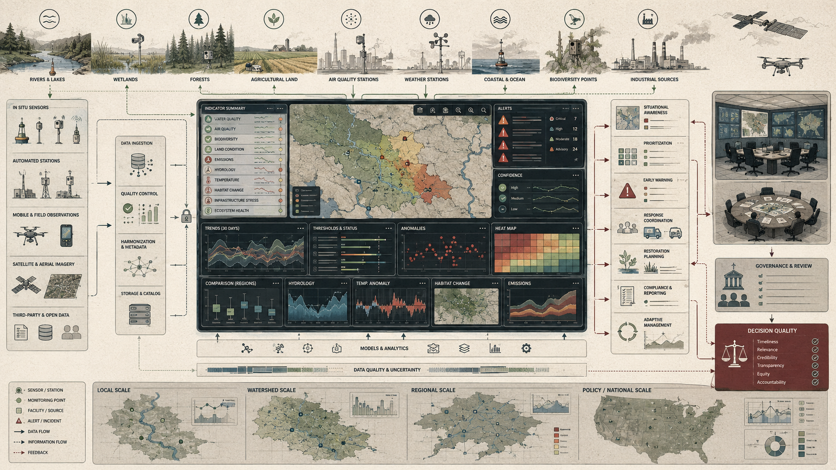
For environmental monitoring systems, dashboards are one of the most visible forms of analytical infrastructure. They determine how water conditions, air quality, hazards, biodiversity signals, compliance data, climate indicators, infrastructure conditions, or ecosystem changes are transformed into shared awareness. The question is not simply whether the dashboard displays data. The question is whether the dashboard helps users reason responsibly from evidence to interpretation and from interpretation to action. That requires more than good design. It requires trustworthy data flows, semantic coherence, uncertainty communication, provenance, role-aware interface structure, governance review, and a clear distinction between visual salience and evidentiary strength.
Engineering Problem
The engineering problem is how to design environmental analytics and dashboard systems that transform heterogeneous environmental evidence into usable, trustworthy, role-appropriate, and accountable decision support without creating false clarity, visual overload, alert fatigue, or untraceable conclusions. A dashboard must make complex monitoring evidence legible, but it must not strip away the context that makes that evidence meaningful. It must simplify without falsifying, summarize without severing provenance, and highlight urgency without turning every signal into an alert.
This problem is difficult because environmental dashboards operate across many kinds of evidence. Some inputs are direct sensor observations; others are modeled estimates, remote-sensing classifications, interpolated surfaces, regulatory records, manually entered field reports, forecast products, or administrative indicators. Some data update every few minutes; others update monthly or annually. Some indicators are meaningful only at a site; others require watershed, regional, national, or global context. Some users need immediate operational awareness; others need audit trails, compliance trends, planning evidence, or public communication. A single dashboard may be expected to serve all of these roles, even though each role requires different analytical structure.
Weak dashboard systems treat visualization as the primary problem. They emphasize charts, maps, colors, widgets, and summary cards while leaving data lineage, transformation logic, uncertainty, semantic consistency, threshold rationale, and user tasks underdeveloped. Strong dashboard systems treat visualization as one layer in a larger analytical architecture. They ask what evidence is being displayed, what transformations produced it, which comparisons are valid, who is using it, what decision it supports, what uncertainty remains, and what action or review should follow.
| Engineering Tension | Why It Matters | Required Evidence |
|---|---|---|
| Visibility versus overload | Dashboards must expose important signals without overwhelming users with every possible layer, chart, or alert. | User-role map, salience rules, alert thresholds, interface testing |
| Simplicity versus provenance | Summary panels improve usability but can hide the source, method, and uncertainty behind displayed values. | Metadata links, source lineage, method notes, drill-down paths |
| Real-time awareness versus historical context | Current values may be misleading without baselines, seasonal norms, trends, or recurrence context. | Baseline tables, time windows, historical comparisons, trend panels |
| Alerting versus decision support | Alerts identify potential concern but may not provide enough context for action. | Alert rationale, recommended action, uncertainty, escalation protocol |
| Map integration versus semantic coherence | Layers can appear visually integrated while differing in time, scale, resolution, method, or meaning. | Layer metadata, timestamp, resolution, CRS, semantic compatibility checks |
| Shared operating picture versus role-specific needs | Different users require different levels of detail, evidence, timing, and authority. | User personas, task analysis, permission model, view configuration |
| Polished interface versus evidentiary accountability | A clean interface can make weak or uncertain evidence appear stronger than it is. | Uncertainty display, confidence flags, audit trail, dashboard review process |
The practical question is therefore: can the dashboard help users see what matters, why it matters, how reliable it is, what evidence supports it, and what kind of action or review it justifies?
Reference Architecture
A practical environmental analytics and dashboard architecture can be understood as a layered interpretive system. The exact implementation may include field sensors, remote sensing products, forecast models, compliance databases, event logs, geospatial services, environmental data platforms, API services, transformation pipelines, visualization components, alert engines, identity systems, public dashboards, and analyst workbenches. The underlying responsibilities remain consistent: ingest, validate, transform, contextualize, visualize, alert, explain, and preserve evidence.
| Layer | Engineering Role | Primary Risk | Evidence Artifact |
|---|---|---|---|
| Source layer | Collects sensor streams, geospatial layers, model outputs, administrative records, field observations, and public datasets. | Source gaps, stale feeds, inconsistent formats, weak documentation | Source inventory, feed registry, update schedule, data contract |
| Ingestion and quality layer | Validates schema, freshness, completeness, units, timestamps, geospatial references, and quality flags. | Silent data failure, missingness, unit mismatch, invalid timestamps | Ingestion log, QA/QC report, schema validation, freshness monitor |
| Transformation layer | Cleans, aggregates, normalizes, interpolates, joins, classifies, and prepares data for analytical use. | Opaque transformation, semantic drift, untraceable aggregation | Transformation manifest, lineage graph, processing version, reproducible workflow |
| Analytical layer | Computes indicators, thresholds, anomalies, forecasts, classifications, rankings, and comparisons. | False alerts, weak baselines, overconfident model outputs, poor comparison logic | Indicator registry, threshold registry, model card, baseline table |
| Interface layer | Displays charts, maps, timelines, alerts, summary cards, filters, drill-downs, and reports. | Visual overload, misleading color scales, poor accessibility, insufficient context | UI specification, design system, accessibility review, user-testing record |
| Interpretive layer | Helps users move from display to judgment through explanation, uncertainty, provenance, and action guidance. | Visual overconfidence, unsupported inference, weak user guidance | Method notes, uncertainty flags, recommended action, explanatory text |
| Governance layer | Defines review authority, data stewardship, public communication, permissions, auditability, and accountability. | Unreviewed indicators, hidden assumptions, unaccountable dashboard changes | Governance policy, dashboard change log, audit trail, review schedule |
| Learning layer | Uses user feedback, event review, false alerts, missed signals, and decision outcomes to improve the dashboard. | Static interfaces that fail under evolving environmental and institutional needs | After-action review, usability backlog, indicator revision log, alert review report |
This architecture makes dashboards visible as interpretive infrastructure rather than presentation surfaces. A dashboard does not provide direct access to environmental reality. It provides access to transformed, selected, arranged, and contextualized evidence. Each layer shapes what users finally see and how they judge it.
Implementation Pattern
A rigorous dashboard implementation begins by defining the monitoring domain, user roles, decision tasks, evidence sources, update cadence, indicator definitions, thresholds, uncertainty requirements, alert rules, drill-down paths, accessibility requirements, and governance responsibilities. The goal is not to display every available metric. The goal is to create an interface that helps specific users answer specific environmental questions responsibly.
| Artifact | Purpose | Typical Format | |
|---|---|---|---|
| Dashboard objective manifest | Defines the dashboard purpose, user roles, decisions supported, domains covered | Defines the dashboard purpose, user roles, decisions supported, domains covered, and update requirements. | YAML, Markdown, design record |
| User-role matrix | Maps responders, regulators, planners, scientists, operators, community users, and public audiences to tasks. | CSV, design document, product requirements | |
| Source inventory | Lists data feeds, sensors, APIs, geospatial layers, models, and administrative sources. | CSV, SQL table, data catalog | |
| Indicator registry | Defines indicator name, domain, unit, source, method, baseline, threshold, uncertainty, and owner. | CSV, YAML, SQL table, metadata catalog | |
| Threshold and alert registry | Defines alert levels, trigger values, uncertainty bands, review rules, and recommended actions. | YAML, database table, policy document | |
| Layer metadata profile | Documents spatial extent, resolution, timestamp, CRS, method, source, and confidence for map layers. | JSON, ISO metadata, STAC-style metadata, data dictionary | |
| Transformation manifest | Records how source data become dashboard-ready indicators and display objects. | YAML, DAG, notebook, workflow log | |
| Uncertainty and provenance policy | Defines how measured, modeled, estimated, interpolated, and missing values are labeled. | YAML, style guide, metadata policy | |
| Accessibility and usability review | Tests whether users can interpret and act on dashboard content across roles and abilities. | Test report, WCAG checklist, user interview summary | |
| Dashboard change log | Preserves changes to indicators, thresholds, visual encodings, data sources, and alert rules. | Git log, release notes, governance register |
The implementation goal is to make dashboard judgment inspectable. A user should be able to understand not only what a dashboard displays, but where the evidence came from, how it was transformed, what uncertainty remains, why an alert fired, which comparisons are valid, and what action or review is expected.
Research-Grade Framing: Dashboards as Infrastructures of Environmental Attention
A research-grade understanding of environmental dashboards begins by treating them as infrastructures of environmental attention rather than as neutral reporting surfaces. Dashboards do not simply reveal environmental conditions. They allocate cognitive priority. They decide what appears in summary, what requires drill-down, what counts as an alert, what counts as background, which time horizons are juxtaposed, which indicators occupy the foreground of user awareness, and which uncertainties remain peripheral.
This makes dashboards epistemically powerful and epistemically risky. They can help users reason across complexity by presenting salient comparisons, thresholds, anomalies, spatial relationships, and temporal patterns in compressed form. But they can also over-aggregate, suppress ambiguity, privilege administratively convenient indicators, flatten unequal exposure, or make model-derived evidence appear equivalent to direct observation. A dashboard designed around compliance counts produces one kind of environmental intelligence. A dashboard designed around hydrological warning, disaster response, ecosystem condition, climate-service capacity, or environmental justice produces another.
Dashboards therefore embody a theory of relevance. Their design choices answer questions such as: What counts as deterioration? What deserves escalation? What should be compared against what? Which users get summary views and which get evidence details? Which uncertainties can remain in the background, and which must be surfaced directly? In environmental analytics, attention design is inseparable from decision design.
| Limited Pattern | Stronger Pattern | Why the Shift Matters |
|---|---|---|
| Display available data | Design task-specific evidence views | Aligns dashboard structure with real decisions rather than data availability alone. |
| Highlight current values | Compare current values to baselines, thresholds, trends, and spatial context | Prevents present status from being interpreted without meaning. |
| Show alerts | Show alert rationale, uncertainty, severity, and action pathway | Connects alerting to decision support rather than notification alone. |
| Use attractive charts and maps | Use visual encodings that preserve scale, uncertainty, and comparison validity | Reduces false salience and visual persuasion. |
| Provide shared visibility | Support shared interpretation with provenance and role-aware context | Helps users reason together from the same evidence base. |
| Publish dashboard updates | Govern dashboard changes, thresholds, indicators, and methods | Makes the interface itself accountable. |
The central design question is not “What can we visualize?” but “What kind of environmental judgment does this dashboard make easier, and what kind might it distort?”
Formal Model: Signals, Salience, Uncertainty, and Decision Quality
A useful formal model separates environmental signal quality, salience, uncertainty, user role, alert burden, and decision quality. Let \(S_i\) represent signal \(i\), \(Q_i\) its quality, \(U_i\) its uncertainty, \(T_i\) its timeliness, \(C_i\) its contextual completeness, \(P_i\) its provenance completeness, and \(A_i\) its action relevance. A dashboard selects, transforms, ranks, and displays signals in ways that influence user judgment.
V_i = f(Q_i, T_i, C_i, P_i, A_i, 1 – U_i)
\]
Interpretation: The value of a dashboard signal depends on quality, timeliness, context, provenance, action relevance, and uncertainty. A signal is not useful merely because it is visible.
S_{\mathrm{salience}} = w_1R + w_2D + w_3M + w_4A + w_5E
\]
Interpretation: Dashboard salience can be modeled as a weighted combination of risk relevance \(R\), deviation from baseline \(D\), magnitude \(M\), actionability \(A\), and equity relevance \(E\).
B_{\mathrm{alert}} = \frac{N_{\mathrm{alerts}}}{N_{\mathrm{actionable\ alerts}}}
\]
Interpretation: Alert burden increases when many alerts are generated but few support real action. High alert burden can produce fatigue and reduce response quality.
P_{\mathrm{provenance}} = \frac{N_{\mathrm{traceable\ displays}}}{N_{\mathrm{displayed\ objects}}}
\]
Interpretation: Provenance completeness measures how many displayed values, charts, maps, or alerts can be traced to source data and transformations.
D_{\mathrm{quality}} = g(V, U, P, R_u, A_c, H)
\]
Interpretation: Decision quality depends on signal value \(V\), uncertainty \(U\), provenance \(P\), user-role fit \(R_u\), action clarity \(A_c\), and human review \(H\).
This formal structure makes dashboard design reviewable. It shows that decision quality is shaped not only by data accuracy, but by salience rules, alert burden, provenance, uncertainty, role fit, and action clarity. A dashboard can be technically current and still produce weak decision support if these dimensions are poorly designed.
What Are Environmental Analytics and Monitoring Dashboards?
Environmental analytics are the interpretive processes through which environmental data are summarized, compared, modeled, contextualized, and transformed into indicators, trends, alerts, scenarios, rankings, maps, or other forms of usable evidence. Monitoring dashboards are the interactive interfaces through which many of those analytics become visible to users. Together, they connect environmental data platforms to operational and strategic judgment by turning streams and archives of environmental information into structured views of status, change, risk, and consequence.
Such systems may include maps and geospatial viewers showing environmental conditions, incidents, monitoring sites, watersheds, assets, or exposed populations; charts and trend panels showing status, change, or threshold exceedance over time; alert modules highlighting anomalies, warnings, compliance concerns, or operational triggers; filters and drill-down tools for narrowing from summary views to site, facility, watershed, region, population, or time period; scenario and comparison tools linking analytics to planning or management alternatives; and metadata, notes, and source links that preserve provenance and interpretive context.
The defining feature of a monitoring dashboard is not that it displays information, but that it structures how evidence is encountered. A well-designed dashboard makes it possible to move between overview and detail, between current conditions and historical baselines, and between summary views and the source data or models that generated them. A poorly designed dashboard can trap users in summary views that appear clear while leaving the evidence chain opaque.
Public examples illustrate the range of dashboard roles. The USGS National Water Dashboard provides map-based access to real-time water and weather information, while USGS Water Data for the Nation reports more than 13,500 real-time monitoring locations across streams, lakes, reservoirs, precipitation, water quality, and groundwater. NOAA’s Environmental Response Management Application supports environmental response, damage assessment, and recovery by enabling users to upload, analyze, export, and display spatial data. EPA ECHO comparative dashboards support compliance and enforcement trend analysis, while WMO dashboard resources support climate indicators and climate-service capacity assessment.
Why Monitoring Dashboards Matter
Monitoring dashboards matter because environmental evidence is rarely actionable in raw form. Data streams can be voluminous, uneven, delayed, uncertain, spatially complex, and difficult to compare across sources or scales. Dashboards reduce this analytic burden by giving users structured views of what matters now, what has changed, where conditions are abnormal, and where deeper investigation may be warranted. They matter especially in settings where environmental conditions evolve quickly and users cannot afford to reconstruct the state of a system from raw files or disconnected tables each time a decision is required.
They also matter because environmental decisions are frequently comparative rather than absolute. A current measurement may matter only relative to a threshold, a historical norm, a nearby station, an upstream condition, a facility baseline, a model expectation, a regulatory category, or a seasonal pattern. Dashboards make these comparisons visible. But they also choose which comparisons become default, which means dashboard design can influence which patterns users notice and which remain hidden.
Most importantly, dashboards matter because they mediate collective awareness. In environmental response, regulation, planning, infrastructure operations, and public communication, multiple actors often need to reason from a shared operating picture rather than from private analytical fragments. Dashboards can help produce that shared view, but only if they preserve enough provenance, uncertainty, and context to support shared interpretation rather than merely shared visibility.
| Need | Dashboard Contribution | Risk Without Good Design |
|---|---|---|
| Situational awareness | Shows current environmental conditions, incidents, alerts, and spatial patterns. | Users may miss fast-moving hazards or emerging anomalies. |
| Comparison | Relates current values to baselines, thresholds, nearby sites, or historical trends. | Values may be interpreted without context. |
| Prioritization | Highlights locations, indicators, or systems requiring attention. | Users may be overwhelmed by undifferentiated data. |
| Coordination | Supports shared operating pictures across agencies, teams, or publics. | Actors may work from inconsistent or fragmented evidence. |
| Accountability | Makes monitoring evidence visible and reviewable. | Claims may become difficult to verify or challenge. |
| Learning | Shows trends, failure patterns, alert performance, and decision outcomes. | Systems may repeat errors without post-event or post-decision review. |
Dashboards matter because they are where environmental data often becomes institutional attention. That makes them strategically powerful and ethically consequential.
Core Components of Environmental Analytics and Dashboard Systems
Environmental analytics and monitoring dashboards typically integrate several interdependent components. These components should not be treated as cosmetic interface features. They form one evidence system. A polished chart without trustworthy transformation logic is weak evidence. A live feed without user-oriented summarization may overwhelm rather than inform. A map without context can encourage false spatial certainty. A monitoring dashboard becomes meaningful when these components work together to preserve both usability and evidentiary discipline.
| Component | Function | Design Risk |
|---|---|---|
| Data feeds | Bring sensor streams, model outputs, administrative records, geospatial layers, and environmental products into the system. | Feed failure, stale data, inconsistent formats, undocumented source changes |
| Transformation logic | Cleans, aggregates, normalizes, aligns, classifies, or computes indicators from source data. | Opaque methods, semantic drift, untraceable calculations |
| Indicator panels | Summarize environmental status, pressure, trend, compliance, or risk in compact form. | Proxy inflation, missing context, activity mistaken for outcome |
| Maps and spatial viewers | Show conditions, incidents, monitoring locations, exposed assets, and spatial relationships. | Scale mismatch, misleading layers, hidden uncertainty, poor projection handling |
| Threshold and alert modules | Identify exceedances, anomalies, warnings, or conditions requiring attention. | Alert fatigue, false reassurance, unreviewed thresholds |
| Exploration tools | Allow filtering, drill-down, comparison, search, and movement from overview to detail. | Users trapped in summaries or overwhelmed by detail |
| Context layers | Provide provenance, metadata, uncertainty, method notes, and explanatory text. | Visual overconfidence and unsupported interpretation |
| Governance records | Track dashboard changes, indicator updates, threshold revisions, and review decisions. | Unaccountable interface changes and loss of institutional memory |
Dashboards should be designed as connected systems of evidence, interface, and accountability. The interface is only the visible layer of a deeper analytical structure.
Key Analytical Distinctions
A dashboard is not the same as a data platform. A platform manages storage, metadata, access, integration, versioning, APIs, and data governance; a dashboard is a user-facing interpretive environment built on top of that substrate. If the platform is weak, the dashboard may appear functional while relying on fragile data flows.
Visualization is not the same as analysis. Charts and maps can display values clearly without resolving causality, relevance, uncertainty, or appropriate action. Good visualization supports analysis, but it does not replace it.
An indicator is not the same as the underlying environmental process. Dashboards often present compressed signals that stand in for more complex realities. A turbidity value, compliance count, habitat index, flood map, or air-quality category can be useful, but it remains a proxy that requires context.
Alerting is not the same as decision support. A system may flag anomalies rapidly while still failing to provide enough context, tradeoff structure, provenance, or response guidance for good judgment.
Current status is not the same as temporal understanding. Many environmental questions require baselines, trends, recurrence, seasonality, lag effects, and historical comparison rather than present values alone.
Shared visibility is not the same as shared interpretation. Multiple actors may view the same dashboard yet draw different conclusions depending on role, incentives, prior knowledge, authority, and decision context.
| Distinction | Why It Matters | Design Implication |
|---|---|---|
| Platform versus dashboard | Storage and access are different from interpretation and decision support. | Maintain data governance beneath the interface. |
| Visualization versus analysis | Display does not guarantee valid interpretation. | Pair visualizations with methods, context, and uncertainty. |
| Indicator versus process | Metrics simplify environmental reality. | Document what each indicator represents and omits. |
| Alert versus action | Attention does not automatically produce response. | Connect alerts to recommended actions and escalation rules. |
| Status versus trajectory | Current values may mislead without temporal context. | Show baselines, trends, and historical ranges. |
| Visibility versus interpretation | Shared screens do not ensure shared judgment. | Use role-specific explanations and evidence drill-down. |
These distinctions keep dashboards from becoming overconfident display systems. They preserve the difference between seeing something and understanding what can responsibly be concluded from it.
System Architecture: From Data Stream to User Judgment
Environmental analytics and dashboard systems operate as layered interpretive architectures. Every layer transforms evidence: source data become validated records, validated records become indicators, indicators become visual objects, visual objects become user judgments, and user judgments become decisions. The system fails when these transformations become invisible or unreviewable.
| Layer | Transformation | Failure Risk |
|---|---|---|
| Source layer | Environmental observations, models, administrative records, and geospatial products generate inputs. | Missing sources, stale feeds, undocumented source revisions |
| Validation layer | Inputs are checked for schema, units, timestamps, quality flags, and completeness. | Invalid values silently enter the dashboard. |
| Transformation layer | Data are cleaned, aligned, aggregated, normalized, interpolated, or joined. | Users see transformed values without understanding transformations. |
| Analytical layer | Thresholds, comparisons, trends, forecasts, classifications, and anomaly scores are computed. | Alert logic or comparison logic becomes unreviewed. |
| Interface layer | Maps, charts, summaries, filters, and alerts expose analytics to users. | Visual choices create false salience or hide uncertainty. |
| Interpretive layer | Users compare, question, contextualize, and judge what the display implies. | Users misread evidence because the interface lacks context. |
| Action layer | Operational, regulatory, planning, or communication responses follow from interpreted evidence. | Actions are taken without sufficient evidence, or evidence fails to trigger action. |
| Learning layer | Outcomes, errors, user feedback, and event reviews improve the dashboard. | The system repeats display, alert, or interpretation failures. |
This layered structure matters because dashboards do not simply display environmental data. They construct an evidence pathway from data stream to user judgment. That pathway must remain inspectable if decisions depend on it.
Visualization, Mapping, and Comparative Framing
Visualization is central to monitoring dashboards because environmental conditions are often easier to interpret comparatively than numerically. A map can show spatial clustering, upstream-downstream relationships, watershed exposure, facility concentration, habitat fragmentation, hazard spread, or environmental inequality in ways that raw coordinates cannot. A time-series chart can reveal whether an anomaly is isolated, recurring, seasonal, or accelerating. Summary panels can help users distinguish system-wide patterns from local outliers.
But visualization is not neutral. It frames comparison. Color scales, default map extents, ranking logic, smoothing, classification bins, aggregation levels, baselines, and time-window selection all influence what users notice and how they interpret significance. A red symbol may imply urgency even if uncertainty is high. A smooth surface may imply precision even if data are sparse. A dashboard default may turn one comparison into common sense while making another difficult to see.
Environmental dashboard design must therefore treat visual encoding as a form of analytical governance. Good maps and charts do not merely look clean. They make valid comparison easier and invalid inference harder. They preserve the ability to inspect source, method, scale, and uncertainty. They support transitions between overview and detail without forcing users to choose between operational speed and evidentiary discipline.
| Visual Design Element | Risk | Safeguard |
|---|---|---|
| Color scale | May exaggerate or minimize severity. | Use documented thresholds, accessible palettes, and legend explanations. |
| Map layer | May hide differences in resolution, timestamp, or method. | Expose layer metadata and data currency. |
| Aggregation | May hide local variation or unequal exposure. | Allow drill-down and disaggregated views. |
| Ranking | May imply priority without context. | Show ranking criteria, uncertainty, and decision relevance. |
| Trend line | May imply causality or smooth over volatility. | Show raw values, confidence, seasonal context, and method notes. |
| Alert badge | May produce urgency without evidence depth. | Link alerts to trigger rationale, evidence, and recommended action. |
The right comparison is often more important than the most visually striking graphic. Dashboard quality depends on whether visualization improves environmental reasoning rather than merely accelerating attention.
Indicators, Thresholds, and Alert Logic
Many monitoring dashboards organize evidence around indicators and thresholds because users need concise signals of what deserves attention. Indicators reduce complex environmental systems into manageable measures; thresholds distinguish ordinary variation from conditions warranting concern, escalation, investigation, or intervention. This can be essential for operational awareness, especially where the monitoring environment is too complex to interpret continuously from raw values alone.
Yet thresholds also embed institutional assumptions and value judgments. A threshold may reflect a regulatory standard, historical norm, public-health level, ecological limit, risk tolerance, engineering rule, or operational convention. Alerts can be too insensitive and miss important change, or too sensitive and generate fatigue that erodes response quality. Thresholds can also become outdated as climate conditions, infrastructure, land use, ecosystem state, or community vulnerability changes.
Strong dashboards make alert logic legible. They help users understand not only that a condition crossed a threshold, but what that threshold represents, how it was chosen, how uncertain the signal is, and what kind of action or review it is meant to support. They also distinguish between hard thresholds, soft warning bands, anomaly flags, model-confidence warnings, and informational notices.
| Requirement | Question | Evidence Needed |
|---|---|---|
| Indicator definition | What exactly is being measured or estimated? | Indicator registry, unit, source, method, domain |
| Threshold rationale | Why does this value trigger attention? | Regulatory standard, ecological threshold, baseline deviation, operational rule |
| Uncertainty treatment | How confident is the displayed value or alert? | Confidence interval, quality flag, model uncertainty, source type |
| Action guidance | What should a user do when the alert fires? | Recommended action, escalation path, response owner |
| Alert performance | Are alerts useful, too frequent, or too rare? | False alert log, missed event log, alert-action ratio |
| Threshold review | Are alert rules still appropriate under changing conditions? | Review schedule, threshold revision log, after-action report |
Alerting is not the endpoint of dashboard analytics. It is the beginning of a decision pathway. Good alert design connects signal, context, uncertainty, and action.
Real-Time Awareness, Historical Context, and Temporal Reasoning
Environmental dashboards often operate across multiple timescales at once. Some are designed for real-time awareness and immediate action. Others support weekly, seasonal, annual, or long-run evaluation. Good dashboards do not treat these timescales as interchangeable. They help users move between present conditions and historical baselines so that significance can be judged appropriately.
A current value may appear alarming until seen against a seasonal pattern; a modest anomaly may appear routine until long-term context reveals persistent drift. A dashboard that shows only present status may support immediate awareness but undermine strategic understanding. A dashboard that shows only long-run trends may miss fast-moving events. Strong systems allow users to shift between now, recent history, baseline period, recurrence interval, forecast horizon, and long-term trajectory.
| Timescale | Dashboard Question | Example Use |
|---|---|---|
| Real time | What is happening now? | Flood stage, air-quality spike, sensor alert, operational incident |
| Recent window | What changed over hours, days, or weeks? | Rapid deterioration, event progression, post-storm recovery |
| Seasonal context | Is this normal for this time of year? | Water levels, vegetation condition, temperature, wildfire risk |
| Historical baseline | How does this compare with past conditions? | Trend detection, recurrence comparison, compliance review |
| Forecast horizon | What is likely to happen next? | Early warning, infrastructure operations, resource mobilization |
| Strategic horizon | Are long-term conditions improving or deteriorating? | Climate services, sustainability strategy, resilience planning |
Temporal reasoning is central to dashboard quality. The best systems let users ask not only “What is happening now?” but also “What is normal here?”, “What changed?”, “How fast?”, “Compared to when?”, and “What does this imply for action?”
User Roles, Operational Context, and Human-Centered Decision Support
Environmental dashboards are used by actors with different responsibilities: responders, regulators, planners, utility operators, infrastructure managers, scientists, community organizations, journalists, public agencies, and the public. A human-centered dashboard must account for these differing roles rather than assume one generic user. A responder may need a common operating picture with fast filtering and incident layers. A regulator may need comparative performance and compliance summaries. A planner may need scenario and trend context. A scientist may need drill-down access to methods and raw data. A community organization may need accessible evidence about exposure, risk, and accountability.
This means dashboards should be designed around tasks, not merely around available metrics. Each user role has a decision horizon, evidence depth, action authority, and tolerance for uncertainty. A public-facing dashboard may need plain-language interpretation and accessibility; an analyst dashboard may need advanced filtering, source metadata, and export tools; an operations dashboard may need low-latency alerts and escalation paths. Trying to serve all roles with one undifferentiated interface often produces a dashboard that is too shallow for experts and too confusing for non-experts.
| User Role | Primary Need | Dashboard Requirement |
|---|---|---|
| Emergency responder | Rapid situational awareness and incident coordination | Low-latency maps, alerts, incident layers, action status |
| Regulator | Compliance patterns, inspection status, violations, enforcement context | Comparative dashboards, facility drill-down, time trends, audit trails |
| Planner | Long-term trends, scenarios, risk, and infrastructure implications | Baseline comparison, forecast horizons, scenario panels, spatial overlays |
| Scientist or analyst | Evidence depth, method transparency, data access | Source metadata, uncertainty, export tools, reproducible methods |
| Infrastructure operator | Thresholds, system state, outage risk, operating actions | Asset views, alert logic, status panels, escalation paths |
| Community user | Understand local conditions, exposure, and action options | Plain language, local relevance, accessibility, environmental justice views |
| Public communicator | Explain conditions clearly and responsibly | Shareable summaries, caveats, context, verified public-facing language |
Human-centered decision support requires more than readable charts. It requires alignment between interface design, decision horizon, institutional responsibility, and the user’s need to move between summary awareness and evidentiary inspection.
Uncertainty, Provenance, and the Risk of Visual Overconfidence
Dashboards are especially vulnerable to visual overconfidence because clean interfaces can make uncertain or highly mediated evidence appear settled. Environmental displays often combine direct observations, modeled estimates, classifications, interpolations, administrative indicators, forecast outputs, and manually reviewed records. If these are presented without provenance or uncertainty context, users may interpret polished graphics as stronger evidence than the underlying chain justifies.
Provenance matters because users need to know where a number, layer, or alert originated, how current it is, whether it is measured or modeled, and under what assumptions it can be interpreted. Uncertainty matters because environmental choice almost always occurs under incomplete information. A dashboard that hides uncertainty may seem easier to use, but it can undermine judgment precisely when stakes are high.
Trustworthy dashboards preserve pathways back to source, method, and confidence. They do not treat uncertainty as a design flaw to be hidden, but as part of the evidence that responsible users must understand. They label measured values, modeled values, interpolated values, inferred categories, and missing data differently. They show quality flags where they matter. They reveal timestamp and update cadence. They make the difference between observation and interpretation visible.
| Evidence Type | Required Context | Risk If Hidden |
|---|---|---|
| Sensor reading | Timestamp, station, unit, calibration status, quality flag | Users may trust stale or drifting measurements. |
| Model output | Model version, input data, confidence, forecast horizon, domain limits | Users may treat modeled estimates as direct observations. |
| Map layer | Resolution, CRS, source, date, method, spatial uncertainty | Users may infer precision the layer does not support. |
| Indicator | Definition, unit, calculation, baseline, threshold, owner | Users may compare indicators that are semantically incompatible. |
| Alert | Trigger rule, severity, uncertainty, action guidance, review status | Users may act on alerts without understanding their basis. |
| Compliance metric | Regulatory category, reporting period, inspection scope, data caveats | Users may misread administrative counts as environmental condition. |
Visual clarity should not come at the expense of evidentiary honesty. The most trustworthy dashboards make uncertainty usable rather than invisible.
Governance, Transparency, and Evidentiary Accountability
Environmental dashboards have a governance dimension because they shape what environmental evidence is visible, comparable, and discussable across institutions and publics. A dashboard can become an operational common picture, a regulatory transparency tool, a public communication system, a planning instrument, or a sustainability-accountability interface. In each case, dashboard design affects what users treat as important and what institutions are expected to justify.
This makes transparency and accountability central. A dashboard should not merely present conclusions; it should preserve enough structure that users can understand sources, methods, timing, uncertainty, and intended interpretation. Environmental analytics become institutionally stronger when users can move from summary to supporting evidence without losing meaning or context.
Governance also applies to the dashboard itself. Indicators change. Thresholds are revised. Layers are added or removed. Models are updated. Color scales, categories, ranking logic, and default views evolve. These changes can alter interpretation even when the underlying environmental conditions do not change. Dashboard governance should therefore include change logs, review authority, release notes, user communication, and audit trails for major analytical or visual changes.
| Governance Responsibility | Question | Evidence |
|---|---|---|
| Data stewardship | Who owns and maintains each source, indicator, and layer? | Data owner registry, stewardship policy, update schedule |
| Method transparency | Can users understand how values and alerts are produced? | Method notes, transformation manifest, indicator metadata |
| Threshold governance | Who defines and revises alert rules? | Threshold registry, review log, escalation protocol |
| Interface accountability | Are changes to views, colors, indicators, or ranking logic documented? | Dashboard change log, release notes, design review |
| Public transparency | Can affected publics understand and challenge dashboard claims? | Plain-language guidance, source links, public documentation |
| Equity review | Does the dashboard reveal or hide unequal environmental burdens? | Disaggregated views, exposure overlays, environmental justice review |
| Post-use learning | Does user behavior and decision outcome improve dashboard design? | After-action review, user feedback, alert performance report |
Evidentiary accountability ultimately depends on whether the dashboard preserves a legible path from data source to displayed judgment. If that path is strong, shared environmental awareness can support coordination, oversight, and better decisions. If it is weak, dashboards may amplify confidence without strengthening evidence.
Failure Modes, Dashboardism, and Analytic Fragility
Monitoring dashboards can fail in subtle ways. Metrics may update while semantics drift. Alerts may continue firing while thresholds no longer fit the context. Map layers may appear integrated while sources differ in timing, resolution, or derivation. Users may become dependent on summary panels that suppress important variation. A dashboard can therefore look live, modern, and comprehensive while quietly weakening evidentiary quality.
One of the main risks is dashboardism: the substitution of visual interface for genuine analytic support. In dashboardism, the presence of many indicators, charts, maps, gauges, or alert cards is mistaken for decision quality. But a dashboard may remain weak in provenance, scenario comparison, uncertainty communication, threshold governance, or task relevance even when it is visually rich. Another risk is fragmentation: multiple dashboards for adjacent environmental questions that fail to align semantically or operationally, leaving users with screens rather than a coherent evidence environment.
| Failure Mode | Consequence | Prevention |
|---|---|---|
| Dashboardism | Visual richness substitutes for decision support. | Design around user tasks, evidence quality, and action pathways. |
| Visual overconfidence | Clean displays make uncertain evidence appear settled. | Expose uncertainty, source type, confidence, and provenance. |
| Alert fatigue | Users ignore alerts because too many are non-actionable. | Review alert-action ratio, severity levels, and threshold logic. |
| Semantic drift | Indicators or categories change meaning while appearing stable. | Maintain versioned indicator definitions and change logs. |
| Layer mismatch | Map layers appear comparable despite different resolutions, dates, or methods. | Show layer metadata and compatibility warnings. |
| Aggregate masking | Summary cards hide local extremes or unequal exposure. | Provide disaggregation, drill-down, and equity overlays. |
| Static role design | One dashboard view poorly serves many user groups. | Create role-aware views and permissioned analytical depth. |
| Governance invisibility | Users cannot tell who changed indicators, thresholds, or views. | Maintain dashboard governance logs and review workflows. |
Strong systems resist these risks by preserving drill-down, provenance, user-role fit, uncertainty, and a clear distinction between summary indicators and the complex environmental processes they only partially represent.
Future Directions
The future of environmental analytics and monitoring dashboards lies in stronger integration with interoperable data platforms, better uncertainty communication, more role-aware interface design, richer coupling between live monitoring and historical context, and clearer links between dashboards and accountable action. Future systems will need to distinguish measured, modeled, estimated, and inferred values more clearly. They will need stronger support for provenance and evidence drill-down. They will need to make alert logic more transparent and alert burden easier to evaluate.
Artificial intelligence will likely expand dashboard capabilities through anomaly detection, automated summarization, predictive alerts, natural-language querying, image and geospatial classification, and decision-support recommendations. But these capabilities will also increase the need for governance. AI-supported dashboards can make environmental intelligence easier to access, but they can also produce persuasive summaries that obscure uncertainty, training data limits, model drift, or unsupported causal claims. The more dashboards become intelligent interfaces, the more they must preserve evidence discipline.
Future dashboards will also need to foreground equity more directly. Environmental conditions are unevenly distributed, and dashboards can either reveal or conceal those inequalities. Air-quality dashboards, flood dashboards, compliance dashboards, water dashboards, heat dashboards, and climate-service dashboards should be able to show not only where conditions are changing, but who is affected, which communities are under-monitored, and where public accountability is needed.
The deeper challenge is not simply to produce more dashboards. It is to build analytic environments that remain semantically coherent, decision-relevant, and evidentially trustworthy as environmental data volume, model complexity, and institutional dependence increase. Environmental dashboards are often described as visualization tools, but their real role is broader. They shape attention, comparison, escalation, and the movement from evidence to action. Where they are well designed, environmental analytics and monitoring dashboards transform fragmented data into shared, inspectable, and actionable judgment. Where they are weakly designed, they risk turning information abundance into visual persuasion without sufficient analytic depth.
Deployment Readiness Gate
Before an environmental analytics or monitoring dashboard is used for operations, regulatory oversight, public communication, planning, emergency response, infrastructure management, or accountability, it should pass a deployment readiness gate. This gate should test whether the dashboard is technically reliable, analytically meaningful, user-appropriate, accessible, and evidence-preserving.
| Readiness Area | Required Question | Pass Evidence |
|---|---|---|
| Purpose readiness | Is the dashboard purpose and decision context clearly defined? | Dashboard objective manifest, user-role matrix, task map |
| Data readiness | Are data sources documented, fresh, validated, and quality-flagged? | Source inventory, QA/QC report, freshness monitor |
| Indicator readiness | Are indicators defined with units, methods, baselines, thresholds, and owners? | Indicator registry, metadata sheet, threshold registry |
| Visualization readiness | Do maps, charts, colors, and rankings support valid interpretation? | Visualization review, accessibility test, color-scale rationale |
| Alert readiness | Are alerts actionable, reviewed, and connected to response pathways? | Alert registry, alert-action matrix, false-alert review |
| Provenance readiness | Can displayed objects be traced back to source data and transformations? | Lineage graph, source links, transformation manifest |
| User readiness | Can intended users interpret and act on dashboard outputs? | User testing, training materials, plain-language guidance |
| Governance readiness | Are dashboard changes, thresholds, and indicators reviewed and auditable? | Governance policy, change log, review schedule |
This readiness gate prevents dashboards from being deployed merely because they are visually complete. The stronger standard is whether they support valid, accountable, and role-appropriate environmental judgment.
Data and Configuration Artifacts
A reproducible dashboard workflow should include explicit artifacts for dashboard purpose, user roles, indicators, sources, thresholds, visual encodings, alert rules, provenance, and governance. These artifacts make the dashboard easier to audit, reproduce, revise, and explain.
| Artifact | Purpose | Suggested Path |
|---|---|---|
| Dashboard objective manifest | Defines the dashboard purpose, users, decisions, domains, and update requirements. | config/dashboard_objective.yml |
| User-role matrix | Maps users to tasks, evidence depth, update needs, and action authority. | data/user_role_matrix.csv |
| Data source inventory | Lists sources, feeds, APIs, update cadence, domains, and owners. | data/dashboard_source_inventory.csv |
| Dashboard indicator registry | Defines indicators, units, baselines, thresholds, source data, and display rules. | data/dashboard_indicator_registry.csv |
| Alert rule registry | Defines alert triggers, severity, uncertainty, action guidance, and review owners. | config/alert_rule_registry.yml |
| Visualization specification | Documents charts, maps, legends, color scales, accessibility, and layout rules. | docs/visualization_specification.md |
| Provenance policy | Defines how displayed values link back to sources, methods, and transformations. | config/provenance_policy.yml |
| Dashboard change log | Tracks changes to indicators, thresholds, models, map layers, and interface defaults. | data/dashboard_change_log.csv |
These artifacts help ensure that the dashboard is not only visually reproducible, but analytically reviewable.
Mathematical Lens: Salience, Alert Burden, Uncertainty, and Decision Quality
Several simple metrics can help evaluate dashboard quality. These metrics are not substitutes for design review, user testing, or domain expertise, but they make dashboard assumptions more visible.
R_{\mathrm{freshness}} = \frac{N_{\mathrm{fresh\ indicators}}}{N_{\mathrm{displayed\ indicators}}}
\]
Interpretation: Freshness ratio measures the share of displayed indicators that are current enough for their intended decision use.
P_{\mathrm{provenance}} = \frac{N_{\mathrm{traceable\ displays}}}{N_{\mathrm{displayed\ objects}}}
\]
Interpretation: Provenance completeness measures whether displayed charts, maps, values, and alerts can be traced to source data and transformations.
B_{\mathrm{alert}} = \frac{N_{\mathrm{alerts}}}{N_{\mathrm{actionable\ alerts}}}
\]
Interpretation: Alert burden rises when many alerts do not support meaningful action. High burden increases the risk of alert fatigue.
U_{\mathrm{visibility}} = \frac{N_{\mathrm{uncertainty\ labeled}}}{N_{\mathrm{modeled\ or\ estimated}}}
\]
Interpretation: Uncertainty visibility measures whether modeled, estimated, interpolated, or low-confidence dashboard objects are clearly labeled.
F_{\mathrm{role}} = \frac{N_{\mathrm{tasks\ supported}}}{N_{\mathrm{priority\ user\ tasks}}}
\]
Interpretation: Role fit measures how well the dashboard supports the priority tasks of its intended users.
Q_{\mathrm{decision}} = w_1R_{\mathrm{freshness}} + w_2P_{\mathrm{provenance}} + w_3U_{\mathrm{visibility}} + w_4F_{\mathrm{role}} – w_5B_{\mathrm{alert}}
\]
Interpretation: Decision-support quality can be approximated as a function of freshness, provenance, uncertainty visibility, role fit, and alert burden.
These measures help evaluate the dashboard as a decision-support system rather than as a static interface. They ask whether displayed evidence is current, traceable, uncertainty-aware, role-relevant, and not overwhelmed by low-value alerts.
Python Workflow: Dashboard Signal Quality and Alert Review
A Python workflow can demonstrate how dashboard indicators might be evaluated for freshness, provenance, uncertainty visibility, role fit, and alert burden. The purpose is not to create a universal dashboard score, but to make dashboard quality dimensions inspectable.
from dataclasses import dataclass
from typing import List
import pandas as pd

@dataclass
class DashboardIndicator:
    indicator_id: str
    domain: str
    user_role: str
    is_fresh: bool
    has_provenance: bool
    is_modeled_or_estimated: bool
    uncertainty_labeled: bool
    supports_priority_task: bool
    alert_count: int
    actionable_alert_count: int

def alert_burden(indicator: DashboardIndicator) -> float:
    if indicator.actionable_alert_count == 0:
        return float(indicator.alert_count)
    return indicator.alert_count / indicator.actionable_alert_count

def decision_support_score(indicator: DashboardIndicator) -> float:
    freshness = 1.0 if indicator.is_fresh else 0.0
    provenance = 1.0 if indicator.has_provenance else 0.0
    uncertainty_visibility = (
        1.0 if not indicator.is_modeled_or_estimated or indicator.uncertainty_labeled else 0.0
    )
    role_fit = 1.0 if indicator.supports_priority_task else 0.0
    burden = min(alert_burden(indicator) / 10.0, 1.0)

    return (
        0.25 * freshness +
        0.25 * provenance +
        0.20 * uncertainty_visibility +
        0.20 * role_fit -
        0.10 * burden
    )

def review_priority(indicator: DashboardIndicator, score: float) -> str:
    if not indicator.has_provenance:
        return "provenance_review"
    if indicator.is_modeled_or_estimated and not indicator.uncertainty_labeled:
        return "uncertainty_visibility_review"
    if alert_burden(indicator) > 5:
        return "alert_burden_review"
    if not indicator.supports_priority_task:
        return "user_role_fit_review"
    if score < 0.70:
        return "dashboard_quality_review"
    return "routine_monitoring"

indicators: List[DashboardIndicator] = [
    DashboardIndicator("river-stage-current", "water", "responder", True, True, False, True, True, 4, 3),
    DashboardIndicator("flood-inundation-model", "flood", "planner", True, True, True, False, True, 3, 2),
    DashboardIndicator("compliance-summary", "regulatory", "regulator", True, True, False, True, True, 8, 2),
    DashboardIndicator("habitat-condition-map", "biodiversity", "analyst", False, False, True, False, False, 1, 1),
]

records = []
for indicator in indicators:
    score = decision_support_score(indicator)
    records.append({
        "indicator_id": indicator.indicator_id,
        "domain": indicator.domain,
        "user_role": indicator.user_role,
        "decision_support_score": round(score, 3),
        "alert_burden": round(alert_burden(indicator), 3),
        "is_fresh": indicator.is_fresh,
        "has_provenance": indicator.has_provenance,
        "uncertainty_labeled": indicator.uncertainty_labeled,
        "supports_priority_task": indicator.supports_priority_task,
        "review_priority": review_priority(indicator, score)
    })

df = pd.DataFrame(records)
print(df.sort_values(["review_priority", "decision_support_score"]))
This workflow treats dashboard objects as governed evidence objects. It evaluates not only whether values exist, but whether they are current, traceable, uncertainty-aware, role-relevant, and alert-efficient.
R Workflow: Dashboard Indicator and User-Role Reporting
An R workflow can support dashboard review by summarizing indicator quality across domains and user roles. This is useful for usability review, governance reporting, and dashboard quality audits.
library(dplyr)
library(readr)

dashboard_indicators <- tribble(
  ~indicator_id, ~domain, ~user_role, ~fresh, ~provenance, ~modeled, ~uncertainty_labeled, ~priority_task_supported, ~alerts, ~actionable_alerts,
  "river-stage-current", "water", "responder", TRUE, TRUE, FALSE, TRUE, TRUE, 4, 3,
  "flood-inundation-model", "flood", "planner", TRUE, TRUE, TRUE, FALSE, TRUE, 3, 2,
  "compliance-summary", "regulatory", "regulator", TRUE, TRUE, FALSE, TRUE, TRUE, 8, 2,
  "habitat-condition-map", "biodiversity", "analyst", FALSE, FALSE, TRUE, FALSE, FALSE, 1, 1,
  "air-quality-exposure", "air_quality", "community", TRUE, TRUE, TRUE, TRUE, TRUE, 5, 4
)

dashboard_summary <- dashboard_indicators %>%
  mutate(
    alert_burden = if_else(actionable_alerts == 0, alerts, alerts / actionable_alerts),
    freshness_score = if_else(fresh, 1, 0),
    provenance_score = if_else(provenance, 1, 0),
    uncertainty_score = if_else(!modeled | uncertainty_labeled, 1, 0),
    role_fit_score = if_else(priority_task_supported, 1, 0),
    decision_support_score = round(
      0.25 * freshness_score +
      0.25 * provenance_score +
      0.20 * uncertainty_score +
      0.20 * role_fit_score -
      0.10 * pmin(alert_burden / 10, 1),
      3
    ),
    review_priority = case_when(
      !provenance ~ "provenance_review",
      modeled & !uncertainty_labeled ~ "uncertainty_visibility_review",
      alert_burden > 5 ~ "alert_burden_review",
      !priority_task_supported ~ "user_role_fit_review",
      decision_support_score < 0.70 ~ "dashboard_quality_review",
      TRUE ~ "routine_monitoring"
    )
  ) %>%
  arrange(review_priority, decision_support_score)

print(dashboard_summary)

write_csv(dashboard_summary, "outputs/dashboard_indicator_review_summary.csv")
The R workflow emphasizes that dashboards should be evaluated by user role and evidence quality, not only by the number of visualizations or indicators they contain.
Systems Code: Dashboards, APIs, Alert Services, and Evidence Logs
Environmental analytics and dashboard systems are full-stack systems. They include source feeds, APIs, validation services, databases, geospatial servers, transformation pipelines, front-end applications, alert services, identity and access controls, governance logs, and public communication layers. A serious companion repository should therefore include both analytical workflows and systems-code scaffolding.
| Language / Tool | Role in Companion Repository | Example Use |
|---|---|---|
| Python | Indicator quality scoring, alert review, data validation, dashboard evidence packaging | Dashboard signal-quality and alert-burden workflow |
| R | Dashboard review reporting, user-role summaries, indicator quality tables | Dashboard quality audit report |
| SQL | Indicator registry, source inventory, alert logs, user-role records, dashboard change logs | Auditable dashboard database schema |
| Go | Lightweight dashboard status API and health-check service | Serve dashboard freshness, source status, and alert-service health |
| Rust | Safe validation CLI for dashboard metadata and alert rules | Validate indicator registry and layer metadata completeness |
| TypeScript | Dashboard front-end component scaffolding | Indicator cards, alert panels, map-layer controls, provenance drawer |
| C / C++ | Embedded or edge monitoring examples feeding dashboard systems | Sensor sampling and local event buffers |
| MicroPython | Low-power monitoring node prototype | Field sensor stream feeding dashboard indicators |
| Bash | Repository setup, validation, and reproducible runs | Run workflows, validate manifests, generate outputs |
This breadth is appropriate because a dashboard is not only a front end. It is a governed evidence system whose reliability depends on the full stack beneath the interface.
GitHub Repository
A companion repository for this article should translate the dashboard framework into reproducible technical scaffolding. The repository should include dashboard objective manifests, user-role matrices, indicator registries, source inventories, alert-rule registries, visualization specifications, provenance policies, Python and R workflows, SQL schemas, and systems-code examples for dashboard APIs, alert services, and evidence logs.
Testing and Validation
Testing environmental dashboards requires more than confirming that charts render and APIs respond. It requires testing data freshness, source validity, transformation correctness, indicator definitions, alert logic, map-layer compatibility, accessibility, user comprehension, provenance, and decision-usefulness. A dashboard can be technically available and still analytically unsafe if users misinterpret what it displays.
| Test Type | Purpose | Example Test |
|---|---|---|
| Data freshness test | Ensure displayed values are current enough for intended decisions. | Fail indicators whose latest timestamp exceeds freshness threshold. |
| Schema and unit validation | Prevent invalid, incompatible, or mislabeled data from reaching the dashboard. | Validate required fields, units, timestamps, and quality flags. |
| Transformation test | Ensure dashboard calculations match documented methods. | Compare indicator outputs against reproducible transformation scripts. |
| Alert logic test | Ensure alerts fire under correct conditions and do not produce excessive noise. | Backtest thresholds against historical events and false alerts. |
| Map-layer compatibility test | Ensure geospatial layers can be meaningfully compared. | Check CRS, timestamp, resolution, spatial extent, and method compatibility. |
| Uncertainty display test | Ensure modeled, estimated, interpolated, and low-confidence values are labeled. | Review dashboard objects for uncertainty flags and source-type labels. |
| User comprehension test | Ensure users understand what the dashboard does and does not support. | Scenario-based usability test by user role. |
| Evidence reconstruction test | Ensure displayed values can be traced to source and method. | Reconstruct selected map layers, charts, and alerts from source data. |
Validation should include both technical tests and decision tests. The dashboard should be tested not only for correctness, but for whether it helps users make better environmental judgments under realistic conditions.
Operational Signals and Dashboard-System Observability
Dashboard systems themselves must be monitored. A dashboard that observes the environment but cannot observe its own data freshness, API health, source failures, alert burden, or provenance gaps is operationally fragile. System observability should track the health of both the data pipeline and the interpretive interface.
| Signal | Why It Matters | Failure Indicator |
|---|---|---|
| Source feed status | Determines whether data are arriving from required sources. | Missing feed, failed API request, delayed telemetry |
| Indicator freshness | Determines whether displayed indicators are current. | Indicator older than required update interval |
| Transformation success | Determines whether data-processing jobs completed correctly. | Failed job, partial load, unexpected null values |
| Alert volume | Determines whether alert load is operationally manageable. | Alert spike, low actionability, unresolved alert backlog |
| Provenance completeness | Determines whether displayed objects remain traceable. | Charts, maps, or alerts missing source/method links |
| User interaction patterns | Reveals whether users can navigate from summary to evidence. | High bounce, no drill-down, repeated failed searches |
| Dashboard change status | Determines whether interface or indicator changes are reviewed. | Unlogged change, unapproved threshold update, outdated release note |
Dashboard observability protects against silent degradation. It helps prevent interfaces from continuing to look reliable after data feeds, methods, or user needs have changed.
Engineer and Researcher Checklist
- Define dashboard purpose, user roles, and supported decisions before designing visual components.
- Maintain a source inventory for every feed, model, geospatial layer, and administrative dataset.
- Document each indicator with unit, method, source, baseline, threshold, uncertainty, and owner.
- Show freshness, provenance, and quality flags for displayed values where decision relevance depends on them.
- Distinguish measured, modeled, estimated, interpolated, and inferred values.
- Validate map-layer compatibility before visually overlaying sources.
- Make alert logic visible, reviewable, and connected to action guidance.
- Test dashboards by user role, not only by technical rendering.
- Avoid using color, ranking, or summary cards in ways that imply unwarranted certainty.
- Provide drill-down from dashboard summaries to source evidence and transformation methods.
- Maintain dashboard change logs for indicators, thresholds, visual encodings, and data sources.
- Audit dashboards for environmental justice blind spots and aggregate masking.
Where This Fits in the Series
This article connects Environmental Monitoring Systems to data platforms, sensor networks, decision support, early warning, risk and resilience, regulatory oversight, public communication, and environmental accountability. It sits near environmental data platforms, environmental sensor networks, IoT architectures, edge computing, monitoring environmental risk and resilience, remote sensing systems, and the future of environmental monitoring systems.
Its role in the series is to examine the interface where environmental evidence becomes human attention. Dashboards are not merely downstream displays. They are interpretive infrastructures that shape what users notice, compare, trust, escalate, and act upon. That makes them central to whether environmental monitoring supports good judgment or merely produces more visible data.
Related articles
- Environmental Data Platforms and Decision Support Systems
- Environmental Sensor Networks
- IoT Architectures for Environmental Monitoring
- Edge Computing in Environmental Monitoring
- Monitoring Environmental Risk and Resilience
- Remote Sensing Systems in Environmental Monitoring
- Satellite Observation and Earth System Monitoring
- The Future of Environmental Monitoring Systems
Further reading
- U.S. Geological Survey (2026) National Water Dashboard. Available at: https://dashboard.waterdata.usgs.gov/
- U.S. Geological Survey (2026) Water Data for the Nation. Available at: https://waterdata.usgs.gov/
- U.S. Geological Survey (2026) USGS Flood Information. Available at: https://www.usgs.gov/mission-areas/water-resources/science/usgs-flood-information
- National Oceanic and Atmospheric Administration (2026) Environmental Response Management Application (ERMA). Available at: https://response.restoration.noaa.gov/resources/maps-and-spatial-data/environmental-response-management-application-erma
- National Oceanic and Atmospheric Administration (2026) ERMA Mapping Tool. Available at: https://coast.noaa.gov/digitalcoast/tools/erma.html
- U.S. Environmental Protection Agency (2026) EPA/State Comparative Maps & Dashboards Home. Available at: https://echo.epa.gov/trends/comparative-maps-dashboards
- U.S. Environmental Protection Agency (2026) Enforcement and Compliance History Online. Available at: https://echo.epa.gov/
- World Meteorological Organization (2026) Dashboards. Available at: https://wmo.int/resources/dashboards
- World Meteorological Organization (2025) Climate Services Dashboard informs climate action. Available at: https://wmo.int/media/news/climate-services-dashboard-informs-climate-action
References
- National Oceanic and Atmospheric Administration (2026) Environmental Response Management Application (ERMA). Available at: https://response.restoration.noaa.gov/resources/maps-and-spatial-data/environmental-response-management-application-erma (Accessed: 14 May 2026).
- National Oceanic and Atmospheric Administration (2026) ERMA Mapping Tool. Available at: https://coast.noaa.gov/digitalcoast/tools/erma.html (Accessed: 14 May 2026).
- U.S. Environmental Protection Agency (2026) EPA/State Comparative Maps & Dashboards Home. Available at: https://echo.epa.gov/trends/comparative-maps-dashboards (Accessed: 14 May 2026).
- U.S. Environmental Protection Agency (2026) Analyze Trends: EPA/State Hazardous Waste Dashboard. Available at: https://echo.epa.gov/trends/comparative-maps-dashboards/state-hazardous-waste-dashboard (Accessed: 14 May 2026).
- U.S. Environmental Protection Agency (2026) Enforcement and Compliance History Online. Available at: https://echo.epa.gov/ (Accessed: 14 May 2026).
- U.S. Geological Survey (2026) National Water Dashboard. Available at: https://dashboard.waterdata.usgs.gov/ (Accessed: 14 May 2026).
- U.S. Geological Survey (2026) Water Data for the Nation. Available at: https://waterdata.usgs.gov/ (Accessed: 14 May 2026).
- U.S. Geological Survey (2026) USGS Flood Information. Available at: https://www.usgs.gov/mission-areas/water-resources/science/usgs-flood-information (Accessed: 14 May 2026).
- World Meteorological Organization (2025) Climate Services Dashboard informs climate action. Available at: https://wmo.int/media/news/climate-services-dashboard-informs-climate-action (Accessed: 14 May 2026).
- World Meteorological Organization (2026) Dashboards. Available at: https://wmo.int/resources/dashboards (Accessed: 14 May 2026).
- World Meteorological Organization (2026) About WMO Climate Monitoring Dashboards. Available at: https://climateindicators-wmo-dashboard.org/climate_dashboard/en/about-wmo-climate-monitoring-dashboards (Accessed: 14 May 2026).