
Last Updated May 11, 2026
Information design and analytical reporting are the disciplines through which analytical findings are structured, ordered, and delivered so that other people can interpret them correctly and use them responsibly. Analysis does not end when a model is fit, a chart is drawn, a metric is calculated, or a dashboard is refreshed. It becomes useful only when evidence is arranged into forms that support reading, comparison, context, judgment, scrutiny, and reuse. Information design is the shaping of that structure. Analytical reporting is the broader practice of assembling findings, visuals, tables, prose, definitions, methods, caveats, review records, and supporting evidence into a coherent communicative artifact.
This topic matters because even sound analysis can fail when reporting is weak. A report may contain the right calculations and still be unreadable, poorly sequenced, overloaded with tables, stripped of necessary context, or misleading in emphasis. Analytical reporting therefore sits at the junction of evidence, design, rhetoric, governance, and institutional use. It is about more than making results visible. It is about deciding what belongs first, what needs explanation, what can remain in an appendix, which comparisons deserve emphasis, how uncertainty should be framed, and how a reader moves from headline conclusion to evidentiary support. A report is not merely a vessel for findings. It is one of the main structures through which findings become legible, contestable, auditable, and reusable.
Main Library
Publications
Article Map
Data Systems & Analytics
Related Topic
Artificial Intelligence Systems
Related Topic
Institutions & Governance
Related Topic
Stewardship & Ethics
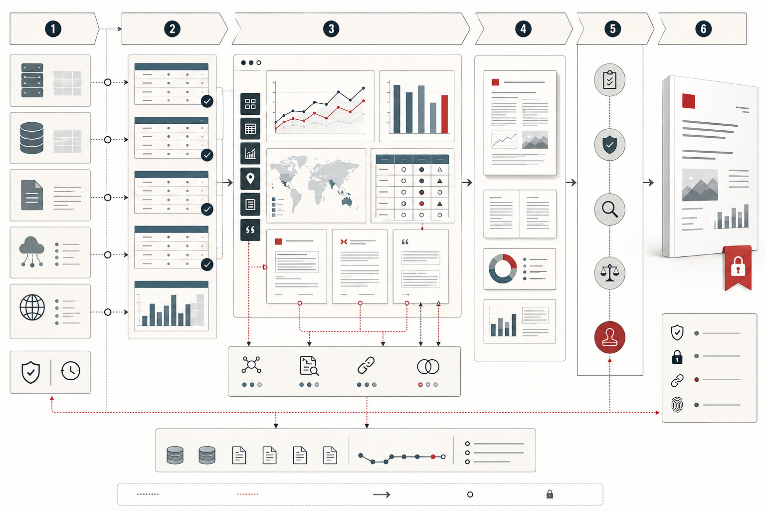
This article builds on the themes developed in Data Visualization and Analytical Communication, Interactive Dashboards and Data Storytelling, Descriptive Analytics and Data Exploration, Reproducible Analytics and Versioned Data Workflows, Metadata, Data Catalogs, and Lineage, and Data Governance and Stewardship. If visualization helps readers see patterns, and reproducible workflows preserve the link between computation and output, analytical reporting provides the larger documentary architecture through which evidence becomes interpretable, reviewable, and institutionally durable.
Reporting as evidence architecture
The strongest way to understand analytical reporting is as evidence architecture. A report is not simply a formatted document or a delivery vehicle for findings. It is a designed structure that organizes claims, support, context, uncertainty, methods, review, and institutional memory. It determines how readers encounter evidence, what they notice first, what they can verify, what they are likely to miss, and how easily they can reconstruct the reasoning path behind a conclusion.
This matters because evidence does not become self-explanatory merely by being accurate. A regression output, chart, statistical table, dashboard export, or metric card may be technically correct and still fail as communication if the reader cannot determine what question it answers, what population it covers, what comparison matters, which assumptions constrain interpretation, or why the finding is decision-relevant. Information design supplies the visual, textual, and structural discipline that allows evidence to become readable. Analytical reporting supplies the institutional form that makes evidence durable enough to circulate, be challenged, and be reused.
At a deeper level, reporting is one of the places where analysis becomes social. Models, summaries, and charts are produced by analysts, engineers, scientists, researchers, or domain teams, but reports are consumed by people with different goals, different expertise, different responsibilities, and different levels of time. A well-designed report therefore performs translation without sacrificing traceability. It makes the main point recoverable for the fast reader while preserving enough methodological and evidentiary depth for the careful reviewer.
What information design and analytical reporting mean
Information design is the deliberate organization of content so that people can find, compare, and interpret what matters with minimal unnecessary effort. It concerns hierarchy, sequence, grouping, emphasis, labeling, visual form, captioning, document structure, navigation, comparison, and cognitive load. In analytical contexts, information design helps readers distinguish claim from support, pattern from noise, summary from detail, and qualification from conclusion.
Analytical reporting is the communication of findings from data, models, monitoring systems, research, or investigation through structured artifacts that integrate prose, visuals, tables, definitions, methods, context, uncertainty, and supporting evidence. A report may be a PDF, Word document, slide deck, web page, dashboard export, technical memo, policy brief, reproducible Quarto document, scientific article, or recurring operational review. The medium varies, but the core responsibility is the same: to help readers recover the right meaning from the evidence.
This distinction matters because a report is not simply a longer chart caption or a container for exported outputs. It is a designed environment for judgment. Its structure determines what counts as primary, what appears secondary, what qualifies the claim, what remains available for inspection, and how easily the logic can be checked. Information design concerns the architecture of that environment; analytical reporting concerns the use of that environment to communicate analytical meaning responsibly.
Why reporting structure matters
Reporting structure matters because readers do not encounter findings all at once. They move through a sequence: title, framing question, summary, main conclusion, supporting evidence, visual interpretation, qualifiers, methods, detail, and appendices. The order of that sequence strongly influences interpretation. If a report begins with methodological density before it establishes the problem, many readers lose the thread. If it begins with a strong claim unsupported by visible comparison or context, it risks overstatement. Good analytical reporting arranges information in the order that best supports sound judgment.
A technically correct report can still be communicatively weak. The issue is not only whether the right content exists, but whether the intended meaning can be recovered from the way the content is arranged. Information design reduces interpretive friction. It helps the reader understand what is primary, what is secondary, what is uncertain, and what can be verified if closer inspection is needed.
Structure is therefore not a cosmetic property. It is part of the epistemic force of the report itself. A badly structured report forces the reader to reconstruct logic from fragments. A well-structured report makes the reasoning path visible. In high-stakes settings, that visibility is not only a communication advantage. It is part of report integrity.
Report genres and distinct epistemic functions
Not all analytical reports serve the same purpose, and one of the strongest upgrades in analytical maturity comes from recognizing distinct report genres. An executive brief, a technical report, a policy memo, an audit report, a scientific article, and an operational status review all treat evidence differently because they answer different institutional questions.
An executive brief is usually oriented toward fast orientation, prioritization, and decision relevance. It needs strong summarization, clear hierarchy, restrained jargon, and immediate statement of what matters now. A technical report is usually oriented toward scrutiny, reproducibility, and methodological sufficiency. It needs traceable assumptions, transparent methods, definitions, diagnostics, and denser evidentiary support. A policy memo often centers alternatives, tradeoffs, feasibility, uncertainty, and consequences. An audit or assurance report prioritizes traceability, standards, exceptions, review status, and defensible documentation. A scientific article often follows a formal structure in which methods, results, and discussion are separated to support evaluation and replication. An operational status report usually foregrounds current state, variance from expectation, incidents, and immediate next actions.
These are not merely stylistic differences. They are distinct epistemic forms. They organize evidence differently because they are meant to be used differently. True reporting skill requires recognizing which form the problem calls for and resisting the temptation to use one format for every purpose.
| Report genre | Primary function | Design emphasis |
|---|---|---|
| Executive brief | Orient leadership toward a decision or priority | Summary, implications, comparison, and decision relevance |
| Technical report | Support scrutiny, reproducibility, and review | Methods, diagnostics, definitions, assumptions, and evidence depth |
| Policy memo | Compare options under constraints and uncertainty | Tradeoffs, feasibility, distributional effects, and consequences |
| Audit or assurance report | Preserve defensible evidence and compliance review | Traceability, exceptions, standards, review findings, and documentation |
| Scientific report | Present research for evaluation and replication | Methods, results, uncertainty, citations, and limitations |
| Operational status report | Monitor current state against expectations | Status, variance, incidents, thresholds, and next actions |
Purpose, audience, and use context
Reporting quality depends on whether the structure fits the purpose. A report intended for periodic monitoring should not be designed like a persuasive narrative memo. A public-facing explainer should not assume the same prior knowledge as an internal research note. A document meant to preserve an audit trail should not sacrifice traceability for rhetorical smoothness. Audience and use context determine the reporting burden.
The less shared context the audience has, the more the report must provide definitions, baselines, framing, and interpretive cues. The more technically sophisticated the audience, the more the report may need to expose assumptions, diagnostics, methods, and exact measures. Mixed audiences create the greatest design challenge because they require layered communication: enough clarity for non-specialists, enough depth for experts, and enough structure that each reader can find the level they need without losing the main logic.
Use context matters equally. A report read once in a leadership meeting, circulated in email, archived for later review, used as a compliance record, or cited as a policy justification places different demands on document design. Good reporting begins by asking not only who will read the document, but what they must be able to do with it after reading. Do they need to decide, verify, monitor, explain, reproduce, contest, audit, or remember? Each use implies a different reporting architecture.
Document architecture and reader pathways
Strong reports have document architecture: a coherent structure that supports different reader pathways without breaking the evidentiary logic of the work. An executive may read only the summary, highlighted figures, and conclusion. A technical reviewer may move directly to methods, assumptions, and appendix tables. A stakeholder may read only the section tied to their function. An auditor may follow the trail from claim to source to method to review record. Information design succeeds when each of these readers can navigate effectively without being forced through unnecessary material and without losing the meaning of the main findings.
This is one reason analytical reporting should be understood as interface design for documents. The reader is navigating an evidence environment. Titles, section heads, summaries, captions, tables, charts, sidebars, appendices, links, cross-references, and version notes all shape that navigation. Good reports do not assume one single linear reading path. They provide layered entry points while preserving one coherent logic of support beneath them all.
This layered architecture is especially important in complex organizations, where one report may need to satisfy leaders, analysts, auditors, collaborators, public stakeholders, and future readers simultaneously. A weak report treats these needs as incompatible. A strong report organizes the document so that different readers can descend to different depths while staying anchored in the same core findings.
Hierarchy, layout, and reading order
Good reports create a visible hierarchy. Titles, headings, subheadings, callouts, captions, tables, figures, and summary boxes should not all compete at the same level of attention. The reader should be able to tell what the main message is, what evidence supports it, and where to go for detail. Layout shapes reading order in much the same way dashboard hierarchy shapes scanning behavior: it directs attention and defines priority.
A badly arranged report forces the reader to assemble the logic themselves from scattered pieces. A well-arranged report reduces that burden by placing summary before detail, support near the claims it qualifies, and methods where they can clarify meaning without blocking comprehension. Reading order is therefore not just a page-design concern. It is part of analytical legibility.
Hierarchy also has a rhetorical function. What is large, early, bolded, boxed, or highlighted will feel important. What is buried, footnoted, or appended will feel secondary. Good reporting uses that rhetorical power responsibly. It aligns emphasis with evidentiary weight rather than with institutional preference, decorative instinct, or a desire to make weak evidence appear stronger than it is.
Headlines, executive summaries, and evidentiary flow
Analytical reporting often succeeds or fails at the level of summary. A good title or executive summary does not merely rephrase the report topic. It states the main analytical takeaway in a way that prepares the reader for the support that follows. But summaries must remain disciplined. They should not imply broader scope, stronger certainty, clearer causality, or greater precision than the body can justify.
This is where evidentiary flow becomes central. A report should move from question to answer to support to qualification in a way that preserves coherence. Readers should not have to guess why a table appears, what a chart is proving, or how a methodological note changes the meaning of the headline. Strong reporting makes the logic of support visible, not merely the presence of content.
In advanced analytical and institutional reporting alike, summary design is an ethical act. The report’s opening claims frame what the rest of the evidence will be taken to mean. When summaries are too forceful relative to the evidence, the entire document becomes rhetorically inflated even if every number inside it is technically correct.
Evidence hierarchy and traceability
A mature report makes its evidence hierarchy visible. That usually means distinguishing among headline claim, primary support, secondary support, methodological explanation, and archival detail. Not every chart, paragraph, or table carries equal argumentative weight. Good analytical reporting helps the reader see which pieces are decisive, which are contextual, and which are present for completeness.
Traceability matters for the same reason. A reader should be able to move from a reported conclusion to the supporting chart or table, from that chart or table to the source definition or method, and from there to the assumptions or data treatment that qualify the result. When reports lack traceability, confidence becomes unearned because the path from claim to support is obscured.
This is especially important in governance, audit, policy, scientific, and high-stakes decision settings. A report is stronger when it is not only persuasive on first read, but also inspectable on second read. Traceability is what makes analytical communication durable under challenge. It is also what allows a report to function as institutional memory rather than as a polished but disposable presentation.
A mathematical lens for report integrity
Information design and analytical reporting can also be evaluated through a mathematical lens. The purpose is not to pretend that report quality can be reduced to one number, but to make the dimensions of reporting integrity explicit. A report is stronger when its structure supports reader pathways, its claims are traceable to evidence, its visuals and tables fit their purpose, uncertainty is placed near the claims it qualifies, methods are sufficient, review is complete, and outputs are versioned.
R_i = w_S S_i + w_T T_i + w_V V_i + w_U U_i + w_M M_i + w_Q Q_i + w_O O_i
\]
Interpretation: Report integrity \(R_i\) for report \(i\) can be modeled as a weighted combination of structure \(S_i\), evidence traceability \(T_i\), visual/table fit \(V_i\), uncertainty placement \(U_i\), methods sufficiency \(M_i\), review quality \(Q_i\), and output control \(O_i\).
The weights should be explicit:
w_S + w_T + w_V + w_U + w_M + w_Q + w_O = 1
\]
Interpretation: The scoring model should reveal what the report is optimizing for. An executive brief may weight structure and visual fit heavily; a technical report may weight traceability and methods sufficiency more heavily; an audit report may weight review status and output control heavily.
Evidence traceability can be modeled at the claim level:
T_i = \frac{1}{n}\sum_{j=1}^{n} E_{ij}
\]
Interpretation: Traceability \(T_i\) is the average traceability of report claims. Each claim \(j\) should connect to visible support \(E_{ij}\), such as a table, chart, method note, source definition, appendix, reproducible workflow, or reviewed data asset.
Uncertainty placement can be evaluated as a design condition:
U_i = \frac{1}{k}\sum_{r=1}^{k} P_{ir} C_{ir}
\]
Interpretation: Uncertainty quality \(U_i\) depends on whether each uncertainty statement \(r\) is placed near the claim it qualifies \(P_{ir}\) and whether the statement is clear enough to change interpretation \(C_{ir}\). Caveats buried in appendices may technically exist but still fail the reader.
Finally, report risk can be represented as the gap between report importance and report integrity:
H_i = K_i(1 – R_i)
\]
Interpretation: Report risk \(H_i\) rises when a report is consequential \(K_i\) but has weak integrity \(R_i\). A low-stakes exploratory note and a board report should not be held to the same control standard.
This mathematical lens helps shift reporting review from taste-based critique to accountable design review. The question becomes: which claims are unsupported, which caveats are misplaced, which visuals are mismatched to their purpose, which methods are insufficient, and which outputs are not versioned or archived?
Python Workflow: Report Integrity Scorecard
The following Python workflow shows how a reporting process can evaluate structure, evidence traceability, visual/table fit, uncertainty placement, methods sufficiency, review status, output versioning, and reader-pathway coverage. In production, these inputs might come from a reporting inventory, data catalog, workflow engine, review system, reproducible document pipeline, and publication archive.
#!/usr/bin/env python3
"""
Python Workflow: Report Integrity Scorecard

This compact workflow evaluates analytical reports as evidence-bearing
artifacts rather than as simple presentation files.
"""

from __future__ import annotations

from dataclasses import dataclass


@dataclass
class ReportSignals:
    structure_score: float
    evidence_traceability: float
    visual_table_fit: float
    uncertainty_placement: float
    methods_sufficiency: float
    review_score: float
    output_control: float
    reader_pathway_score: float


def report_integrity_score(signals: ReportSignals) -> float:
    return round(
        0.15 * signals.structure_score
        + 0.20 * signals.evidence_traceability
        + 0.15 * signals.visual_table_fit
        + 0.12 * signals.uncertainty_placement
        + 0.13 * signals.methods_sufficiency
        + 0.10 * signals.review_score
        + 0.10 * signals.output_control
        + 0.05 * signals.reader_pathway_score,
        3,
    )


def report_integrity_gap(signals: ReportSignals) -> float:
    return round(1.0 - report_integrity_score(signals), 3)


def main() -> None:
    examples = {
        "quarterly_revenue_integrity_brief": ReportSignals(
            structure_score=1.0,
            evidence_traceability=1.0,
            visual_table_fit=0.95,
            uncertainty_placement=0.95,
            methods_sufficiency=0.85,
            review_score=1.0,
            output_control=1.0,
            reader_pathway_score=1.0,
        ),
        "supplier_risk_policy_memo": ReportSignals(
            structure_score=0.85,
            evidence_traceability=0.70,
            visual_table_fit=0.75,
            uncertainty_placement=0.80,
            methods_sufficiency=0.70,
            review_score=0.65,
            output_control=0.50,
            reader_pathway_score=1.0,
        ),
        "legacy_kpi_retrospective_report": ReportSignals(
            structure_score=0.45,
            evidence_traceability=0.40,
            visual_table_fit=0.30,
            uncertainty_placement=0.25,
            methods_sufficiency=0.35,
            review_score=0.20,
            output_control=0.00,
            reader_pathway_score=0.50,
        ),
    }

    for report_id, signals in examples.items():
        print(
            report_id,
            "report_integrity_score=",
            report_integrity_score(signals),
            "report_integrity_gap=",
            report_integrity_gap(signals),
        )


if __name__ == "__main__":
    main()
This workflow separates polish from integrity. A report may look professional while still lacking traceable claims, adequate methods, properly placed caveats, strong captions, reviewed evidence, or versioned outputs. Scoring does not replace editorial judgment, but it makes the basis of judgment visible.
R Workflow: Report Genre, Section, Evidence, Visual, Uncertainty, and Review Summary
The following R workflow summarizes report genres, section types, evidence claims, traceability links, visual elements, uncertainty statements, review checkpoints, and output controls. It supports a recurring reporting integrity review: which reports are approved, which claims are traceable, which visuals carry design risk, where uncertainty is placed, and which outputs are versioned and archived?
#!/usr/bin/env Rscript

# R Workflow: Report Genre, Section, Evidence, Visual, Uncertainty, and Review Summary
#
# This workflow summarizes analytical reporting integrity using base R.

reports <- data.frame(
  report_id = c("rep001", "rep002", "rep003", "rep004", "rep005"),
  report_genre = c(
    "executive_brief",
    "technical_report",
    "policy_memo",
    "operational_status",
    "audit_record"
  ),
  status = c("approved", "in_review", "in_review", "approved", "needs_revision"),
  publication_format = c("pdf", "html", "docx", "dashboard_pdf", "pdf"),
  stringsAsFactors = FALSE
)

sections <- data.frame(
  section_id = c("sec001", "sec002", "sec003", "sec004", "sec005"),
  section_type = c("executive_summary", "key_findings", "limitations", "methods", "results"),
  reader_pathway = c("executive", "executive", "executive", "technical", "technical"),
  stringsAsFactors = FALSE
)

claims <- data.frame(
  claim_id = c("claim001", "claim002", "claim003", "claim004", "claim005"),
  claim_type = c("descriptive", "limitation", "technical_result", "policy_tradeoff", "status"),
  claim_strength = c("high", "medium", "medium", "medium", "high"),
  uncertainty_level = c("low", "medium", "medium", "medium", "low"),
  stringsAsFactors = FALSE
)

evidence_links <- data.frame(
  link_id = c("evl001", "evl002", "evl003", "evl004", "evl005"),
  traceability_status = c("complete", "complete", "complete", "partial", "complete"),
  review_status = c("approved", "approved", "in_review", "in_review", "approved"),
  stringsAsFactors = FALSE
)

visuals <- data.frame(
  visual_id = c("vis001", "vis002", "vis003", "vis004", "vis005"),
  visual_type = c("table", "line_chart", "bar_chart", "matrix", "line_chart"),
  purpose = c("exact_lookup", "trend", "comparison", "tradeoff_comparison", "monitoring"),
  caption_quality = c("approved", "approved", "in_review", "in_review", "approved"),
  design_risk = c("low", "low", "medium", "medium", "low"),
  stringsAsFactors = FALSE
)

uncertainty <- data.frame(
  uncertainty_id = c("unc001", "unc002", "unc003", "unc004"),
  uncertainty_type = c(
    "late_adjustment_window",
    "source_system_completeness",
    "scenario_assumption",
    "instrumentation_recovery_window"
  ),
  placement = c("main_body", "main_body", "main_body", "caption"),
  near_claim = c(TRUE, TRUE, TRUE, TRUE),
  statement_quality = c("approved", "in_review", "in_review", "approved"),
  stringsAsFactors = FALSE
)

reviews <- data.frame(
  review_id = c("rev001", "rev002", "rev003", "rev004"),
  review_type = c(
    "analytical_review",
    "executive_readability_review",
    "technical_reproducibility_review",
    "policy_review"
  ),
  status = c("approved", "approved", "in_review", "in_review"),
  stringsAsFactors = FALSE
)

outputs <- data.frame(
  output_id = c("out001", "out002", "out003", "out004"),
  output_format = c("pdf", "html", "docx", "dashboard_pdf"),
  versioned = c(TRUE, TRUE, TRUE, TRUE),
  archived = c(TRUE, FALSE, FALSE, TRUE),
  hash_recorded = c(TRUE, TRUE, FALSE, TRUE),
  stringsAsFactors = FALSE
)

genre_summary <- aggregate(
  report_id ~ report_genre + status + publication_format,
  data = reports,
  FUN = length
)
names(genre_summary) <- c("report_genre", "status", "publication_format", "report_count")

section_summary <- aggregate(
  section_id ~ section_type + reader_pathway,
  data = sections,
  FUN = length
)
names(section_summary) <- c("section_type", "reader_pathway", "section_count")

claim_summary <- aggregate(
  claim_id ~ claim_type + claim_strength + uncertainty_level,
  data = claims,
  FUN = length
)
names(claim_summary) <- c("claim_type", "claim_strength", "uncertainty_level", "claim_count")

traceability_summary <- aggregate(
  link_id ~ traceability_status + review_status,
  data = evidence_links,
  FUN = length
)
names(traceability_summary) <- c("traceability_status", "review_status", "link_count")

visual_summary <- aggregate(
  visual_id ~ visual_type + purpose + caption_quality + design_risk,
  data = visuals,
  FUN = length
)
names(visual_summary) <- c("visual_type", "purpose", "caption_quality", "design_risk", "visual_count")

uncertainty_summary <- aggregate(
  uncertainty_id ~ uncertainty_type + placement + near_claim + statement_quality,
  data = uncertainty,
  FUN = length
)
names(uncertainty_summary) <- c(
  "uncertainty_type",
  "placement",
  "near_claim",
  "statement_quality",
  "uncertainty_count"
)

review_summary <- aggregate(
  review_id ~ review_type + status,
  data = reviews,
  FUN = length
)
names(review_summary) <- c("review_type", "status", "review_count")

output_summary <- aggregate(
  output_id ~ output_format + versioned + archived + hash_recorded,
  data = outputs,
  FUN = length
)
names(output_summary) <- c("output_format", "versioned", "archived", "hash_recorded", "output_count")

dir.create("outputs", showWarnings = FALSE, recursive = TRUE)

write.csv(genre_summary, "outputs/report_genre_summary_r.csv", row.names = FALSE)
write.csv(section_summary, "outputs/report_section_summary_r.csv", row.names = FALSE)
write.csv(claim_summary, "outputs/evidence_claim_summary_r.csv", row.names = FALSE)
write.csv(traceability_summary, "outputs/evidence_traceability_summary_r.csv", row.names = FALSE)
write.csv(visual_summary, "outputs/visual_element_summary_r.csv", row.names = FALSE)
write.csv(uncertainty_summary, "outputs/uncertainty_summary_r.csv", row.names = FALSE)
write.csv(review_summary, "outputs/review_summary_r.csv", row.names = FALSE)
write.csv(output_summary, "outputs/report_output_summary_r.csv", row.names = FALSE)

cat("Wrote report genre, section, evidence, visual, uncertainty, and review summaries.\n")
This workflow treats the report as an auditable object. It does not only ask whether a report exists. It asks whether the report genre fits the use case, whether claims have support, whether visuals are doing the right work, whether uncertainty is placed responsibly, and whether the final output is controlled.
Tables, charts, and the division of labor
Tables and charts do different work, and strong reports use each for the right purpose. Charts are often superior for pattern detection, trend, comparison, distribution, ranking, and relationship. Tables are often superior for lookup, exact values, audit detail, and dense cross-reference. A report should not default to pages of raw tables when the reader needs pattern, nor to decorative charts when the reader needs precise values.
Good information design therefore assigns labor appropriately: charts reveal pattern, tables preserve exactness, and prose explains meaning. When these roles are clear, the document becomes easier to read and harder to misinterpret. When they are confused, the reader either misses the pattern or cannot verify the detail.
This division of labor also helps reports scale. High-level sections can rely more on visuals, summaries, and interpretive prose, while appendices and technical sections can carry more tables, diagnostics, and exact specifications without overloading the main narrative. The strongest reporting does not ask one device to do every job.
Context, baselines, and comparative meaning
A common reporting failure is the presentation of naked numbers: results without baseline, denominator, prior period, target, comparator, distribution, uncertainty, or historical range. A metric is rarely meaningful in isolation. Is it improving or deteriorating? Relative to what? Is it within expectation, outside tolerance, or merely fluctuating normally? Does it differ materially across groups? Is the current value large because the numerator changed, because the denominator changed, or because the population definition shifted?
Analytical reporting becomes stronger when every important quantity appears within a frame of comparison. Context is not embellishment. It is part of what makes the number interpretable in the first place. Baselines, benchmarks, temporal reference points, targets, peer comparisons, and distributional context convert quantities into evidence.
This is particularly important when reports are read quickly. In fast organizational settings, many readers will not infer the missing comparison on their own. The report must provide it if the quantity is meant to guide judgment. A number without context may create confidence, but it rarely creates understanding.
Reporting uncertainty, limits, and qualifiers
Strong reporting does not only communicate findings; it communicates limits. Confidence intervals, scenario ranges, sample restrictions, missing-data concerns, methodological assumptions, data-quality caveats, temporal windows, model limitations, and known sources of instability all change how a result should be read. A report is weaker when these qualifiers are technically present but structurally marginalized.
Many reports overstate certainty not by falsifying numbers, but by hiding the conditions that constrain interpretation. A summary may sound more definitive than the evidence justifies simply because uncertainty sits in an appendix, a footnote, or a technical supplement instead of near the claim it modifies. This is a design failure as much as an analytical failure.
Honest reporting integrates limitations into the architecture of the report. It puts uncertainty where it can shape meaning, not where it can be ignored without friction. The goal is not to weaken every claim with excessive caution, but to align confidence with evidence. A trustworthy report makes warranted reading easier than unwarranted reading.
Methods placement, technical detail, and appendix strategy
One of the hardest reporting decisions is where to place methods, diagnostics, and technical detail. Too much methodological density in the main narrative can obscure the findings. Too little methodological transparency can make the report untrustworthy. Good reporting solves this through layered disclosure.
The main body should usually contain enough method to let the reader understand what kind of claim is being made and how cautiously it should be read. More exact specification, diagnostics, sensitivity analyses, definitions, formulas, source notes, query logic, model assumptions, and supplemental tables can then move into appendices or technical annexes. This keeps the main narrative readable without severing it from methodological accountability.
Appendix strategy is therefore not an afterthought. It is part of information design. It determines how the document balances readability with traceability, persuasion with reproducibility, and audience breadth with technical sufficiency. A strong appendix is not a dumping ground. It is a structured support layer for readers who need to inspect the evidence more closely.
Static reports, dashboards, interactive displays, and reproducible documents
Not every analytical result should become the same kind of artifact. Some findings belong in static reports because they need stable argument, citation, review, and archival durability. Some belong in dashboards because they require recurring monitoring and quick comparison. Some belong in interactive displays because they invite exploratory slicing, filtering, or detail-on-demand. Some belong in reproducible documents because trust depends on keeping prose, code, and output tightly linked.
This is one of the major advantages of modern reproducible reporting systems such as Quarto and related literate-programming workflows: the same underlying analytical work can be rendered into HTML pages, PDFs, Word files, presentations, dashboards, books, or websites while preserving the connection among code, prose, and results. That means reporting is not only a design problem, but a workflow problem. A report is stronger when the path from computation to communication is stable and inspectable.
Platform choice should therefore follow reporting purpose rather than habit. A recurring operational need should not automatically become a PDF. A high-stakes formal record should not automatically become an ephemeral dashboard. A technical validation report should not be reduced to a slide deck if the methods and diagnostics need to be preserved. Strong reporting asks what platform best supports the intended use.
Reports as institutional memory, governance, and decision records
Reports do more than communicate current findings. In many organizations they become institutional memory. They preserve not only outcomes, but reasoning paths, caveats, assumptions, definitions, comparisons, and review decisions that later readers may need in order to understand why a past decision was made. In this sense, reports are not only communication artifacts. They are governance artifacts.
This is especially clear in policy, operations, compliance, audit, science, public administration, and research settings. A report may later serve as a decision record, audit trail, handoff mechanism, precedent, dispute-resolution artifact, or source of institutional learning. That institutional function changes how the document should be designed. Traceability, version clarity, definitional precision, explicit caveats, and review status become more important when the report will outlive the immediate moment of presentation.
The best analytical reports are therefore not only readable now. They remain interpretable later, when context has eroded and organizational memory has thinned. A future reader should be able to understand not only what the report concluded, but how it arrived there and what limits shaped the conclusion.
Failure modes in analytical reporting
Analytical reporting fails in recognizable ways. Reports can be too dense, too thin, too decorative, too jargon-heavy, poorly ordered, context-starved, or overloaded with visuals that do not support the main claim. More pages, more tables, and more charts do not automatically mean more clarity. Excess can actively reduce understanding.
Another common failure is evidentiary misalignment. The report headline says one thing, but the support beneath it is indirect, partial, or unqualified. Or the methods section contains assumptions that materially alter the meaning of the result but are too detached from the main narrative to influence how readers interpret the headline. These are not merely writing flaws. They are failures of analytical integrity because they distort how evidence is received.
A third failure mode is false completeness: the report looks polished and definitive, but key caveats, missing-data issues, uncertainty, alternative interpretations, or methodological limits are absent. In such cases, design outruns evidence.
A fourth failure mode is visual decoration: charts, icons, colors, or layouts are used to create the feeling of sophistication without improving comparison, explanation, or verification. A fifth is appendix burial, where crucial limitations technically exist but are placed where most readers will not encounter them. A sixth is version ambiguity, where reports circulate without clear versioning, review status, or archival control. A seventh is orphaned reporting, where a report survives after its source definitions, data pipelines, or assumptions have changed.
These failures show that reporting quality is not only a matter of style. It is a matter of evidence governance.
Reporting in the analytical workflow
Reporting belongs throughout the analytical workflow, not just at the end. Working summaries, exploratory notes, reproducible notebooks, executive briefs, technical reports, slide decks, dashboards, and archived appendices all play different roles at different stages. Communication evolves alongside analysis rather than being bolted on after the fact.
This matters because analytical understanding is often sharpened by the act of reporting. When an analyst must explain a result clearly, gaps in logic, weak support, ambiguous definitions, missing comparisons, and hidden assumptions become easier to see. Reporting is therefore not only a delivery mechanism. It is part of how analytical rigor is tested and stabilized.
In mature workflows, reporting also becomes a bridge between discovery and institutional action. It is how findings move from individual analysis into shared decision space. It is also how analysis becomes reusable: a later team can understand what was done, what was concluded, what remained uncertain, and where the evidence lives.
Ethics of emphasis, trust, and report integrity
Trustworthy reporting requires more than correct calculations. Readers need to know what data was used, what period is covered, what definitions apply, what assumptions matter, what comparisons are relevant, and where uncertainty enters. They also need a report whose rhetorical force is proportionate to its evidentiary strength.
This is where the ethics of emphasis become central. Titles, summaries, callouts, section headers, highlighted charts, executive bullets, color choices, and figure order all amplify some parts of the report more than others. That amplification can guide comprehension legitimately, but it can also overstate certainty, widen scope, imply causality, or minimize inconvenient caveats. In analytical reporting, honesty is partly a matter of sequence, tone, and emphasis—not only numerical correctness.
A trustworthy report is one that makes warranted reading easier than unwarranted reading. That is as much a design achievement as a statistical one. The strongest reports do not merely persuade; they allow themselves to be inspected.
Applications across domains
Information design and analytical reporting matter across nearly every domain that relies on evidence. In business, they shape executive briefs, KPI summaries, market analyses, board reports, performance reviews, and analytical memos. In science, they structure research articles, technical reports, supplementary materials, reproducible documents, and data-release notes. In policy, they shape evidence reviews, options memos, public reports, budget justifications, and legislative analysis. In operations, they shape status reporting, incident analysis, quality reviews, supply-chain monitoring, and recurring decision reviews. In governance, they shape audit records, compliance reports, risk assessments, access reviews, and stewardship documentation.
Across all these domains, the central question is the same: does the report help the intended audience recover the right meaning from the evidence, with the right level of detail, context, caution, and traceability? If it does, reporting becomes part of analytical infrastructure. If it does not, reporting becomes a source of noise, confusion, or institutional overconfidence.
Implementation principles for high-integrity reporting
Start with the report genre. Decide whether the artifact is an executive brief, technical report, policy memo, audit record, scientific report, operational review, or dashboard export. The genre determines the evidence burden.
Place the main claim early, but proportionately. The reader should understand the takeaway quickly, but the summary should not exceed the strength of the evidence.
Build a visible evidence hierarchy. Distinguish headline claims, primary support, secondary support, methods, appendices, and archival detail.
Put uncertainty near the claim it qualifies. Important caveats should not be hidden where they cannot shape interpretation.
Use charts, tables, and prose for different jobs. Charts reveal pattern. Tables preserve exactness. Prose interprets meaning and consequence.
Preserve traceability. Claims should connect to evidence, evidence to source assets, source assets to definitions, and methods to assumptions or reproducible workflows.
Design for multiple readers without losing one logic. Executives, analysts, auditors, and future readers may need different depths, but they should remain anchored in the same evidentiary structure.
Version and archive consequential reports. Reports that support decisions, audit, policy, governance, or public communication should be versioned, reviewed, archived, and linked to their source context.
Treat reporting as part of analysis. Reporting should help expose weak logic, not merely decorate finished conclusions.
| Control | Purpose | Failure it prevents |
|---|---|---|
| Report genre classification | Matches structure to use context | Using one format for every analytical purpose |
| Evidence hierarchy | Distinguishes claim, support, methods, and appendix detail | Reports where readers cannot tell what evidence matters most |
| Claim-to-evidence traceability | Links conclusions to charts, tables, methods, and source definitions | Persuasive but unsupported reporting |
| Uncertainty placement | Places limitations near the claims they qualify | Caveats that technically exist but do not affect interpretation |
| Visual/table fit review | Ensures charts, tables, and prose perform distinct roles | Decorative visuals and unreadable table dumps |
| Methods and appendix strategy | Balances readability with technical sufficiency | Main narratives that are either overloaded or unverifiable |
| Review checkpoints | Records analytical, editorial, technical, and governance review | Unreviewed reports becoming institutional evidence |
| Versioned output control | Preserves final artifacts, hashes, formats, and archive locations | Ambiguous circulating versions and lost decision records |
GitHub Repository
This article can be paired with a companion code workflow that models analytical reporting as report integrity infrastructure. The example includes report inventories, section architecture, evidence claims, claim-to-evidence links, visual-element review, uncertainty statements, methods and appendices, review checkpoints, versioned outputs, reader personas, SQL schemas, scorecard scripts, typed contracts, Quarto report templates, governance checklists, and multi-language examples across Python, R, Julia, SQL, Go, Rust, C, C++, TypeScript, and Terraform placeholders.
Conclusion
Information design and analytical reporting are central to trustworthy data systems because analysis only becomes institutionally useful when evidence is structured for interpretation, scrutiny, memory, and responsible use. Information design shapes the reader’s path through evidence. Analytical reporting gives that evidence a durable form through which it can support decisions, reviews, audits, debates, and future learning.
The deeper point is that reporting is not downstream decoration. It is part of the analytical system itself. A report can preserve reasoning or obscure it, clarify uncertainty or bury it, support accountability or manufacture confidence. High-integrity reporting connects claims to evidence, evidence to methods, methods to assumptions, and outputs to versioned records. It makes the right interpretation easier than the wrong one. In data-intensive organizations, that is not merely a communication skill. It is a condition of responsible analytical practice.
Related articles
- Data Systems and Analytics knowledge series
- Data Visualization and Analytical Communication
- Interactive Dashboards and Data Storytelling
- Descriptive Analytics and Data Exploration
- Reproducible Analytics and Versioned Data Workflows
- Metadata, Data Catalogs, and Lineage
- Data Governance and Stewardship
Further reading
- Cairo, A. (2016) The Truthful Art: Data, Charts, and Maps for Communication. Berkeley: New Riders.
- Cleveland, W.S. (1994) The Elements of Graphing Data. Revised edn. Summit, NJ: Hobart Press.
- Few, S. (2012) Show Me the Numbers: Designing Tables and Graphs to Enlighten. 2nd edn. Burlingame, CA: Analytics Press.
- Few, S. (2013) Information Dashboard Design: Displaying Data for At-a-Glance Monitoring. 2nd edn. Burlingame, CA: Analytics Press.
- Tufte, E.R. (2001) The Visual Display of Quantitative Information. 2nd edn. Cheshire, CT: Graphics Press.
- Wilke, C.O. (2019) Fundamentals of Data Visualization. Sebastopol, CA: O’Reilly Media.
- Wickham, H., Çetinkaya-Rundel, M. and Grolemund, G. (2023) R for Data Science. 2nd edn. Sebastopol, CA: O’Reilly Media.
References
- Cairo, A. (2016) The Truthful Art: Data, Charts, and Maps for Communication. Berkeley: New Riders.
- Cleveland, W.S. (1994) The Elements of Graphing Data. Revised edn. Summit, NJ: Hobart Press.
- Few, S. (2005) Effectively Communicating Numbers: Selecting the Best Means of Display. Available at: https://www.perceptualedge.com/articles/Whitepapers/Communicating_Numbers.pdf
- Few, S. (2008) Statistical Narrative. Available at: https://www.perceptualedge.com/articles/visual_business_intelligence/statistical_narrative.pdf
- Few, S. (2012) Show Me the Numbers: Designing Tables and Graphs to Enlighten. 2nd edn. Burlingame, CA: Analytics Press.
- Few, S. (2012) Use-Based Types of Quantitative Display. Available at: https://www.perceptualedge.com/articles/visual_business_intelligence/types_of_quantitative_display.pdf
- Few, S. (2014) Display Platforms for Quantitative Information. Available at: https://www.perceptualedge.com/articles/visual_business_intelligence/display_platforms_for_quantitative_information.pdf
- George Mason University Writing Center (n.d.) Scientific (IMRaD) Research Reports – Overview. Available at: https://writingcenter.gmu.edu/writing-resources/imrad/writing-an-imrad-report
- Gordon, K. (2021) Visual Hierarchy in UX: Definition. Nielsen Norman Group. Available at: https://www.nngroup.com/articles/visual-hierarchy-ux-definition/
- Budiu, R. (2020) 8 Design Guidelines for Complex Applications. Nielsen Norman Group. Available at: https://www.nngroup.com/articles/complex-application-design/
- Quarto (n.d.) Quarto: An Open-Source Scientific and Technical Publishing System. Available at: https://quarto.org/
- Tufte, E.R. (2001) The Visual Display of Quantitative Information. 2nd edn. Cheshire, CT: Graphics Press.
- Wickham, H., Çetinkaya-Rundel, M. and Grolemund, G. (2023) Communicate. In: R for Data Science. Available at: https://r4ds.hadley.nz/communicate.html
- Wickham, H., Çetinkaya-Rundel, M. and Grolemund, G. (2023) Quarto. In: R for Data Science. Available at: https://r4ds.hadley.nz/quarto.html
- Wickham, H., Çetinkaya-Rundel, M. and Grolemund, G. (2023) Quarto formats. In: R for Data Science. Available at: https://r4ds.hadley.nz/quarto-formats.html
- Wilke, C.O. (2019) Fundamentals of Data Visualization. Sebastopol, CA: O’Reilly Media.