
Last Updated May 11, 2026
Data visualization and analytical communication are the disciplines through which analytical findings become visible, interpretable, and usable by other people. A dataset may contain real structure, and a model may produce meaningful results, but until those patterns are rendered into forms that support comparison, interpretation, explanation, and responsible use, much of that value remains inaccessible. Visualization is the craft of making data perceptible. Analytical communication is the broader practice of presenting that perceptual structure through titles, labels, captions, annotations, reports, dashboards, narrative framing, and evidence-aware design so an audience can build a sound mental model of what the evidence actually shows.
This topic matters because insight is not self-transmitting. Even strong analysis can fail if its presentation obscures the signal, compresses away the relevant comparison, misleads through poor scaling, hides uncertainty, overloads the viewer with decorative complexity, or assumes more audience context than the audience actually has. Good visual communication reduces cognitive friction while preserving evidentiary discipline. It helps people see trend, variation, difference, distribution, uncertainty, relationship, and structure without smuggling in claims the data cannot support. A chart is never just a chart. It is a designed argument about what deserves to be seen, how comparison should happen, and what kind of interpretation is justified.
Main Library
Publications
Article Map
Data Systems & Analytics
Related Topic
Artificial Intelligence Systems
Related Topic
Institutions & Governance
Related Topic
Stewardship & Ethics
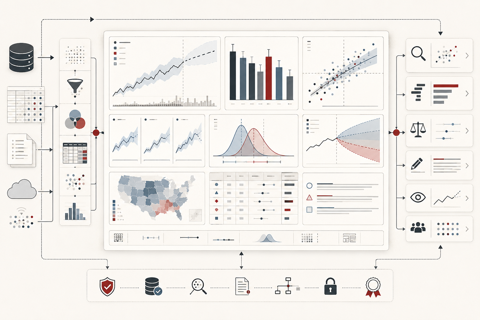
This article builds on the themes developed in Descriptive Analytics and Data Exploration, Model Evaluation and Performance Metrics, Statistical Modeling and Inference, Information Design and Analytical Reporting, Interactive Dashboards and Data Storytelling, Reproducible Analytics and Versioned Data Workflows, and Data Governance and Stewardship. If exploration helps analysts discover structure, and reporting helps evidence become durable, visualization is the perceptual and communicative layer through which evidence becomes visible enough to be reasoned about.
Visualization as visual reasoning
The strongest way to understand data visualization is as visual reasoning. A chart is not merely an image generated from data. It is a reasoning structure that allows a viewer to compare, locate, rank, group, distinguish, detect change, inspect uncertainty, and infer relationships. It turns numerical or categorical evidence into perceptual form so that the eye and mind can work together.
This matters because human judgment is strongly shaped by what visual form makes easy to perceive. Aligned length supports one kind of comparison. Position along a common scale supports another. Color supports grouping or emphasis, but can fail when used as the only signal. Area, angle, and volume can be visually striking while making precise comparison harder. Dense multivariate displays can reveal structure to expert readers but overwhelm non-specialist audiences. Visualization therefore always involves a design decision about what kind of reasoning the viewer should be able to perform.
Seen this way, visual communication is not downstream decoration. It is part of the epistemic infrastructure of analytics. It helps determine whether evidence can be inspected fairly, whether uncertainty can be seen, whether outliers can be noticed, whether comparisons are honest, whether claims are supported, and whether audiences can interpret the result without being misled by the form of display.
What data visualization and analytical communication mean
Data visualization is the construction of graphical forms that encode quantitative, categorical, spatial, temporal, relational, or distributional information so viewers can inspect patterns, compare values, identify variation, and interpret structure. Analytical communication is the broader practice of translating data, models, metrics, and findings into forms that another person can understand, question, and use. Visualization is often the most visible part of that process, but it is only one part. Analytical communication also includes titles, labels, legends, captions, annotations, source notes, narrative sequence, uncertainty framing, accessibility design, review status, and links to underlying evidence.
This distinction matters because a chart can be technically correct and still communicatively weak. A graphic may encode the right values yet fail to explain why the comparison matters, what the units mean, how uncertainty should be read, which denominator applies, what period is covered, or what limitations constrain the conclusion. Good analytical communication therefore does more than display data. It helps the audience interpret the data without overstepping the evidence.
Put differently, visualization concerns the form of evidence, while analytical communication concerns the use of that evidence in reasoning. A chart that is visually elegant but interpretively ambiguous has not yet completed the task. A chart becomes analytically useful when the viewer can recover the intended comparison, understand the relevant context, and see the limits of the claim.
Why visualization matters
Visualization matters because some structures are easier to see than to derive from tables or prose alone. Trends become visible when values are ordered along time. Dispersion becomes legible when values are plotted as distributions rather than collapsed into one average. Subgroup differences emerge when categories are aligned for comparison. Outliers, breaks, clusters, nonlinear patterns, heteroskedasticity, and changing variance often become apparent graphically before they are fully formalized statistically.
That is why visualization is central not only to presentation but also to analysis itself. A good chart can reveal that a relationship is curved rather than linear, that variability differs across groups, that a summary average hides multimodality, or that a model fits one region of the data better than another. In this sense, visualization is often a method of discovery before it becomes a method of explanation.
Visualization also matters because not all analytical audiences are prepared to reason directly from tables, equations, model coefficients, residual diagnostics, or dense statistical outputs. Visual form lowers the threshold for entry into evidence, but only when it is designed to clarify rather than impress. A clear graphic can make a complex pattern accessible without trivializing it. A poor graphic can make a simple pattern appear confusing or more certain than it is.
Visualization as analytical thinking
One of the most important mistakes in practice is to treat visualization as a cosmetic layer added after the “real” analysis is complete. In reality, visualization often participates directly in analytical reasoning. Visual inspection helps reveal anomalies, suggests transformations, clarifies subgroup structure, tests whether summaries are misleading, and provides informal model diagnostics. In exploratory work, a chart is not merely a display of findings. It is part of how findings are generated.
This is one reason plotting choices are intellectually consequential. To graph a variable as a time series rather than as an unordered set of points is to state that temporal order matters. To facet by subgroup is to state that pooled summaries may not be sufficient. To show distributions rather than only means is to insist that variation matters alongside central tendency. To include uncertainty bands is to remind the viewer that the estimate is not the same thing as certainty. Visualization is therefore not neutral. It embodies analytical priorities.
Good analysts often learn something from the act of drawing the chart that they did not fully know beforehand. A scatterplot may reveal curvature. A residual plot may reveal model misspecification. A faceted chart may reveal that the overall pattern is driven by one subgroup. A distribution plot may reveal that an average conceals two populations. That is precisely why visualization belongs inside the logic of inquiry rather than outside it.
Audience, context, and communicative burden
Analytical communication depends on audience. A chart for analysts may privilege diagnostic density, while a chart for decision-makers may require greater explanatory clarity, fewer simultaneous variables, and more explicit framing. A technical audience may tolerate compressed notation and indirect inference. A broader audience may need labels, annotations, comparisons to baselines, and clearer narrative cues.
This does not mean simplifying until substance disappears. It means designing the communication so the intended audience can recover the intended meaning without being forced to guess at the interpretive frame. Good communication preserves rigor while reducing ambiguity. It anticipates what the viewer does not already know and supplies enough scaffolding for the evidence to be read properly.
Context matters for the same reason. A visualization shown inside an exploratory notebook, dashboard, board presentation, policy memo, technical report, public article, academic paper, or operational monitoring interface may require different levels of detail, annotation, and surrounding prose. The chart itself is only one part of the communication environment. The more specialized the material, the more carefully the frame must be constructed.
Perception, encodings, and comparative accuracy
Visualization is constrained by perception. The problem is not only what can be drawn, but what viewers can compare accurately and with reasonable cognitive effort. Encodings based on aligned position along a common scale generally support more reliable comparison than encodings based on angle, area, volume, saturation, or decorative shape. This is one reason bar charts, dot plots, aligned line charts, and scatterplots often remain powerful despite their simplicity.
Choosing a visual encoding is therefore partly a matter of perceptual ergonomics. A visually elaborate display may feel impressive while making the relevant comparison harder rather than easier. Three-dimensional charts, exploded pie charts, pictorial icons, and overloaded color palettes may attract attention but weaken measurement judgment. Restraint is often analytically stronger because it preserves perceptual bandwidth for comparison.
Good analytical graphics usually begin with a simple question: what judgment does the viewer need to make? Compare magnitude? Assess trend? Inspect distribution? Locate outliers? Understand uncertainty? Identify a threshold breach? Evaluate a relationship? The encoding should serve that judgment directly. If the encoding makes that judgment harder, the design is working against the analysis.
| Encoding | Best suited for | Common risk |
|---|---|---|
| Position on common scale | Accurate comparison, trend, relationship, distribution | Can become dense if too many series are added |
| Length | Category comparison and magnitude ranking | Baseline distortion if bars do not start appropriately |
| Color hue | Grouping, classification, emphasis | Accessibility failure if used as the only signal |
| Color intensity | Heat maps, density, magnitude gradients | Can imply precision or order where interpretation is weak |
| Area | Approximate part-to-whole or spatial emphasis | Harder precise comparison than position or length |
| Angle | Simple part-to-whole relationships | Weak precision for comparing similar slices |
| Shape or icon | Category differentiation or symbolic labeling | Decorative clutter if overused |
Chart choice and analytical fit
Chart choice should follow analytical purpose rather than habit. Bar charts are useful for comparing discrete categories when aligned length is meaningful. Dot plots can be even cleaner when precise comparison matters and heavy bars would dominate the page. Line charts are useful for ordered sequences, especially time. Scatterplots reveal association, curvature, clustering, and influential outliers. Histograms, density plots, box plots, and violin plots reveal distributional form. Heat maps, small multiples, and faceting help reveal multidimensional or subgroup structure.
The important point is not that each chart type has one fixed meaning, but that some forms are better matched to some questions than others. A line chart can falsely imply continuity where categories are merely nominal. A pie chart can burden precise comparison. A gauge can consume space without showing trend, denominator, or distribution. A table may be better than a figure when exact lookup matters more than visual pattern. Good chart choice depends on the intended analytical reading, not on template convenience.
Analytical fit also includes scale, ordering, and granularity. A chart type may be technically appropriate in general but still wrong for the specific comparison being made if categories are sorted poorly, time resolution is too coarse, the axis range exaggerates noise, or the chart hides the denominator. A good visualization does not merely ask “what can I plot?” It asks “what does the viewer need to compare, and what design makes that comparison fair?”
Visualizing distributions, variation, and uncertainty
One of the most important functions of visualization is to make variation visible. Analytical communication fails when it presents only point estimates and hides the spread, instability, or uncertainty that qualifies them. Histograms, density plots, violin plots, box plots, error bars, interval plots, fan charts, calibration curves, and uncertainty bands all provide ways to show that an estimate or pattern is not the same thing as certainty.
This is especially important because many weak analytical graphics collapse uncertainty into silence. A line without intervals can imply precision that the data does not justify. A bar without variation can conceal heterogeneity. An average without distribution can mislead by hiding skew, multimodality, or extreme cases. Good analytical communication does not merely show what is typical. It shows how much instability or uncertainty surrounds the typical case.
Uncertainty visualization also requires restraint. Intervals, bands, and distributions should clarify risk, not confuse the graphic with unnecessary noise. The challenge is to preserve evidentiary honesty without sacrificing readability. The strongest uncertainty graphics do not merely add uncertainty as an afterthought. They integrate it into the core visual logic so the audience cannot accidentally read the estimate as more final than it really is.
Relationships, multivariate structure, and cognitive load
Visualization is especially powerful when the task is to reveal relationships rather than single values. Scatterplots can show association, curvature, clusters, subgroup structure, influential outliers, and changing variance. Conditional plots and faceting can reveal that an apparent overall relationship changes across categories. Pairwise displays, heat maps, linked views, and small multiples can make multivariate structure more tractable, although they also raise the cognitive burden on the reader.
This is one reason multivariate analytical communication requires careful design. Too little structure can flatten away important differences. Too much simultaneous structure can overwhelm the audience and destroy the comparison. A chart can technically contain more information than the reader can realistically process in one pass. Effective communication often depends on staging complexity: showing one important comparison first, then adding qualifiers, then surfacing deeper structure if the audience needs it.
Cognitive load is not a superficial design concern. It is part of whether the analysis can be understood. If the viewer must decode too many encodings, legends, scales, symbols, facets, annotations, and exceptions at once, attention shifts away from interpretation toward interface survival. Good visual communication protects attention for the analytical question.
Exploratory graphics vs. explanatory graphics
It is useful to distinguish between exploratory graphics and explanatory graphics. Exploratory graphics are built for discovery. They often tolerate more density, more variables, and more tentative structure because their audience is usually the analyst or research team. Explanatory graphics are built for communication. They typically require clearer emphasis, more annotation, stronger hierarchy, and tighter control over what the reader should notice first.
This distinction matters because the same graphic that is useful for exploration may be poor for communication. An analyst can tolerate ambiguity while searching for structure; an audience receiving conclusions cannot be expected to do that work unaided. Good analytical communication therefore often involves redesigning an exploratory view into a more focused explanatory one.
This is not a move from truth to simplification. It is a move from private analytical inspection to shared interpretive responsibility. The explanatory graphic should not hide important complexity, but it should organize the complexity so the reader can understand the claim, support, comparison, and limitation in the right order.
Dashboards, monitoring, and analytical interfaces
Dashboards occupy a special place in visualization because they are less like singular arguments and more like ongoing analytical interfaces. Their purpose is often to support monitoring, exception detection, state awareness, repeated comparison, and operational response over time. That means dashboard design must privilege quick orientation, stable layout, sensible grouping, and clear signaling of thresholds, changes, and anomalies.
But dashboards also fail in recognizable ways. They can become cluttered, overloaded with metrics, visually inconsistent, or analytically incoherent if every stakeholder request is simply added as another tile. A dashboard full of charts is not automatically useful. It becomes useful only when the arrangement helps a user answer recurring questions efficiently and reliably.
This is why dashboards should be treated as decision-support environments, not as display surfaces. The question is not how many metrics can be shown, but whether the visual system helps the viewer notice what actually requires interpretation or action. Dashboards need the same discipline as other analytical outputs: definitions, refresh state, source visibility, accessibility, context, and governance review.
Annotation, narrative, and explanatory framing
A chart rarely speaks entirely for itself. Titles, subtitles, callouts, labels, captions, source notes, and brief explanatory text often determine whether the viewer sees the intended analytical point or simply confronts a field of marks. Annotation is especially important when the chart is explanatory rather than exploratory, because the communication task is not merely to expose the data but to guide the audience toward a justified interpretation.
This is where visualization becomes narrative without becoming manipulative. A good annotation highlights the relevant comparison, explains an unusual point, clarifies uncertainty, or situates the graphic inside a larger question. It does not force a conclusion that the evidence cannot sustain. The best analytical communication is often explicit about both what the graphic shows and what it does not prove.
Narrative framing matters because viewers rarely approach a visualization as blank slates. They bring assumptions, expectations, and institutional pressures with them. Annotation helps reduce the gap between what the chart objectively encodes and what the audience is likely to infer on first inspection. The goal is not to eliminate interpretation, but to make the intended and warranted interpretation easier to recover.
A mathematical lens for visual integrity
Data visualization and analytical communication can also be evaluated through a mathematical lens. The purpose is not to reduce visual judgment to a simplistic score, but to make the dimensions of visual integrity explicit. A visualization becomes stronger when the chart type fits the task, the encoding supports accurate comparison, uncertainty is visible, annotation clarifies rather than decorates, accessibility checks pass, evidence is traceable, audience burden is managed, and review is complete.
V_i = w_C C_i + w_E E_i + w_U U_i + w_A A_i + w_X X_i + w_T T_i + w_R R_i
\]
Interpretation: Visual integrity \(V_i\) for visualization \(i\) can be modeled as a weighted combination of chart fit \(C_i\), encoding quality \(E_i\), uncertainty communication \(U_i\), annotation quality \(A_i\), accessibility \(X_i\), traceability \(T_i\), and review status \(R_i\).
The weights should be explicit:
w_C + w_E + w_U + w_A + w_X + w_T + w_R = 1
\]
Interpretation: The scoring model should reveal what the visualization is optimizing for. A public-facing chart may weight accessibility and annotation heavily, while a technical diagnostic may weight chart fit, encoding, uncertainty, and traceability more heavily.
KPI or metric context can be represented separately:
K_i = \frac{B_i + D_i + T_i + N_i}{4}
\]
Interpretation: Metric context \(K_i\) improves when the visualization includes a baseline \(B_i\), denominator or population frame \(D_i\), trend or temporal context \(T_i\), and target, threshold, or normative comparator \(N_i\). A value without context may look precise while remaining difficult to interpret.
Uncertainty communication can be evaluated as a placement problem:
U_i = \frac{1}{m}\sum_{j=1}^{m} P_{ij}Q_{ij}
\]
Interpretation: Uncertainty quality \(U_i\) rises when each uncertainty element \(j\) is placed near the claim it qualifies \(P_{ij}\) and stated clearly enough to affect interpretation \(Q_{ij}\). Uncertainty hidden in notes or appendices may technically exist while still failing the viewer.
Visual risk can then be represented as consequence multiplied by integrity gap:
H_i = S_i(1 – V_i)
\]
Interpretation: Visual risk \(H_i\) increases when a visualization is consequential \(S_i\) but has weak visual integrity \(V_i\). A board report, policy chart, public dashboard, or model-performance visual should meet stronger controls than a low-stakes exploratory plot.
This mathematical lens changes visual review from taste-based critique to accountable design review. The question becomes: which charts mismatch their tasks, which encodings weaken comparison, which uncertainty is hidden, which annotations overstate evidence, which visuals fail accessibility, and which outputs are not traceable to their sources?
Python Workflow: Visualization Integrity Scorecard
The following Python workflow shows how a visualization review process can evaluate chart fit, encoding quality, uncertainty placement, annotation quality, accessibility, evidence traceability, audience fit, review status, and output control.
#!/usr/bin/env python3
"""
Python Workflow: Visualization and Analytical Communication Integrity Scorecard

This compact workflow evaluates visualizations as evidence-bearing
communication artifacts rather than as simple exported graphics.
"""

from __future__ import annotations

from dataclasses import dataclass


@dataclass
class VisualizationSignals:
    chart_fit: float
    encoding_quality: float
    uncertainty_communication: float
    annotation_quality: float
    accessibility: float
    evidence_traceability: float
    audience_fit: float
    review_score: float
    output_control: float


def visual_integrity_score(signals: VisualizationSignals) -> float:
    return round(
        0.16 * signals.chart_fit
        + 0.16 * signals.encoding_quality
        + 0.13 * signals.uncertainty_communication
        + 0.12 * signals.annotation_quality
        + 0.12 * signals.accessibility
        + 0.11 * signals.evidence_traceability
        + 0.08 * signals.audience_fit
        + 0.07 * signals.review_score
        + 0.05 * signals.output_control,
        3,
    )


def visual_integrity_gap(signals: VisualizationSignals) -> float:
    return round(1.0 - visual_integrity_score(signals), 3)


def main() -> None:
    examples = {
        "revenue_variance_trend": VisualizationSignals(
            chart_fit=1.0,
            encoding_quality=1.0,
            uncertainty_communication=0.95,
            annotation_quality=1.0,
            accessibility=1.0,
            evidence_traceability=1.0,
            audience_fit=0.75,
            review_score=1.0,
            output_control=1.0,
        ),
        "supplier_risk_option_matrix": VisualizationSignals(
            chart_fit=0.70,
            encoding_quality=0.70,
            uncertainty_communication=0.70,
            annotation_quality=0.70,
            accessibility=0.60,
            evidence_traceability=0.50,
            audience_fit=1.0,
            review_score=0.50,
            output_control=0.50,
        ),
        "legacy_kpi_gauge": VisualizationSignals(
            chart_fit=0.25,
            encoding_quality=0.20,
            uncertainty_communication=0.10,
            annotation_quality=0.10,
            accessibility=0.00,
            evidence_traceability=0.25,
            audience_fit=1.0,
            review_score=0.20,
            output_control=0.00,
        ),
    }

    for visual_id, signals in examples.items():
        print(
            visual_id,
            "visual_integrity_score=",
            visual_integrity_score(signals),
            "visual_integrity_gap=",
            visual_integrity_gap(signals),
        )


if __name__ == "__main__":
    main()
This workflow separates visual polish from visual integrity. A chart can look professional while still having weak traceability, misleading encoding, hidden uncertainty, poor accessibility, or unsupported annotation. Scoring does not replace design judgment, but it makes the basis of judgment visible.
R Workflow: Chart, Encoding, Uncertainty, Annotation, Accessibility, and Review Summary
The following R workflow summarizes visualization contexts, chart types, encoding assessments, uncertainty elements, annotation quality, accessibility checks, traceability, review status, and output controls. It supports a recurring visualization integrity review: which graphics are approved, which chart choices fit the task, which encodings rely too heavily on color, where uncertainty is hidden, and which visuals require revision before publication?
#!/usr/bin/env Rscript

# R Workflow: Chart, Encoding, Uncertainty, Annotation,
# Accessibility, and Review Summary

visuals <- data.frame(
  visual_id = c("viz001", "viz002", "viz003", "viz004", "viz005", "viz006"),
  visualization_context = c(
    "executive_reporting",
    "technical_validation",
    "policy_analysis",
    "operational_monitoring",
    "legacy_reporting",
    "model_evaluation"
  ),
  status = c("approved", "in_review", "in_review", "approved", "needs_revision", "in_review"),
  publication_surface = c("report", "technical_report", "policy_memo", "dashboard", "dashboard", "technical_report"),
  stringsAsFactors = FALSE
)

charts <- data.frame(
  chart_id = c("chart001", "chart002", "chart003", "chart004", "chart005", "chart006"),
  chart_type = c("line_chart", "histogram", "box_plot", "matrix", "line_chart", "gauge"),
  analytical_task = c("trend", "distribution", "distribution_comparison", "tradeoff_comparison", "monitoring", "status_display"),
  chart_fit = c("high", "high", "high", "medium", "high", "low"),
  stringsAsFactors = FALSE
)

encodings <- data.frame(
  encoding_id = c("enc001", "enc002", "enc003", "enc004", "enc005"),
  primary_encoding = c(
    "position_common_scale",
    "position_common_scale",
    "position_and_color",
    "position_common_scale",
    "angle_and_color"
  ),
  perceptual_accuracy = c("high", "high", "medium", "high", "low"),
  color_dependency = c(FALSE, FALSE, TRUE, FALSE, TRUE),
  stringsAsFactors = FALSE
)

uncertainty <- data.frame(
  uncertainty_id = c("unc001", "unc002", "unc003", "unc004", "unc005"),
  uncertainty_type = c(
    "late_adjustment_window",
    "source_system_completeness",
    "scenario_assumption",
    "instrumentation_recovery_window",
    "legacy_definition_uncertainty"
  ),
  visual_form = c("caption", "interval_note", "annotation", "threshold_band", "none"),
  near_claim = c(TRUE, TRUE, TRUE, TRUE, FALSE),
  statement_quality = c("approved", "in_review", "in_review", "approved", "weak"),
  stringsAsFactors = FALSE
)

accessibility <- data.frame(
  check_id = c("acc001", "acc002", "acc003", "acc004", "acc005"),
  check_type = c(
    "color_not_only_signal",
    "text_legibility",
    "color_not_only_signal",
    "color_contrast",
    "color_not_only_signal"
  ),
  status = c("pass", "pass", "warn", "pass", "fail"),
  severity = c("high", "medium", "high", "high", "high"),
  stringsAsFactors = FALSE
)

visual_summary <- aggregate(
  visual_id ~ visualization_context + status + publication_surface,
  data = visuals,
  FUN = length
)
names(visual_summary) <- c(
  "visualization_context",
  "status",
  "publication_surface",
  "visual_count"
)

chart_summary <- aggregate(
  chart_id ~ chart_type + analytical_task + chart_fit,
  data = charts,
  FUN = length
)
names(chart_summary) <- c(
  "chart_type",
  "analytical_task",
  "chart_fit",
  "chart_count"
)

encoding_summary <- aggregate(
  encoding_id ~ primary_encoding + perceptual_accuracy + color_dependency,
  data = encodings,
  FUN = length
)
names(encoding_summary) <- c(
  "primary_encoding",
  "perceptual_accuracy",
  "color_dependency",
  "encoding_count"
)

uncertainty_summary <- aggregate(
  uncertainty_id ~ uncertainty_type + visual_form + near_claim + statement_quality,
  data = uncertainty,
  FUN = length
)
names(uncertainty_summary) <- c(
  "uncertainty_type",
  "visual_form",
  "near_claim",
  "statement_quality",
  "uncertainty_count"
)

accessibility_summary <- aggregate(
  check_id ~ check_type + status + severity,
  data = accessibility,
  FUN = length
)
names(accessibility_summary) <- c(
  "check_type",
  "status",
  "severity",
  "check_count"
)

dir.create("outputs", showWarnings = FALSE, recursive = TRUE)

write.csv(visual_summary, "outputs/visual_summary_r.csv", row.names = FALSE)
write.csv(chart_summary, "outputs/chart_summary_r.csv", row.names = FALSE)
write.csv(encoding_summary, "outputs/encoding_summary_r.csv", row.names = FALSE)
write.csv(uncertainty_summary, "outputs/uncertainty_summary_r.csv", row.names = FALSE)
write.csv(accessibility_summary, "outputs/accessibility_summary_r.csv", row.names = FALSE)

cat("Wrote visualization, chart, encoding, uncertainty, and accessibility summaries.\n")
This workflow treats charts as inspectable analytical artifacts. It does not only ask whether a visualization exists. It asks whether the chart type fits the task, whether the encoding supports comparison, whether uncertainty is visible, whether color is doing too much work, and whether the output is ready for its audience.
Accessibility, trust, and ethical visual communication
Good analytical communication is inseparable from trust. A viewer should be able to understand what is being shown, what units and scales are used, what comparisons are intended, what uncertainty qualifies the result, and what limitations remain. Source transparency, sensible labeling, accessible color choices, readable typography, and non-deceptive scale design all contribute to that trust.
Accessibility matters here not only ethically but analytically. If a chart cannot be read by color-blind viewers, screen-reader users, low-vision users, or non-specialist stakeholders, then the communication has already failed for part of its audience. Likewise, if a visualization requires insider context to decode, it may reinforce institutional opacity rather than evidence-based understanding.
Analytical integrity therefore involves more than accuracy of the plotted values. It includes whether the graphic supports fair interpretation by the people expected to rely on it. A trustworthy visualization is one that makes honest reading easier than misreading. It does not require the viewer to reverse-engineer the missing context, infer the denominator, guess the active filter, or discover the caveat only after making the wrong interpretation.
Failure modes in visual communication
Visualization fails in recognizable ways. Scales can truncate or distort relative magnitude. Categories can be ordered misleadingly. Decorative complexity can overwhelm comparison. Uncertainty can be omitted. Labels can be vague or absent. Dense dashboards can substitute abundance for clarity. Three-dimensional effects can create false salience without analytical value. A visually striking graphic can therefore be analytically weak if it impedes accurate reading or exaggerates the evidentiary force of the data.
Another common failure is mismatched granularity. A graphic may be too compressed for the inference being implied or too detailed for the communicative purpose at hand. A chart can also fail by implying more causality, certainty, or completeness than the underlying analysis warrants. These are not merely style errors. They are failures of analytical integrity.
One especially important failure mode is false narrative closure: the chart appears neat and decisive, but the underlying evidence remains partial, noisy, or contingent. In such cases, design outruns evidence, and the result is a persuasive-looking but epistemically weak communication artifact. Another failure is accessibility neglect, where color, scale, labels, or interactive affordances make the evidence less available to some audiences. Responsible visualization must treat these failures as substantive, not cosmetic.
Visualization in the analytical workflow
Visualization belongs throughout the analytical workflow. During exploration, it helps discover structure, anomalies, and model problems. During statistical analysis, it helps diagnose assumptions and residual behavior. During communication, it helps translate findings into forms others can inspect and use. During deployment and monitoring, it helps track performance, drift, thresholds, and operational state.
This means visualization is not one phase between “analysis” and “presentation.” It is one of the recurring mechanisms through which analytical work becomes thinkable, checkable, and communicable. The same dataset may require different visual forms at different stages because the task changes from discovery to diagnosis to explanation to monitoring.
Seen this way, visualization is one of the main interfaces between analytical rigor and institutional decision-making. It is how evidence enters shared space. That shared space may be a notebook, report, dashboard, board deck, policy memo, model-monitoring interface, public article, or scientific publication. Each context changes the communication burden, but the core responsibility remains the same: make the evidence visible without making the claim stronger than the evidence allows.
Governance, metadata, lineage, and visual evidence
Visualizations should not be detached from the data systems that produce them. A chart that appears in a report or dashboard should be connected to source assets, definitions, transformations, refresh timing, quality signals, and review status when the use context is consequential. This is especially true for executive reporting, policy analysis, audit records, public dashboards, model-performance monitoring, and operational decision support.
This connects visualization directly to Metadata, Data Catalogs, and Lineage, Data Quality Metrics and Observability, Data Governance and Stewardship, and Reproducible Analytics and Versioned Data Workflows. Visual evidence is stronger when viewers can understand what the measure means, where the data came from, how current it is, whether the transformation was reviewed, and whether the output can be reproduced.
A chart should not become an orphaned artifact. Consequential visuals should be versioned, reviewed, and traceable. Their captions, source notes, and methods links are not bureaucratic extras. They are part of what allows the visualization to function as evidence rather than decoration.
Applications across domains
Data visualization and analytical communication matter across nearly every domain. In science, they help reveal patterns, uncertainty, and experimental results. In public policy, they help communicate tradeoffs, trends, risk distributions, and distributional effects. In operations, they support monitoring, anomaly detection, quality review, and system state awareness. In business, they support performance interpretation, segmentation, forecasting, and decision support. In machine learning, they help diagnose models, compare metrics, communicate calibration, inspect thresholds, and reveal error patterns.
In sustainability, visual communication can make emissions, resource flows, climate risk, infrastructure vulnerability, biodiversity change, or resilience indicators more interpretable. In healthcare, it can help communicate outcomes, capacity, uncertainty, and population differences. In finance, it can show reconciliation, exposure, risk, and variance. In every case, the same core question remains: does the visualization help the audience see the right structure clearly enough to support justified interpretation and better decisions?
The answer depends not only on the chart itself but on its context, definitions, annotations, uncertainty, accessibility, and traceability. That is why visualization belongs to the broader discipline of analytical communication, not only to graphic design.
Implementation principles for high-integrity visualization
Start with the analytical task. Decide whether the viewer needs to compare, rank, track change, inspect distribution, identify outliers, understand uncertainty, or evaluate a relationship.
Choose chart type by evidence need, not template habit. A chart form should match the comparison or judgment it is supposed to support.
Use perceptually strong encodings for important comparisons. Position and length on aligned scales usually support more reliable comparison than area, angle, volume, or decoration.
Give metrics context. Important values need period, denominator, baseline, target, trend, threshold, comparator, or distributional frame.
Show uncertainty where it changes interpretation. Intervals, ranges, distributions, caveats, and assumptions should appear close enough to the claim to qualify it.
Annotate responsibly. Titles, captions, and callouts should guide attention toward warranted interpretation, not manufacture certainty.
Design for accessibility from the beginning. Do not rely only on color, hover, tiny labels, or visual conventions that exclude part of the audience.
Separate exploration from explanation. Exploratory graphics can be dense and provisional; explanatory graphics should be clearer, more guided, and more accountable.
Connect consequential visuals to sources and methods. Charts used for decisions, public communication, audit, or governance should be traceable to data, definitions, and review status.
Review visual outputs as evidence artifacts. A chart should be checked for analytical fit, perceptual accuracy, accessibility, uncertainty, and rhetorical proportionality before publication.
| Control | Purpose | Failure it prevents |
|---|---|---|
| Chart-fit review | Matches visual form to analytical task | Using attractive but inappropriate chart types |
| Encoding review | Checks scale, baseline, sorting, color, labels, and perceptual accuracy | Visual forms that distort or weaken comparison |
| Metric-context review | Ensures values have baseline, denominator, target, threshold, or trend | Naked metrics and unsupported interpretation |
| Uncertainty placement | Places intervals, caveats, or assumptions near the relevant claim | False precision and caveats hidden from the main reading path |
| Annotation review | Ensures captions and callouts clarify evidence proportionately | Decorative labels or narrative overreach |
| Accessibility check | Reviews color dependency, contrast, labels, alt text, and legibility | Charts that exclude readers or hide meaning |
| Evidence traceability | Links the visual to source assets, methods, definitions, and review status | Orphaned visuals with weak auditability |
| Output control | Versions, archives, and hashes consequential visual outputs | Ambiguous circulating versions and lost evidence records |
GitHub Repository
This article can be paired with a companion code workflow that models visualization and analytical communication as evidence-design infrastructure. The example includes visualization inventories, chart assessments, encoding reviews, uncertainty elements, annotations, accessibility checks, audience contexts, evidence links, review checkpoints, output controls, SQL schemas, scorecard scripts, typed contracts, Quarto report templates, a static HTML visualization mockup, design checklists, and multi-language examples across Python, R, Julia, SQL, Go, Rust, C, C++, TypeScript, HTML, and Terraform placeholders.
The companion repository provides a vendor-neutral data visualization and analytical communication scaffold with visual integrity scoring, chart-fit review, encoding assessment, uncertainty placement checks, annotation quality review, accessibility checks, SQL governance queries, reproducible reporting templates, typed contracts, documentation, and CI smoke-test patterns.
Conclusion
Data visualization and analytical communication are central to trustworthy data systems because evidence only becomes useful when people can inspect, compare, interpret, and question it. Visualization makes structure perceptible. Analytical communication gives that structure context, hierarchy, annotation, uncertainty, accessibility, and traceability. Together, they determine whether analytical findings enter shared reasoning clearly or distort the evidence through poor design.
The deeper point is that visualization is not an ornamental endpoint of analysis. It is part of analysis itself. It helps discover patterns, diagnose models, communicate findings, monitor systems, and preserve institutional memory. A high-integrity visualization does not merely look good. It supports the right comparison, makes uncertainty visible, respects audience context, remains accessible, and connects visual claims to the evidence behind them. In data-intensive organizations, that is not only a communication skill. It is a condition of responsible analytical practice.
Related articles
- Data Systems and Analytics knowledge series
- Descriptive Analytics and Data Exploration
- Model Evaluation and Performance Metrics
- Statistical Modeling and Inference
- Information Design and Analytical Reporting
- Interactive Dashboards and Data Storytelling
- Reproducible Analytics and Versioned Data Workflows
- Data Governance and Stewardship
Further reading
- Cairo, A. (2016) The Truthful Art: Data, Charts, and Maps for Communication. Berkeley: New Riders.
- Cleveland, W.S. (1993) Visualizing Data. Summit, NJ: Hobart Press.
- Cleveland, W.S. (1994) The Elements of Graphing Data. Revised edn. Summit, NJ: Hobart Press.
- Few, S. (2012) Show Me the Numbers: Designing Tables and Graphs to Enlighten. 2nd edn. Burlingame, CA: Analytics Press.
- Few, S. (2013) Information Dashboard Design: Displaying Data for At-a-Glance Monitoring. 2nd edn. Burlingame, CA: Analytics Press.
- Knaflic, C.N. (2015) Storytelling with Data: A Data Visualization Guide for Business Professionals. Hoboken: Wiley.
- Tufte, E.R. (2001) The Visual Display of Quantitative Information. 2nd edn. Cheshire, CT: Graphics Press.
- Wilke, C.O. (2019) Fundamentals of Data Visualization. Sebastopol: O’Reilly Media.
References
- Cairo, A. (2016) The Truthful Art: Data, Charts, and Maps for Communication. Berkeley: New Riders.
- Cleveland, W.S. (1993) Visualizing Data. Summit, NJ: Hobart Press.
- Cleveland, W.S. and McGill, R. (1984) ‘Graphical perception: Theory, experimentation, and application to the development of graphical methods’, Journal of the American Statistical Association, 79(387), pp. 531–554.
- Few, S. (2005) Effectively Communicating Numbers: Selecting the Best Means of Display. Available at: https://www.perceptualedge.com/articles/Whitepapers/Communicating_Numbers.pdf
- Few, S. (2012) Show Me the Numbers: Designing Tables and Graphs to Enlighten. 2nd edn. Burlingame, CA: Analytics Press.
- Heer, J. and Bostock, M. (2010) Crowdsourcing Graphical Perception: Using Mechanical Turk to Assess Visualization Design. Available at: https://vis.stanford.edu/files/2010-MTurk-CHI.pdf
- NIST/SEMATECH (2012) How to “look” at DOE data. Available at: https://www.itl.nist.gov/div898/handbook/pri/section4/pri42.htm
- NIST/SEMATECH (2012) Exploring relationships. Available at: https://www.itl.nist.gov/div898/handbook/ppc/section4/ppc42.htm
- Quarto (n.d.) Quarto: An Open-Source Scientific and Technical Publishing System. Available at: https://quarto.org/
- Tufte, E.R. (2001) The Visual Display of Quantitative Information. 2nd edn. Cheshire, CT: Graphics Press.
- Wickham, H. (2016) ggplot2: Elegant Graphics for Data Analysis. 2nd edn. Cham: Springer.
- Wickham, H., Çetinkaya-Rundel, M. and Grolemund, G. (2023) Visualize. In: R for Data Science. 2nd edn. Available at: https://r4ds.hadley.nz/visualize.html
- Wickham, H., Çetinkaya-Rundel, M. and Grolemund, G. (2023) Communication. In: R for Data Science. 2nd edn. Available at: https://r4ds.hadley.nz/communication.html
- Wilke, C.O. (2019) Fundamentals of Data Visualization. Sebastopol: O’Reilly Media.