
Last Updated June 15, 2026
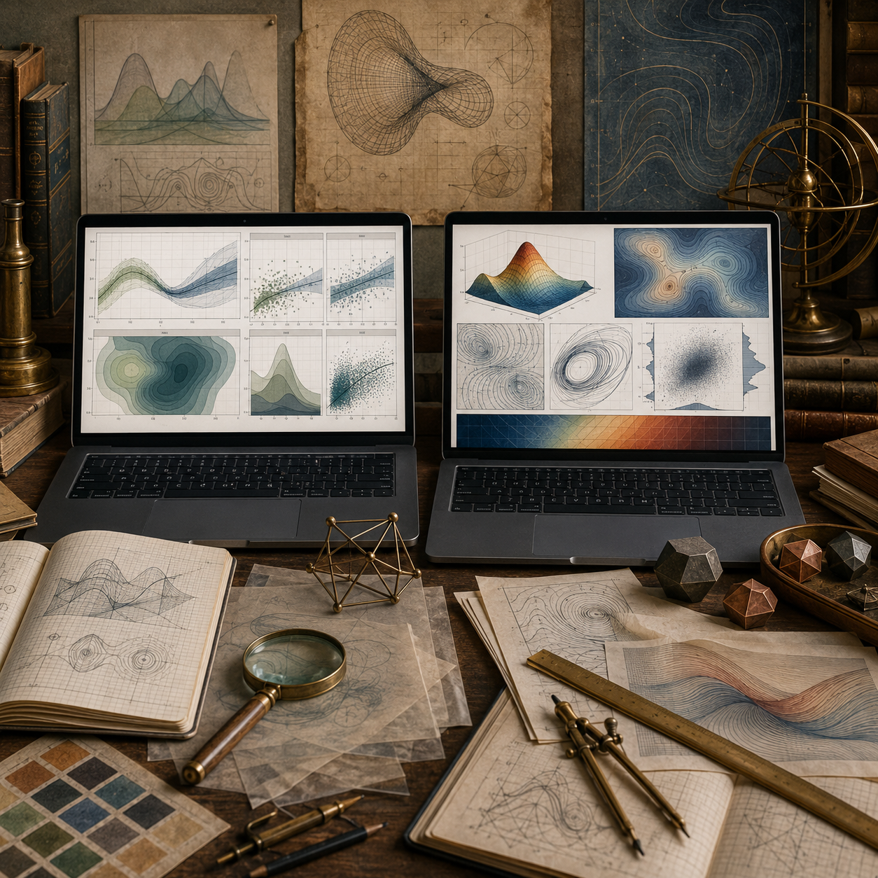
Visualization of continuous models turns equations, trajectories, fields, surfaces, uncertainty, and diagnostics into interpretable visual evidence. A continuous model may be defined by calculus, differential equations, state variables, rates, gradients, flows, or spatial fields, but visualization helps people see how those structures behave over time, across space, and under changing assumptions.
In systems modeling, visualization is not decoration. It is part of model inspection. A graph can reveal equilibrium, oscillation, growth, decay, collapse, threshold behavior, sensitivity, stiffness, numerical instability, uncertainty, or misleading smoothness. The visual form chosen can clarify the model, but it can also distort interpretation if axes, scales, smoothing, aggregation, color, uncertainty, or context are handled poorly.
This article introduces visualization of continuous models for systems modeling, including trajectories, phase portraits, slope fields, vector fields, surfaces, contour plots, uncertainty bands, sensitivity displays, diagnostic plots, reproducible graphics workflows, and responsible interpretation.
Continuous models often produce more than one kind of output. A differential equation may produce a time trajectory. A system of equations may produce a phase portrait. A spatial model may produce a surface or field. A sensitivity analysis may produce uncertainty bands, parameter sweeps, or response surfaces. Each visual form emphasizes a different aspect of the model.
The purpose of visualization is not merely to make a model look accessible. It is to help inspect mathematical behavior, computational reliability, uncertainty, and interpretation. A responsible visualization shows enough structure for the reader to see what the model implies and enough context to understand what the graph does not prove.
Why Visualization Matters
Visualization matters because continuous models often describe patterns that are difficult to understand from formulas or tables alone. A trajectory can show growth or decline. A phase portrait can show attraction, repulsion, cycling, or instability. A contour plot can show gradients and thresholds. An uncertainty band can show how much of a result depends on assumptions.
\frac{d\mathbf{x}}{dt}=\mathbf{f}(t,\mathbf{x},\theta)
\]
Interpretation: A continuous model describes how state variables change through time under parameters \(\theta\).
Visualization helps interpret the behavior of this system, but it does not replace mathematical or computational review.
| Visual form | What it shows | Systems modeling use |
|---|---|---|
| Trajectory plot. | State over time. | Growth, decay, transition, oscillation, or collapse. |
| Phase portrait. | Movement through state space. | Equilibria, cycles, basins, and local dynamics. |
| Slope field. | Local direction of change. | How an ODE behaves across possible states. |
| Vector field. | Direction and magnitude in space. | Flow, force, transport, diffusion, or spatial dynamics. |
| Contour or surface plot. | Continuous response over two inputs. | Optimization, thresholds, gradients, and interaction effects. |
| Uncertainty band. | Range of plausible outputs. | Scenario comparison and parameter sensitivity. |
The right visualization depends on the mathematical object being inspected and the interpretive question being asked.
Visualization as Model Inspection
A model visualization should help inspect the model, not merely present its conclusion. Good visual workflows make assumptions, variables, scales, uncertainty, diagnostics, and limitations easier to review.
Visual Inspection Sequence
Define the Object
Identify whether the visual represents a trajectory, field, surface, sensitivity result, or diagnostic output.
Choose the Encoding
Select axes, scales, line types, contours, bands, arrows, facets, or surfaces based on the model question.
Preserve Metadata
Record parameters, initial conditions, solver settings, units, time horizon, and data source.
Review Interpretation
Check whether the graph clarifies behavior or encourages an unsupported conclusion.
A visualization is strongest when it is paired with enough information to reproduce the model and question its assumptions.
Trajectories and Time Series
Trajectory plots show how state variables evolve over time. They are among the most common visualizations of continuous models.
x(t)
\]
Interpretation: A trajectory shows the value of a state variable as a function of time.
Trajectory plots are useful for showing growth, decay, convergence, oscillation, overshoot, collapse, delay, or response to forcing. They also make it possible to compare scenarios under different assumptions.
| Trajectory feature | Possible model behavior | Review question |
|---|---|---|
| Monotone growth. | Increasing stock, population, exposure, or accumulation. | Is growth bounded or unbounded? |
| Monotone decline. | Decay, depletion, cooling, recovery, or dissipation. | Does the model approach zero, a threshold, or a floor? |
| Oscillation. | Feedback, delay, predator-prey interaction, or forcing. | Is the oscillation structural or numerical? |
| Overshoot. | Delayed response or policy resistance. | Are assumptions about delay and control documented? |
| Sharp transition. | Threshold, discontinuity, regime shift, or solver artifact. | Does the transition come from the model or numerical method? |
A trajectory should include clear axes, units, time horizon, and scenario context. Without those, the graph can look persuasive while remaining difficult to audit.
Phase Portraits and State Space
Phase portraits show how a system moves through state space rather than how each variable changes separately over time. This is especially useful for systems of differential equations.
\frac{dx}{dt}=f(x,y),\qquad \frac{dy}{dt}=g(x,y)
\]
Interpretation: A two-state system can be visualized as motion through the \((x,y)\) plane.
Phase portraits can reveal equilibria, attraction, repulsion, cycles, spirals, separatrices, and basins of behavior.
| Phase-space feature | Interpretation | Systems meaning |
|---|---|---|
| Equilibrium point. | Rates of change are zero. | Candidate steady state or balance point. |
| Attractor. | Nearby trajectories move toward a region. | Stable pattern, recovery state, or persistent regime. |
| Repeller. | Nearby trajectories move away. | Instability or fragile balance. |
| Limit cycle. | Trajectory repeats in state space. | Sustained oscillation or cyclical dynamics. |
| Separatrix. | Boundary between different outcomes. | Threshold between basins or regimes. |
Phase portraits help modelers see the geometry of dynamics, but they require careful scaling and interpretation. The plotted state-space window can hide important behavior outside the visible region.
Slope Fields and Vector Fields
Slope fields and vector fields visualize local direction. A slope field for a one-dimensional ODE shows the direction of change at many points. A vector field extends this idea into two or more dimensions.
\frac{dy}{dt}=f(t,y)
\]
Slope field: At each point \((t,y)\), the model defines a local slope.
\mathbf{F}(x,y)=\langle P(x,y),Q(x,y)\rangle
\]
Vector field: At each point in space, the model defines a direction and magnitude.
| Field visualization | What it reveals | Review concern |
|---|---|---|
| Slope field. | Local ODE behavior across possible states. | Can become visually crowded or scale-dependent. |
| Vector field. | Direction and magnitude of spatial flow. | Arrow scaling can exaggerate or suppress behavior. |
| Streamline plot. | Paths implied by a vector field. | May suggest certainty beyond the model. |
| Gradient field. | Direction of steepest increase. | Depends on surface definition and coordinate scale. |
| Flux visualization. | Movement through a boundary or region. | Requires careful boundary and unit definition. |
Fields are especially useful when the model is local: every point has a direction, slope, force, gradient, or flow value.
Surfaces, Contours, and Spatial Structure
Many continuous models describe outcomes over two inputs or spatial dimensions. Surface and contour plots can make these relationships visible.
z=f(x,y)
\]
Interpretation: A response surface shows how an output \(z\) varies with two inputs \(x\) and \(y\).
Contours are often more readable than three-dimensional surfaces because they show level sets on a flat plane.
f(x,y)=c
\]
Contour: A level curve connects points where the modeled output has the same value.
| Visualization | Best use | Interpretive risk |
|---|---|---|
| Surface plot. | Showing overall shape, peaks, valleys, and curvature. | Perspective can hide values or distort slopes. |
| Contour plot. | Showing thresholds, gradients, and level sets. | Color and spacing can imply false precision. |
| Heat map. | Showing magnitude across a grid. | Color scale can exaggerate differences. |
| Response surface. | Showing parameter interaction. | May hide uncertainty or model boundaries. |
| Spatial field map. | Showing distributed quantities. | Interpolation can imply knowledge between sampled points. |
Surface and contour visualizations should preserve units, domains, grid resolution, color scale, and boundary assumptions.
Uncertainty, Sensitivity, and Scenarios
Continuous model outputs often depend on uncertain parameters, initial conditions, structural assumptions, and solver settings. Visualization can help show this dependence rather than hiding it behind a single line.
x(t;\theta)
\]
Interpretation: A trajectory may depend on parameter vector \(\theta\).
Scenario lines, uncertainty bands, fan charts, parameter sweeps, and sensitivity surfaces can show how much conclusions depend on assumptions.
| Uncertainty visual | What it shows | Responsible use |
|---|---|---|
| Scenario lines. | Different plausible assumptions. | Label assumptions clearly. |
| Uncertainty band. | Range of outputs. | Explain what the band represents. |
| Fan chart. | Increasing spread over time. | Avoid implying exact probabilities without support. |
| Parameter sweep. | Response across parameter values. | Show parameter ranges and rationale. |
| Sensitivity plot. | Which inputs matter most. | Distinguish local from global sensitivity. |
A single smooth line can be misleading when uncertainty is large. In many systems contexts, the spread is as important as the central trajectory.
Diagnostic Visualization
Diagnostic visualizations help evaluate numerical behavior and model reliability. They are especially important when continuous models are solved numerically.
Diagnostic Visual Types
Error Plot
Compares numerical output to an analytic or refined benchmark.
Step-Size Plot
Shows how adaptive solvers change step size over time.
Residual Plot
Displays mismatch between model output and observed or benchmark values.
Invariant Plot
Checks whether conserved quantities, bounds, or positivity constraints hold.
Diagnostics should be part of the visualization workflow, not an afterthought. A graph of the modeled trajectory should often be accompanied by a graph of error, step behavior, or constraint checks.
Visual Design Choices
Visual design choices shape interpretation. Axis limits, scale transformations, smoothing, color, binning, interpolation, and line thickness can all affect how a continuous model is read.
| Design choice | Possible distortion | Governance response |
|---|---|---|
| Axis limits. | May hide instability, saturation, or extreme values. | Document visible range and excluded range. |
| Log scale. | May make exponential growth look linear. | State scale transformation clearly. |
| Smoothing. | May hide discontinuities or numerical artifacts. | Preserve raw or unsmoothed comparison. |
| Color scale. | May exaggerate or suppress gradients. | Use clear legends and consistent scales. |
| Interpolation. | May imply values between known grid points. | Document grid resolution and interpolation method. |
| Scenario selection. | May privilege one narrative. | Explain why scenarios were chosen. |
A responsible visual should make the model easier to inspect, not merely easier to believe.
Systems Modeling Interpretation
In systems modeling, visualization often becomes the public face of a model. A curve, surface, or field may be what readers remember, even if the underlying model is complex. That makes visual interpretation a governance issue.
Continuous model visualizations should distinguish mathematical structure, numerical output, scenario framing, empirical uncertainty, and decision relevance. A graph may show what the model implies under stated assumptions. It does not automatically show what the real system will do.
The interpretive standard is not “the visualization is clear.” The stronger standard is: “the visualization is clear, reproducible, appropriately scaled, uncertainty-aware, and honest about what it represents.”
Mathematical Deepening
This section adds a more formal layer for mathematically advanced readers. Visualization of continuous models connects topology, geometry, differential equations, vector calculus, numerical analysis, uncertainty quantification, interpolation, dimensionality reduction, response surfaces, solver diagnostics, and visual encoding.
Visualization Building Blocks
State Space
The mathematical space in which system states are represented.
Trajectory
The path a system follows through time or state space.
Field
A continuous assignment of vectors, slopes, gradients, or values across a domain.
Surface
A continuous response over one or more inputs.
Visualization Review
Scale Review
Check axes, units, transformations, and visible domains.
Uncertainty Review
Show ranges, scenarios, confidence, or sensitivity where relevant.
Diagnostic Review
Inspect error, solver behavior, residuals, and constraints.
Interpretation Review
Separate visual evidence from unsupported claims.
Visualization Governance
Metadata Record
Preserve parameters, units, solver settings, and time horizon.
Design Record
Record scale, color, smoothing, interpolation, and scenario choices.
Output Record
Save data tables behind generated figures.
Warning Record
Document visual limitations and interpretive risks.
Examples from Systems Modeling
Continuous model visualization appears across many systems modeling contexts.
Population Dynamics
Trajectory plots show growth, carrying capacity, collapse, or recovery over time.
Epidemiological Models
Compartment trajectories and uncertainty bands show outbreak scenarios and intervention effects.
Climate Feedback
Scenario lines, fan charts, and sensitivity plots show forcing, feedback, and uncertainty.
Resource Systems
Stock-flow trajectories show depletion, regeneration, scarcity, and policy response.
Infrastructure Systems
Load curves, stress surfaces, and failure thresholds show system capacity and risk.
Spatial Dynamics
Vector fields, contours, and heat maps show transport, diffusion, gradients, and distributed accumulation.
Across these examples, visualization helps make continuous change inspectable, but only when visual assumptions are documented.
Computation and Reproducible Workflows
Computational visualization workflows should preserve both graphics and the data behind them. A reproducible workflow should store input parameters, generated trajectories, scenario labels, solver settings, uncertainty records, figure specifications, output tables, and interpretation notes.
When a figure supports explanation or decision-making, the graph should not be the only artifact. The underlying data, code, metadata, and warning notes should be available for review.
Python Workflow: Continuous Model Visualization Audit
The Python workflow below creates a reproducible trajectory table and a visualization audit record for logistic growth scenarios.
from __future__ import annotations

from dataclasses import asdict, dataclass
from pathlib import Path
import csv
import json
import math


@dataclass(frozen=True)
class TrajectoryRecord:
    scenario: str
    time: float
    value: float
    growth_rate: float
    carrying_capacity: float
    warning: str


@dataclass(frozen=True)
class VisualizationAuditRecord:
    figure_id: str
    visual_type: str
    model_object: str
    x_axis: str
    y_axis: str
    scale_note: str
    uncertainty_note: str
    interpretation_warning: str


def logistic_solution(t: float, x0: float, r: float, k: float) -> float:
    return k / (1 + ((k - x0) / x0) * math.exp(-r * t))


def build_trajectories() -> list[TrajectoryRecord]:
    scenarios = [
        ("low_growth", 0.18, 100.0),
        ("baseline", 0.35, 100.0),
        ("high_growth", 0.55, 100.0),
    ]

    records: list[TrajectoryRecord] = []

    for scenario, r, k in scenarios:
        for step in range(0, 81):
            t = step * 0.25
            records.append(
                TrajectoryRecord(
                    scenario=scenario,
                    time=t,
                    value=logistic_solution(t, x0=10.0, r=r, k=k),
                    growth_rate=r,
                    carrying_capacity=k,
                    warning="Trajectory visualization depends on equation, initial condition, parameters, time horizon, axis scale, and scenario selection."
                )
            )

    return records


records = build_trajectories()

audit_records = [
    VisualizationAuditRecord(
        figure_id="logistic_growth_scenario_trajectories",
        visual_type="trajectory_plot",
        model_object="logistic_solution",
        x_axis="time",
        y_axis="state value",
        scale_note="Linear axes; time horizon 0 to 20.",
        uncertainty_note="Scenario lines are parameter contrasts, not probability intervals.",
        interpretation_warning="The figure shows model-implied trajectories under selected assumptions, not empirical forecasts."
    ),
    VisualizationAuditRecord(
        figure_id="logistic_growth_parameter_comparison",
        visual_type="scenario_comparison",
        model_object="growth_rate_parameter_sweep",
        x_axis="time",
        y_axis="state value",
        scale_note="Same y-axis should be used across scenarios.",
        uncertainty_note="Parameter selection should be documented.",
        interpretation_warning="Scenario selection can frame interpretation and should be justified."
    )
]

output_dir = Path("outputs")
(output_dir / "tables").mkdir(parents=True, exist_ok=True)
(output_dir / "json").mkdir(parents=True, exist_ok=True)

with (output_dir / "tables" / "continuous_model_trajectories.csv").open("w", newline="", encoding="utf-8") as handle:
    writer = csv.DictWriter(handle, fieldnames=asdict(records[0]).keys())
    writer.writeheader()
    for record in records:
        writer.writerow(asdict(record))

with (output_dir / "tables" / "visualization_audit_records.csv").open("w", newline="", encoding="utf-8") as handle:
    writer = csv.DictWriter(handle, fieldnames=asdict(audit_records[0]).keys())
    writer.writeheader()
    for record in audit_records:
        writer.writerow(asdict(record))

(output_dir / "json" / "continuous_model_trajectories.json").write_text(
    json.dumps([asdict(record) for record in records], indent=2),
    encoding="utf-8"
)

(output_dir / "json" / "visualization_audit_records.json").write_text(
    json.dumps([asdict(record) for record in audit_records], indent=2),
    encoding="utf-8"
)

print("Wrote continuous model visualization audit outputs.")
This workflow preserves trajectories and visualization metadata so the figure can be reviewed rather than treated as a standalone image.
R Workflow: Trajectory and Scenario Plot Records
The R workflow below records scenario trajectories and figure metadata for a continuous model visualization.
logistic_solution <- function(t, x0, r, k) {
  k / (1 + ((k - x0) / x0) * exp(-r * t))
}

times <- seq(0, 20, by = 0.25)

scenarios <- data.frame(
  scenario = c("low_growth", "baseline", "high_growth"),
  growth_rate = c(0.18, 0.35, 0.55),
  carrying_capacity = c(100, 100, 100)
)

records <- do.call(
  rbind,
  lapply(seq_len(nrow(scenarios)), function(i) {
    data.frame(
      scenario = scenarios$scenario[i],
      time = times,
      value = logistic_solution(
        times,
        x0 = 10,
        r = scenarios$growth_rate[i],
        k = scenarios$carrying_capacity[i]
      ),
      growth_rate = scenarios$growth_rate[i],
      carrying_capacity = scenarios$carrying_capacity[i],
      warning = "Trajectory visualization depends on equation, initial condition, parameters, time horizon, axis scale, and scenario selection."
    )
  })
)

figure_audit <- data.frame(
  figure_id = c(
    "logistic_growth_scenario_trajectories",
    "logistic_growth_parameter_comparison"
  ),
  visual_type = c("trajectory_plot", "scenario_comparison"),
  model_object = c("logistic_solution", "growth_rate_parameter_sweep"),
  x_axis = c("time", "time"),
  y_axis = c("state value", "state value"),
  scale_note = c(
    "Linear axes; time horizon 0 to 20.",
    "Same y-axis should be used across scenarios."
  ),
  uncertainty_note = c(
    "Scenario lines are parameter contrasts, not probability intervals.",
    "Parameter selection should be documented."
  ),
  interpretation_warning = c(
    "The figure shows model-implied trajectories under selected assumptions, not empirical forecasts.",
    "Scenario selection can frame interpretation and should be justified."
  )
)

dir.create("outputs/tables", recursive = TRUE, showWarnings = FALSE)

write.csv(
  records,
  "outputs/tables/r_continuous_model_trajectories.csv",
  row.names = FALSE
)

write.csv(
  figure_audit,
  "outputs/tables/r_visualization_audit_records.csv",
  row.names = FALSE
)

print(head(records))
print(figure_audit)
This workflow treats visualization as an auditable modeling artifact with data and metadata preserved together.
Haskell Workflow: Typed Visualization Records
Haskell can represent visualization metadata as typed records, making figure assumptions explicit.
module Main where

data VisualizationRecord = VisualizationRecord
  { figureId :: String
  , visualType :: String
  , modelObject :: String
  , xAxis :: String
  , yAxis :: String
  , scaleNote :: String
  , uncertaintyNote :: String
  , interpretationWarning :: String
  } deriving (Show)

records :: [VisualizationRecord]
records =
  [ VisualizationRecord
      "logistic_growth_scenario_trajectories"
      "trajectory_plot"
      "logistic_solution"
      "time"
      "state value"
      "Linear axes; time horizon 0 to 20."
      "Scenario lines are parameter contrasts, not probability intervals."
      "The figure shows model-implied trajectories under selected assumptions, not empirical forecasts."
  , VisualizationRecord
      "phase_portrait_review"
      "phase_portrait"
      "two_state_dynamic_system"
      "state x"
      "state y"
      "State-space window should be documented."
      "Initial condition selection affects visible trajectories."
      "Phase portraits show local and geometric behavior, not automatic empirical validity."
  , VisualizationRecord
      "vector_field_review"
      "vector_field"
      "spatial_flow_field"
      "x coordinate"
      "y coordinate"
      "Arrow scaling should be documented."
      "Magnitude and direction can be visually distorted by normalization."
      "Vector fields require unit and boundary interpretation."
  ]

main :: IO ()
main =
  mapM_ print records
The typed workflow keeps figure purpose, axes, scale choices, uncertainty notes, and interpretation warnings visible.
SQL Workflow: Visualization Assumption Registry
SQL can document visualization assumptions when figures support reports, dashboards, model reviews, or decision workflows.
CREATE TABLE continuous_model_visualization_registry (
    visualization_key TEXT PRIMARY KEY,
    visualization_name TEXT NOT NULL,
    visual_operation TEXT NOT NULL,
    systems_modeling_role TEXT NOT NULL,
    review_warning TEXT NOT NULL
);

INSERT INTO continuous_model_visualization_registry VALUES
(
  'trajectory_plot',
  'Trajectory plot',
  'Plot state value against time.',
  'Shows growth, decline, oscillation, convergence, or collapse.',
  'A smooth trajectory may hide uncertainty, solver error, or invalid assumptions.'
);

INSERT INTO continuous_model_visualization_registry VALUES
(
  'phase_portrait',
  'Phase portrait',
  'Plot motion through state space.',
  'Shows equilibria, cycles, attraction, repulsion, and basins.',
  'The visible state-space window can hide important behavior.'
);

INSERT INTO continuous_model_visualization_registry VALUES
(
  'vector_field',
  'Vector field',
  'Plot direction and magnitude across a domain.',
  'Shows flow, gradient, force, or spatial movement.',
  'Arrow scaling and normalization should be documented.'
);

INSERT INTO continuous_model_visualization_registry VALUES
(
  'contour_surface',
  'Contour or surface plot',
  'Visualize response over two inputs or spatial dimensions.',
  'Shows gradients, thresholds, and interaction effects.',
  'Color scale, interpolation, and grid resolution can distort interpretation.'
);

INSERT INTO continuous_model_visualization_registry VALUES
(
  'uncertainty_band',
  'Uncertainty band',
  'Plot ranges around modeled trajectories.',
  'Shows sensitivity, scenario spread, or uncertainty.',
  'The meaning of the band must be explained.'
);

INSERT INTO continuous_model_visualization_registry VALUES
(
  'diagnostic_plot',
  'Diagnostic plot',
  'Visualize error, residuals, solver steps, or constraints.',
  'Helps distinguish model behavior from numerical artifact.',
  'Diagnostics should accompany important model outputs.'
);

SELECT
    visualization_name,
    visual_operation,
    systems_modeling_role,
    review_warning
FROM continuous_model_visualization_registry
ORDER BY visualization_key;
This registry ties visual interpretation to trajectory plots, phase portraits, vector fields, contours, uncertainty bands, diagnostics, and review warnings.
GitHub Repository
The companion repository for this article is designed as a reproducible mathematical-modeling workspace. It supports trajectory tables, visualization audit records, phase portrait metadata, vector field records, contour and surface plot metadata, uncertainty-band notes, SQL governance tables, generated outputs, advanced mathematical audit reports, and reusable calculator scripts.
Complete Code Repository
Companion article folder with Python, R, Julia, SQL, Haskell, C, C++, Fortran, Rust, Go, notebooks, documentation, synthetic teaching data, generated outputs, schemas, Canvas-ready workflow artifacts, and reusable calculator scripts for visualization of continuous models, trajectories, phase portraits, slope fields, vector fields, contour plots, surfaces, uncertainty bands, sensitivity displays, diagnostic plots, visual metadata, figure governance, and responsible mathematical modeling.
Interpretive Limits and Responsible Use
Continuous model visualizations can make complex behavior easier to understand, but they can also make assumptions feel more certain than they are. A clean graph may hide parameter uncertainty, structural uncertainty, solver error, scale choices, smoothing, interpolation, scenario selection, or omitted boundary behavior.
Responsible use requires documentation. Preserve the data behind figures. Record parameters, initial conditions, solver settings, units, scales, transformations, grid resolution, color scales, smoothing rules, and uncertainty definitions. Use diagnostic visuals when results matter. Avoid presenting a model-implied graph as if it were direct evidence of the real system.
The central question is not only “Does the visualization communicate?” It is “Does the visualization make the model inspectable, reproducible, uncertainty-aware, and honest about its limits?”
Related Articles
- Calculus for Systems Modeling
- Symbolic Calculus and Model Inspection
- Ordinary Differential Equation Solver Workflows
- Phase Lines, Phase Planes, and Phase Portraits
- Vectors, Fields, and Continuous Space
- Gradient, Divergence, and Curl
- Stability, Error, and Convergence in Numerical Modeling
- Parameter Sweeps and Sensitivity Analysis
- Scientific Computing for Systems Modeling
- Interpretation, Assumptions, and Responsible Mathematical Modeling
Further Reading
- Cleveland, W.S. (1993) Visualizing Data. Summit, NJ: Hobart Press.
- Cleveland, W.S. (1994) The Elements of Graphing Data. Summit, NJ: Hobart Press.
- Few, S. (2009) Now You See It: Simple Visualization Techniques for Quantitative Analysis. Oakland, CA: Analytics Press.
- Munzner, T. (2014) Visualization Analysis and Design. Boca Raton, FL: CRC Press.
- Tufte, E.R. (2001) The Visual Display of Quantitative Information. 2nd edn. Cheshire, CT: Graphics Press.
- Ware, C. (2021) Information Visualization: Perception for Design. 4th edn. Cambridge, MA: Morgan Kaufmann.
- Wilkinson, L. (2005) The Grammar of Graphics. 2nd edn. New York: Springer.
- Wickham, H. (2016) ggplot2: Elegant Graphics for Data Analysis. 2nd edn. Cham: Springer.
- Hunter, J.D. (2007) ‘Matplotlib: A 2D graphics environment’, Computing in Science & Engineering, 9(3), pp. 90–95.
- Massachusetts Institute of Technology (MIT) OpenCourseWare (2011) Introduction to Numerical Analysis. Cambridge, MA: MIT OpenCourseWare.
References
- Cleveland, W.S. (1993) Visualizing Data. Summit, NJ: Hobart Press.
- Cleveland, W.S. (1994) The Elements of Graphing Data. Summit, NJ: Hobart Press.
- Few, S. (2009) Now You See It: Simple Visualization Techniques for Quantitative Analysis. Oakland, CA: Analytics Press.
- Hunter, J.D. (2007) ‘Matplotlib: A 2D graphics environment’, Computing in Science & Engineering, 9(3), pp. 90–95.
- Munzner, T. (2014) Visualization Analysis and Design. Boca Raton, FL: CRC Press.
- Tufte, E.R. (2001) The Visual Display of Quantitative Information. 2nd edn. Cheshire, CT: Graphics Press.
- Ware, C. (2021) Information Visualization: Perception for Design. 4th edn. Cambridge, MA: Morgan Kaufmann.
- Wickham, H. (2016) ggplot2: Elegant Graphics for Data Analysis. 2nd edn. Cham: Springer.
- Wilkinson, L. (2005) The Grammar of Graphics. 2nd edn. New York: Springer.