
Last Updated May 8, 2026
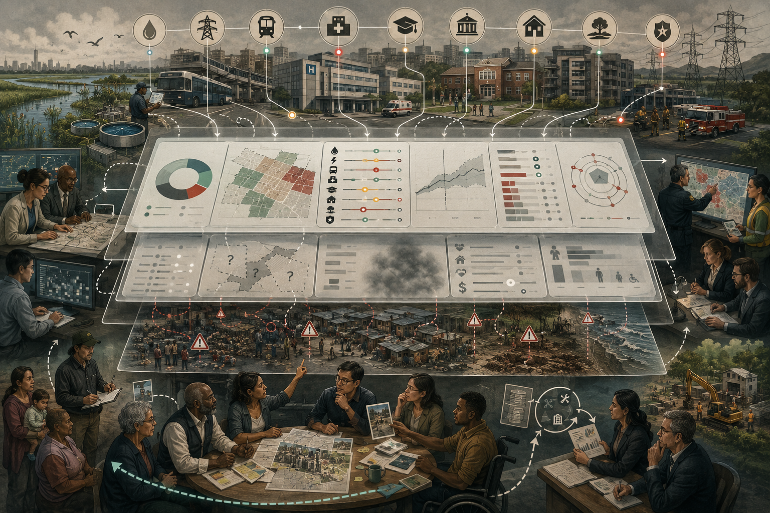
Resilience indicator dashboards are powerful because they make complex systems visible, but they are dangerous when they make partial visibility feel complete. Dashboards can help institutions track preparedness, compare places, monitor adaptation, identify weak points, allocate resources, and communicate progress. They can turn scattered information about exposure, vulnerability, infrastructure, governance, recovery, finance, public health, ecosystems, and social protection into a structured view of resilience. Yet every dashboard also filters reality. It selects indicators, defines boundaries, weights variables, aggregates difference, hides uncertainty, privileges available data, and can make system fragility look more measurable than it really is.
This article examines resilience indicator dashboards and their blind spots in the fullest sense: not only as technical tools for tracking metrics, but as governance instruments that shape what institutions notice, value, fund, ignore, and claim to have improved. Resilience dashboards are increasingly used in climate adaptation, disaster risk reduction, city planning, infrastructure appraisal, development programming, public finance, public health, and institutional stress testing. They can support better decisions. But they can also produce false precision, dashboard theater, performative accountability, misleading comparisons, and aggregate scores that obscure unequal vulnerability.
Main Library
Publications
Article Map
Risk & Resilience
Related Topic
Resilience Measurement
Related Topic
Stress Testing
Related Topic
Public Legitimacy
Resilience measurement is necessary because institutions cannot govern what they refuse to observe. OECD’s adaptation-measurement work emphasizes that measuring progress helps inform planning, prioritize action, mobilize resources, and strengthen accountability. UNDRR’s Disaster Resilience Scorecard for Cities provides structured assessments to help local governments monitor disaster resilience and review implementation challenges. The World Bank’s Resilience Rating System assesses project resilience through structured criteria, while its 2024 resilience framework emphasizes that resilience involves preparing for, coping with, recovering from, and adapting to shocks. These tools are valuable. The problem begins when dashboards become substitutes for judgment rather than supports for judgment.
Why This Topic Matters
Resilience indicator dashboards matter because resilience is increasingly expected to be monitorable, comparable, auditable, and reportable. Public agencies, cities, infrastructure planners, development banks, insurers, climate-adaptation offices, disaster-risk agencies, health systems, and public institutions all need ways to track whether resilience is improving. Dashboards promise to make this possible. They convert complex systems into indicators, charts, scores, maps, thresholds, progress bars, trend lines, traffic-light ratings, and summary views.
That promise is real. Without indicators, resilience can remain rhetorical. A city can claim resilience because it has a strategy. A project can claim resilience because it passed climate screening. A public institution can claim preparedness because it has a plan. A utility can claim resilience because it hardened one asset. A community program can claim impact because it funded activities. Dashboards can discipline those claims by asking what changed, who benefited, what capacity improved, which risks remain, and whether outcomes are being tracked.
But dashboards also change governance. They do not merely display information. They define what counts as information. They shape what senior officials see, what funders reward, what staff report, what communities can challenge, and what becomes legible as progress. When dashboards are well designed, they can reveal risk and improve accountability. When they are poorly designed, they can reward superficial compliance, hide distributional harm, and create confidence that exceeds the evidence.
This topic matters because resilience is a systems concept, while dashboards often prefer simplified signals. Resilience involves capacities before shocks, performance during shocks, recovery after shocks, and adaptation over time. It includes physical infrastructure, social networks, public trust, ecological function, fiscal capacity, governance quality, institutional learning, and justice. No dashboard can fully capture all of that. A dashboard can support resilience governance only if its blind spots are acknowledged and actively managed.
The central question is not whether resilience dashboards should be used. They should. The question is how to use them without mistaking measurement for reality. A good dashboard should make uncertainty visible, not hide it. It should support judgment, not replace it. It should reveal vulnerability, not flatten it into a reassuring score.
What Resilience Indicator Dashboards Are
A resilience indicator dashboard is a structured display of metrics used to assess resilience-related conditions, capacities, vulnerabilities, trends, and outcomes. It may include indicators of hazard exposure, infrastructure condition, emergency preparedness, social vulnerability, recovery speed, insurance coverage, public-health capacity, ecological condition, public trust, fiscal resilience, or adaptation progress. It may be designed for a city, country, public institution, project, infrastructure system, community, sector, or portfolio.
Dashboards can be internal management tools, public accountability tools, investor-facing tools, planning tools, early-warning tools, project-rating tools, or community-engagement tools. Some dashboards are interactive digital platforms. Others are scorecards or indicator matrices. Some use maps, charts, and composite scores. Others use qualitative scoring, traffic-light ratings, or maturity levels. The form varies, but the logic is similar: dashboards organize indicators to make resilience easier to monitor and govern.
A resilience dashboard usually contains several layers. The first layer is the indicator set: the variables selected to represent important dimensions of resilience. The second layer is the data infrastructure: sources, collection methods, update frequency, quality controls, and metadata. The third layer is interpretation: thresholds, weights, benchmarks, baselines, targets, and color coding. The fourth layer is governance: who owns the dashboard, who updates it, who can challenge it, and what decisions it informs.
These layers are often invisible to dashboard users. A senior official may see a red-yellow-green summary without seeing the assumptions beneath it. A public-facing dashboard may show progress without explaining data gaps. A composite score may rank jurisdictions without showing how weights were chosen. A map may highlight exposed areas without showing social vulnerability, uncertainty, or historical injustice.
This is why dashboards should be understood as measurement systems, not just visual interfaces. The interface is only the visible surface. The deeper question is how the dashboard translates resilience into categories, data, weights, and decisions. A dashboard is not neutral simply because it looks technical. It embeds choices about what counts, who counts, and what remains unseen.
Why Dashboards Are Useful
Dashboards are useful because resilience governance requires coordinated attention. Complex systems produce too much information for decision-makers to interpret without structure. A city may need to track flood exposure, heat risk, shelter access, road conditions, hospital capacity, household vulnerability, drainage maintenance, insurance gaps, power reliability, emergency response, and public trust. A dashboard can organize this complexity into a form that supports action.
Dashboards help establish baselines. They show where a system starts before investments, reforms, or shocks occur. Baselines are essential because resilience improvement cannot be demonstrated without a reference point. A dashboard can show whether exposure is increasing, whether service continuity is improving, whether recovery times are shortening, whether vulnerable neighborhoods are better protected, or whether adaptation actions are actually reducing risk.
Dashboards also help reveal weak points. A city may discover that emergency plans are strong but social protection is weak. A public institution may discover that digital continuity is strong but workforce surge capacity is low. A project may discover that infrastructure robustness is adequate but community access is poor. A dashboard’s value lies not only in showing strengths, but in showing where resilience is uneven.
They also support communication. Dashboards can make resilience more understandable to the public, elected officials, funders, regulators, and communities. They can help explain why investment is needed before disaster occurs. They can show progress over time and make preparedness visible in non-crisis periods. This matters because prevention often suffers politically when its benefits are invisible.
Dashboards can also support accountability. If resilience commitments are tracked publicly, institutions may be more likely to report progress, identify gaps, and justify decisions. Public dashboards can help communities ask whether promised investments reached them, whether vulnerable groups were protected, and whether recovery was equitable.
The usefulness of dashboards therefore should not be dismissed. The problem is not that dashboards simplify complexity. All tools simplify. The problem is when simplification is hidden, overtrusted, or disconnected from judgment. Dashboards are useful when they invite better questions. They are harmful when they end the conversation too early.
From Indicators to Dashboards
Indicators become dashboards when they are organized into a system of visibility. A single indicator may show one condition, such as the percentage of critical facilities in flood-prone areas. A dashboard places that indicator alongside others: emergency response capacity, drainage maintenance, shelter accessibility, social vulnerability, insurance coverage, public communication, recovery time, and adaptation investment. The dashboard turns multiple signals into a decision environment.
This transition from indicators to dashboards introduces new interpretive risks. Individual indicators already require judgment, but dashboards add selection, grouping, ordering, weighting, thresholds, visualization, and aggregation. The same data can tell different stories depending on how it is displayed. A dashboard that places infrastructure indicators first may frame resilience as an engineering problem. A dashboard that foregrounds social vulnerability may frame resilience as a justice problem. A dashboard that highlights investment spending may frame resilience as a financing problem. Each may be partly right, but none is complete.
Dashboards also create a hierarchy of attention. Indicators on the front page matter more than indicators buried in technical appendices. Red indicators attract action; green indicators may be ignored. Indicators updated monthly may appear more important than indicators updated annually. Indicators with clean numeric data may dominate indicators that require qualitative interpretation. Over time, the dashboard can reshape institutional priorities.
A dashboard also converts uncertainty into interface design. Does uncertainty appear as a confidence interval, a footnote, a gray category, an error band, or not at all? Does the dashboard show missing data? Does it distinguish observed data from modeled estimates? Does it label proxy indicators clearly? Does it show when data are outdated? These design choices affect whether users understand the limits of the dashboard.
The movement from indicators to dashboards therefore requires governance. It is not enough to ask whether each indicator is valid. Analysts must ask how indicators interact when displayed together. What does the dashboard encourage users to see? What does it discourage them from seeing? Which decisions will it influence? Which communities can challenge its interpretation?
A resilience dashboard should be designed as a public reasoning tool. It should help users ask better questions about complex systems, not simply produce a polished picture of control.
What Dashboards Actually Measure
Most resilience dashboards do not measure resilience directly. They measure indicators associated with resilience and then infer resilience from those signals. This distinction is critical. A dashboard may measure preparedness plans, shelter capacity, insurance coverage, infrastructure redundancy, social vulnerability, fiscal reserves, service continuity, ecological condition, recovery speed, or adaptation spending. These are meaningful indicators, but they are not resilience itself.
Resilience is partly latent. It becomes visible when systems face stress, disruption, or change. A dashboard can estimate readiness before a shock, but actual performance may differ. A public institution may score well on preparedness because it has plans, but fail during crisis because staff are unavailable, digital systems collapse, or public trust is low. A city may score well on infrastructure but recover unequally. A project may score well on climate screening but create new social vulnerability.
Dashboards often measure three broad categories: conditions, capacities, and outcomes. Conditions include exposure, vulnerability, asset quality, ecological health, and institutional context. Capacities include preparedness, response systems, governance, financial protection, social networks, and adaptive learning. Outcomes include service continuity, loss reduction, recovery speed, reduced displacement, and improved wellbeing. Strong dashboards distinguish these categories rather than collapsing them into a single undifferentiated score.
Dashboards also frequently measure proxies. For example, the existence of an emergency plan may be used as a proxy for preparedness. Number of shelters may be used as a proxy for evacuation capacity. Tree canopy may be used as a proxy for heat resilience. Insurance coverage may be used as a proxy for financial protection. These proxies can be useful, but they can mislead if treated as direct measures. A plan may be unused. A shelter may be inaccessible. Tree canopy may be unevenly distributed. Insurance may exclude major risks.
This is the core measurement problem: dashboards make resilience appear observable by translating it into observable fragments. That translation is necessary, but it must remain visible. Users should know when the dashboard is measuring actual performance, when it is measuring capacity, when it is measuring proxy conditions, and when it is relying on assumptions.
A dashboard is strongest when it tells users not only what the indicator says, but what kind of evidence the indicator represents.
Blind Spot 1: False Precision
False precision is one of the most common dashboard blind spots. It occurs when a dashboard presents uncertain, incomplete, or judgment-dependent information as if it were exact. A resilience score of 74.6 can look more authoritative than a qualitative judgment, even if the score depends on proxy indicators, missing data, subjective weights, and uncertain assumptions. The decimal point can create confidence the evidence does not deserve.
False precision is especially dangerous in resilience measurement because resilience is multidimensional and partly counterfactual. A dashboard may estimate that a system is moderately resilient, but that estimate may depend on assumptions about future hazards, social behavior, institutional response, maintenance, political trust, and recovery capacity. These are not stable physical constants. They are uncertain system conditions.
Traffic-light systems can also create false precision. A green indicator may imply safety when the underlying data are outdated, incomplete, or narrowly defined. A yellow indicator may hide severe vulnerability for one group. A red indicator may trigger urgent attention even when uncertainty is high. Color coding is useful, but it can compress nuance.
Composite scores increase the risk. A single resilience index can combine infrastructure, governance, social vulnerability, finance, and ecological indicators into one number. That number may be useful for communication, but it can obscure the fact that some components are measured with strong data and others with weak proxies. It can also hide the weighting choices that determine the final result.
False precision does not mean dashboards should avoid numbers. Numbers are necessary. The solution is transparent uncertainty. Dashboards should show confidence levels, data age, missingness, uncertainty bands, proxy status, and qualitative notes. They should distinguish measured values from modeled values. They should avoid unnecessary decimal precision. They should provide disaggregated views beneath headline scores.
A resilience dashboard should not pretend that uncertainty has been solved by visualization. It should make uncertainty usable for decision-making.
Blind Spot 2: Aggregation Hides Unequal Resilience
Aggregation is useful because it summarizes complexity, but it can hide unequal resilience. A city may receive a strong overall resilience score while low-income neighborhoods remain exposed to heat, flood, pollution, poor housing, limited transport, and weak recovery support. A public institution may meet average service-continuity targets while disabled users, rural residents, non-English speakers, or people without digital access lose access during disruption.
Aggregate dashboards often reward system-wide performance. They may show that emergency response time improved, that infrastructure reliability increased, or that adaptation spending rose. But resilience is not only a system average. It is also a distribution. If the already protected become more protected while vulnerable groups remain exposed, aggregate improvement may coexist with deep injustice.
This blind spot matters because shocks do not fall evenly. Heat waves, floods, fires, pandemics, cyber outages, and fiscal crises are filtered through housing, health, income, race, disability, age, labor conditions, language access, mobility, social protection, and public trust. A dashboard that does not disaggregate by group and place may call a system resilient because the average looks acceptable.
Aggregation can also hide spatial patterns. A map may show citywide tree canopy, but heat resilience depends on where trees are located relative to vulnerable populations. A dashboard may show total shelter capacity, but not whether shelters are accessible by transit, disability-inclusive, trusted, safe, or culturally appropriate. A dashboard may show insurance coverage rates, but not whether coverage excludes the highest-risk households.
Equity-adjusted dashboards should therefore include distributional indicators. They should show resilience by neighborhood, income, race or ethnicity where appropriate and lawful, disability, age, housing tenure, migration status, rurality, and access to essential services. They should also show who receives investment, who benefits from recovery, who bears risk, and who can participate in decisions.
A resilience dashboard that cannot answer “resilient for whom?” is not measuring resilience adequately. It is measuring aggregate system protection while leaving hidden fragility intact.
Blind Spot 3: Available Data Becomes Visible Reality
Dashboards tend to privilege data that already exist. This creates a powerful blind spot: what is available becomes what is visible, and what is visible becomes what is governed. If infrastructure data are strong but community-trust data are weak, the dashboard may frame resilience as infrastructure. If financial data are available but informal care networks are not, the dashboard may underestimate social resilience. If formal households are recorded but informal settlements are missing, the dashboard may erase the most vulnerable residents.
Data availability is never neutral. Wealthier jurisdictions often have better datasets, more sensors, more administrative capacity, better mapping, and more technical staff. Poorer communities may have missing, outdated, or fragmented data. Marginalized groups may be undercounted in official systems. Informal workers, undocumented migrants, unhoused people, incarcerated people, and people in informal settlements may be invisible in conventional datasets.
This creates a paradox. The places and groups most exposed to harm may be least visible in dashboards. A dashboard can then produce a clean picture precisely because it has excluded the messy realities that matter most. It may show resilience because the most fragile data are missing.
Available-data bias also affects indicator selection. Analysts may choose indicators not because they best represent resilience, but because data can be obtained cheaply and updated regularly. This can lead to dashboards full of measurable fragments: number of plans, number of projects, kilometers of infrastructure, dollars spent, workshops held, alerts issued. These may matter, but they may not show whether vulnerability declined or whether systems performed better under stress.
Better dashboards should show data gaps as indicators in their own right. Missing data should not disappear. Data quality, coverage, update frequency, representativeness, and uncertainty should be visible. Dashboards should include qualitative evidence, community reporting, participatory mapping, field verification, and narrative interpretation when quantitative data are incomplete.
A dashboard should not reward ignorance by hiding missingness. It should make data gaps politically and analytically visible, especially where those gaps correspond to vulnerable people and places.
Blind Spot 4: Proxies Become the Thing Itself
Resilience dashboards rely heavily on proxies. A proxy is an indirect measure used when direct measurement is difficult. Proxies are necessary because many resilience dimensions are hard to observe directly. But proxies become dangerous when institutions forget that they are proxies.
A common example is using the existence of a plan as a proxy for preparedness. A plan may be important, but it does not prove operational readiness. Has the plan been tested? Do staff know it? Are resources available? Are legal authorities clear? Do communities trust the communication channels? Does the plan work under compound stress? A dashboard that scores the plan but not its performance may overstate resilience.
Another example is adaptation spending. Money allocated to adaptation is not the same as adaptation achieved. Spending may fund useful work, or it may fund consultants, studies, partial projects, or interventions that do not reduce vulnerability. A dashboard that treats spending as resilience can confuse input with outcome.
Infrastructure hardening is another proxy. Strengthening an asset may reduce risk for that asset, but it may not improve system resilience if dependencies remain weak. A hospital with a hardened building may still depend on vulnerable roads, power, water, staff, suppliers, and digital systems. A dashboard focused on asset condition may miss system interdependence.
Social resilience proxies are also risky. Number of community organizations may not indicate trust. Number of public meetings may not indicate meaningful participation. Number of alerts issued may not indicate comprehension or action. Insurance coverage may not indicate financial protection if exclusions, deductibles, or affordability barriers are severe.
The solution is not to abandon proxies. The solution is to label them clearly, test them against outcomes, and use multiple indicators where possible. Dashboards should distinguish input proxies, capacity proxies, process proxies, and outcome measures. They should ask whether proxies actually correlate with performance under stress.
A proxy becomes a blind spot when it is treated as proof. A good dashboard keeps the inferential chain visible: this indicator suggests resilience because of these assumptions, under these conditions, with these limitations.
Blind Spot 5: Dashboards Struggle With Time, Thresholds, and Counterfactuals
Resilience is temporal. It concerns what happens before, during, after, and between shocks. Dashboards often struggle with this because they prefer current-state indicators: today’s exposure, today’s capacity, today’s score, today’s project status. But resilience depends on trajectories. A system may look stable while deteriorating. Another may look weak but improving. A third may perform well under ordinary stress but collapse beyond a threshold.
Time matters in several ways. Preparedness indicators describe pre-shock capacity. Service-continuity indicators describe performance during stress. Recovery indicators describe post-shock restoration. Adaptation indicators describe longer-term learning and transformation. A dashboard that mixes these without distinction can confuse readiness, performance, recovery, and transformation.
Thresholds are also difficult. Many systems do not degrade linearly. A hospital may function until staffing or bed capacity crosses a critical limit. A power grid may remain stable until demand and supply margins narrow too far. A watershed may absorb rainfall until soil saturation and drainage failure interact. A community may cope with repeated shocks until savings, trust, and institutional patience are exhausted. Dashboards that show smooth scores may miss threshold behavior.
Counterfactuals are another blind spot. A resilience intervention may prevent harm that never becomes visible. If a flood does not occur, how does the dashboard show that drainage upgrades mattered? If early warning prevents deaths, how does the dashboard estimate avoided loss? If social protection prevents hunger, how does it measure the crisis that did not happen? Resilience success is often partly invisible because it appears as non-failure.
Dashboards should therefore include trend indicators, stress scenarios, thresholds, leading indicators, and recovery curves. They should distinguish short-term status from long-term trajectory. They should connect indicators to plausible counterfactuals where possible. They should avoid treating a current score as a permanent condition.
Resilience is not a snapshot. It is a relationship between system capacity and changing disturbance over time. Dashboards that forget time can make slow fragility look like stability.
Blind Spot 6: Scale and Boundary Problems
Every dashboard draws a boundary. It decides what system is being measured: a city, region, watershed, infrastructure network, public institution, project, portfolio, neighborhood, sector, or country. That boundary shapes the meaning of every indicator. A citywide resilience dashboard may hide neighborhood vulnerability. A project dashboard may ignore systemwide dependencies. A national dashboard may erase local differences. A household dashboard may understate institutional failure.
Scale problems are unavoidable because resilience exists across levels. Household resilience depends on income, health, housing, social networks, insurance, and public services. Community resilience depends on trust, local organizations, infrastructure, and mutual aid. City resilience depends on governance, land use, transport, utilities, public health, finance, and ecosystems. National resilience depends on fiscal capacity, institutions, social protection, supply chains, and law. Ecological resilience depends on landscapes, watersheds, species, and feedbacks.
A dashboard designed for one scale may be misleading at another. A national indicator of adaptation spending may not show whether vulnerable communities benefited. A city indicator of shelter capacity may not show whether each neighborhood has access. A project resilience rating may not show whether the project increases risk elsewhere. A regional water indicator may not show household affordability.
Boundary problems also arise with interdependence. A public institution may appear resilient within its own boundary while depending on external suppliers, cloud systems, power grids, transport networks, and neighboring jurisdictions. A dashboard that measures the institution alone may miss external fragility. Critical infrastructure dashboards face the same problem: system resilience often depends on dependencies outside the measured system.
Better dashboards should make boundaries explicit. They should show what is inside and outside the measurement frame. They should include cross-scale indicators and dependency maps where possible. They should allow users to move from aggregate view to local view, from system view to component view, and from asset view to social impact.
A dashboard’s boundary is never just technical. It determines whose vulnerability counts as part of the system and whose vulnerability is treated as external.
Blind Spot 7: Dashboard Theater and Performative Accountability
Dashboard theater occurs when institutions use dashboards to signal control, transparency, or progress without changing decisions. The dashboard becomes a performance of accountability rather than a mechanism of learning. Indicators are updated, colors change, reports are issued, and presentations are made, but budgets, staffing, maintenance, risk reduction, community protection, and institutional reform remain unchanged.
This is a governance failure, not a visualization problem. A dashboard can be technically polished and institutionally useless if it is not connected to decisions. It may show that a vulnerability is severe, but no agency is responsible for action. It may show that recovery is unequal, but no funding mechanism changes. It may show that data are missing, but no resources are allocated to improve data systems. It may show that preparedness is weak, but no authority can compel reform.
Performative dashboards often track activity rather than outcomes. They show workshops held, plans produced, projects started, money allocated, or indicators reported. These are easier to measure than whether risk declined, services continued, communities were protected, or institutions learned. Activity dashboards can be useful, but they become misleading when presented as resilience dashboards.
Dashboard theater can also arise when indicators are selected to tell a positive story. Agencies may choose metrics that show progress, avoid politically sensitive indicators, underweight inequality, or exclude uncertainty. Public dashboards may become reputational tools rather than public reasoning tools.
Accountability requires more than visibility. It requires responsibility, authority, resources, review, and correction. A dashboard should identify who owns each indicator, what threshold triggers action, what corrective steps are required, and how progress will be verified. It should include mechanisms for community challenge and independent review.
A resilience dashboard should not merely show the state of the system. It should help change the system. If the dashboard does not affect decisions, it is documentation, not governance.
Equity, Distribution, and Hidden Fragility
Equity is where dashboard blind spots become most consequential. A dashboard may show that a city, agency, or infrastructure system is improving while the people most exposed to harm remain underprotected. This can happen because vulnerable groups are missing from data, because indicators are aggregated, because social vulnerability is underweighted, or because dashboard users focus on system averages rather than lived resilience.
Hidden fragility often sits at the margins: informal settlements, renters, rural communities, disabled residents, older people living alone, low-income households, migrants, people without digital access, small businesses without reserves, workers in exposed jobs, communities with low institutional trust, and ecosystems that are not captured in financial accounts. If dashboards do not actively look for these conditions, they may not appear.
Equity requires dashboards to ask distributional questions. Who receives early warning? Who can act on it? Who has insurance? Who has savings? Who can evacuate? Who has cooling access? Who receives recovery funds? Who experiences repeated outages? Who is displaced? Who participates in planning? Who bears the costs of adaptation? Who benefits from investment?
Dashboards should also track cumulative vulnerability. One risk factor rarely tells the whole story. A household may face heat exposure, poor housing, health vulnerability, energy insecurity, low income, limited mobility, and weak access to public services at the same time. A dashboard that tracks these separately may miss how they compound. Resilience indicators should therefore include intersectional and cumulative measures where possible.
Equity also requires participatory interpretation. Communities should not only be data points. They should help define what resilience means, identify missing indicators, validate dashboard findings, and challenge official interpretations. Local knowledge can reveal blind spots that administrative data miss.
A dashboard that hides inequality can become a tool of injustice. A dashboard that reveals inequality can become a tool of repair. The difference lies in indicator design, disaggregation, governance, and whether measurement leads to action.
Dashboard Governance: Who Chooses the Indicators?
Every dashboard begins with governance choices. Who decides what indicators are included? Who defines resilience? Who sets thresholds? Who assigns weights? Who controls data? Who validates results? Who can challenge the dashboard? Who is responsible when indicators show failure? These questions determine whether the dashboard supports public accountability or merely institutional reporting.
Indicator selection is especially important. If engineers dominate the process, the dashboard may emphasize assets and redundancy. If finance officials dominate, it may emphasize losses, costs, and investment. If emergency managers dominate, it may emphasize preparedness and response. If communities are included, the dashboard may also include trust, access, displacement, care, safety, and lived experience. None of these perspectives is sufficient alone.
Weighting is also governance. A composite score may assign equal weight to infrastructure, social vulnerability, governance, and ecology, or it may privilege one over the others. These choices reflect values. If equity receives a small weight, the dashboard can show progress even while inequality remains high. If public trust is omitted because it is hard to measure, legitimacy may disappear from the resilience story.
Thresholds are governance too. What counts as acceptable recovery time? What level of outage is tolerable? What level of heat exposure triggers action? What level of insurance gap is unacceptable? These are not purely statistical questions. They involve rights, public values, political priorities, and unequal vulnerability.
Dashboard governance should include transparency, documentation, review, and revision. Indicator definitions should be public. Data sources should be traceable. Assumptions should be explained. Changes to scoring methods should be documented. Communities and independent reviewers should have ways to question the dashboard.
A resilience dashboard should therefore be treated as a public instrument, not just a technical product. Its legitimacy depends on whether the people affected by resilience decisions have meaningful visibility into how measurement is constructed and used.
Toward Better Resilience Dashboard Design
Better resilience dashboards should be designed around humility, transparency, disaggregation, and decision relevance. They should not promise total visibility. They should show what they know, what they do not know, what they infer, and what remains uncertain.
First, dashboards should distinguish indicator types. Inputs, outputs, capacities, processes, outcomes, and impacts should not be mixed without explanation. Spending is not outcome. A plan is not preparedness. A sensor is not resilience. A project is not transformation. Good dashboards make the causal chain visible.
Second, dashboards should preserve disaggregation. Headline scores may be useful, but users should be able to drill down by geography, group, sector, system component, and indicator family. Aggregate resilience should never be allowed to hide local fragility.
Third, dashboards should show uncertainty and data quality. Missing data, outdated data, modeled estimates, proxy indicators, confidence levels, and data-quality gaps should be visible. A dashboard should not hide uncertainty in footnotes no one reads.
Fourth, dashboards should include blind-spot indicators. These may include data missingness, distributional inequality, proxy dependence, threshold uncertainty, recovery inequality, institutional ownership gaps, and action follow-through. The dashboard should assess itself.
Fifth, dashboards should connect indicators to decisions. Each high-risk indicator should identify an accountable owner, a trigger threshold, a corrective action pathway, and a review cycle. Otherwise, measurement becomes passive.
Sixth, dashboards should integrate qualitative evidence. Community testimony, participatory mapping, after-action reviews, institutional learning reports, worker knowledge, local knowledge, and expert judgment can reveal conditions that quantitative indicators miss.
Seventh, dashboards should be updated through learning. Indicators should change when evidence improves, risks shift, or communities identify blind spots. A static resilience dashboard may become brittle.
The best dashboard is not the one with the most indicators or the cleanest interface. It is the one that helps institutions see what matters, act on what they see, and remain honest about what remains invisible.
Mathematical Lens
A resilience dashboard can be represented as a structured measurement system that combines visible indicators, interpretive assumptions, uncertainty, and blind-spot risk. Let \(D_r\) represent dashboard-informed resilience:
D_r = \alpha C_i + \beta A_i + \gamma P_i + \delta O_i + \epsilon E_i – \lambda U_d – \mu B_s – \nu G_a
\]
Interpretation: Dashboard-informed resilience increases when capacity, asset, process, outcome, and equity indicators are strong. It decreases when data uncertainty, blind-spot risk, and aggregation loss are high.
Dashboard blind-spot risk can be represented as:
B_s = \rho F_p + \sigma A_g + \tau P_x + \phi M_d + \chi S_b + \psi T_u
\]
Interpretation: Blind-spot risk rises when false precision, aggregation, proxy dependence, missing data, scale-boundary errors, and threshold uncertainty are high.
An equity-adjusted dashboard score can be represented as:
D_e = D_r – \omega I_d
\]
Interpretation: Equity-adjusted dashboard resilience reduces the dashboard score when distributional inequality is high. A system should not be treated as highly resilient if dashboard gains are concentrated among already protected groups.
| Term | Meaning | Interpretive role |
|---|---|---|
| \(D_r\) | Dashboard-informed resilience | Represents resilience as inferred through dashboard indicators and assumptions. |
| \(C_i\) | Capacity indicators | Preparedness, response, learning, governance, coordination, and institutional capability. |
| \(A_i\) | Asset indicators | Physical, financial, ecological, social, and institutional resources. |
| \(P_i\) | Process indicators | Planning, maintenance, participation, accountability, risk governance, and learning processes. |
| \(O_i\) | Outcome indicators | Reduced losses, continuity, recovery, adaptation, and lower future vulnerability. |
| \(E_i\) | Equity indicators | Distributional protection, access, participation, and fair recovery. |
| \(U_d\) | Data uncertainty | Uncertainty caused by missing, outdated, modeled, weak, or uneven data. |
| \(B_s\) | Blind-spot risk | Risk that the dashboard hides important fragility or overstates what is known. |
| \(G_a\) | Aggregation loss | Loss of interpretive detail when disaggregated conditions are collapsed into summary indicators. |
| \(F_p\) | False precision | Risk that uncertain indicators appear more exact than the evidence supports. |
| \(A_g\) | Aggregation pressure | Degree to which scores hide group, place, sector, or system-component differences. |
| \(P_x\) | Proxy dependence | Reliance on indirect indicators that may not capture actual resilience performance. |
| \(M_d\) | Missing data | Data gaps, undercounted groups, weak coverage, or absent local knowledge. |
| \(S_b\) | Scale-boundary error | Risk that dashboard boundaries exclude important dependencies or vulnerable groups. |
| \(T_u\) | Threshold uncertainty | Uncertainty about when systems move from strain to failure. |
| \(I_d\) | Distributional inequality | Unequal protection, access, recovery, or resilience outcomes across groups and places. |
The equations are conceptual rather than predictive. Their value is to make dashboard assumptions visible. A dashboard should not be judged only by the resilience score it produces, but by how well it accounts for uncertainty, blind spots, inequality, proxy dependence, and aggregation loss.
Advanced Python Workflow: Dashboard Blind-Spot Diagnostics
This Python workflow models resilience dashboard quality by combining indicator coverage, dashboard usability, data quality, update frequency, disaggregation strength, equity visibility, uncertainty transparency, action linkage, and community validation against false precision, proxy dependence, missing data, aggregation loss, boundary error, and dashboard theater risk.
from __future__ import annotations

import pandas as pd
import numpy as np

INPUT_FILE = "resilience_dashboard_blind_spots_panel.csv"
OUTPUT_FILE = "resilience_dashboard_blind_spot_scores.csv"


def load_data(path: str) -> pd.DataFrame:
    """
    Load a resilience dashboard diagnostic dataset.

    All *_index columns should be normalized to [0, 1].
    Higher values should mean more of the named property.

    Examples:
      - indicator_coverage_index: higher = stronger coverage of relevant resilience domains
      - uncertainty_transparency_index: higher = clearer communication of uncertainty
      - false_precision_risk_index: higher = greater risk of overconfident dashboard interpretation
      - dashboard_theater_risk_index: higher = greater risk that reporting replaces action
    """
    df = pd.read_csv(path)

    required_columns = [
        "dashboard_name",
        "jurisdiction",
        "dashboard_type",
        "indicator_coverage_index",
        "dashboard_usability_index",
        "data_quality_index",
        "update_frequency_index",
        "disaggregation_strength_index",
        "equity_visibility_index",
        "uncertainty_transparency_index",
        "action_linkage_index",
        "community_validation_index",
        "governance_accountability_index",
        "threshold_clarity_index",
        "stress_performance_integration_index",
        "false_precision_risk_index",
        "proxy_dependence_index",
        "missing_data_risk_index",
        "aggregation_loss_index",
        "scale_boundary_error_index",
        "dashboard_theater_risk_index",
        "blind_spot_severity_index",
    ]

    missing = [col for col in required_columns if col not in df.columns]

    if missing:
        raise ValueError(f"Missing required columns: {missing}")

    return df


def validate_indices(df: pd.DataFrame) -> pd.DataFrame:
    """Validate that all *_index fields are complete and normalized to [0, 1]."""
    index_columns = [col for col in df.columns if col.endswith("_index")]

    for col in index_columns:
        if df[col].isna().any():
            raise ValueError(f"Column '{col}' contains missing values.")

        if ((df[col] < 0) | (df[col] > 1)).any():
            raise ValueError(f"Column '{col}' contains values outside [0, 1].")

    return df


def compute_scores(df: pd.DataFrame) -> pd.DataFrame:
    """
    Compute dashboard strength, blind-spot risk,
    actionability, and equity-adjusted dashboard reliability.
    """
    df = df.copy()

    df["dashboard_strength_score"] = (
        0.12 * df["indicator_coverage_index"] +
        0.10 * df["dashboard_usability_index"] +
        0.11 * df["data_quality_index"] +
        0.08 * df["update_frequency_index"] +
        0.11 * df["disaggregation_strength_index"] +
        0.10 * df["equity_visibility_index"] +
        0.10 * df["uncertainty_transparency_index"] +
        0.10 * df["action_linkage_index"] +
        0.08 * df["community_validation_index"] +
        0.10 * df["governance_accountability_index"] +
        0.05 * df["threshold_clarity_index"] +
        0.05 * df["stress_performance_integration_index"]
    ).clip(lower=0, upper=1)

    df["blind_spot_risk_score"] = (
        0.16 * df["false_precision_risk_index"] +
        0.15 * df["proxy_dependence_index"] +
        0.15 * df["missing_data_risk_index"] +
        0.14 * df["aggregation_loss_index"] +
        0.13 * df["scale_boundary_error_index"] +
        0.13 * df["dashboard_theater_risk_index"] +
        0.14 * df["blind_spot_severity_index"]
    ).clip(lower=0, upper=1)

    df["dashboard_actionability_score"] = (
        0.24 * df["action_linkage_index"] +
        0.20 * df["governance_accountability_index"] +
        0.18 * df["threshold_clarity_index"] +
        0.16 * df["stress_performance_integration_index"] +
        0.12 * df["update_frequency_index"] +
        0.10 * df["dashboard_usability_index"]
    ).clip(lower=0, upper=1)

    df["equity_adjusted_dashboard_reliability_score"] = (
        0.34 * df["dashboard_strength_score"] +
        0.24 * df["dashboard_actionability_score"] +
        0.18 * (1 - df["blind_spot_risk_score"]) +
        0.14 * df["equity_visibility_index"] +
        0.10 * df["community_validation_index"]
    ).clip(lower=0, upper=1)

    df["dashboard_reliability_gap"] = (
        df["dashboard_strength_score"] -
        df["blind_spot_risk_score"]
    )

    df["dashboard_band"] = np.select(
        [
            df["equity_adjusted_dashboard_reliability_score"] >= 0.80,
            df["equity_adjusted_dashboard_reliability_score"] >= 0.60,
            df["equity_adjusted_dashboard_reliability_score"] >= 0.40,
        ],
        [
            "Strong resilience dashboard reliability",
            "Moderate resilience dashboard reliability",
            "Limited resilience dashboard reliability",
        ],
        default="Weak resilience dashboard reliability",
    )

    df["blind_spot_warning"] = np.select(
        [
            df["blind_spot_risk_score"] - df["dashboard_strength_score"] >= 0.35,
            df["blind_spot_risk_score"] - df["dashboard_strength_score"] >= 0.20,
            df["blind_spot_risk_score"] - df["dashboard_strength_score"] >= 0.05,
        ],
        [
            "Severe dashboard blind-spot risk",
            "High dashboard blind-spot risk",
            "Moderate dashboard blind-spot risk",
        ],
        default="Lower dashboard blind-spot risk or stronger dashboard reliability",
    )

    return df


def build_summary(df: pd.DataFrame) -> pd.DataFrame:
    """Return a ranked summary table for resilience dashboard review."""
    columns = [
        "dashboard_name",
        "jurisdiction",
        "dashboard_type",
        "dashboard_strength_score",
        "blind_spot_risk_score",
        "dashboard_actionability_score",
        "equity_adjusted_dashboard_reliability_score",
        "dashboard_reliability_gap",
        "dashboard_band",
        "blind_spot_warning",
    ]

    summary = df[columns].copy()

    summary = summary.sort_values(
        by=[
            "equity_adjusted_dashboard_reliability_score",
            "dashboard_actionability_score",
            "blind_spot_risk_score",
        ],
        ascending=[False, False, True],
    ).reset_index(drop=True)

    return summary


def main() -> None:
    df = load_data(INPUT_FILE)
    df = validate_indices(df)
    scored = compute_scores(df)
    summary = build_summary(scored)

    summary.to_csv(OUTPUT_FILE, index=False)

    print("Resilience dashboard blind-spot diagnostics complete.")
    print(summary.to_string(index=False))


if __name__ == "__main__":
    main()
This workflow is diagnostic rather than predictive. It does not claim to measure dashboard truth. Instead, it asks whether a resilience dashboard is sufficiently broad, transparent, disaggregated, uncertainty-aware, equity-sensitive, actionable, and accountable—or whether false precision, proxy dependence, missing data, aggregation loss, boundary errors, and dashboard theater create serious blind spots.
Advanced R Workflow: Dashboard Quality and Equity Diagnostics
This R workflow summarizes dashboard reliability by jurisdiction and dashboard type. It is useful for identifying dashboards that look polished but have weak uncertainty transparency, poor disaggregation, missing data, low community validation, or weak links to corrective action.
library(readr)
library(dplyr)

input_file <- "resilience_dashboard_blind_spots_panel.csv"
jurisdiction_output_file <- "dashboard_blind_spots_jurisdiction_summary.csv"
type_output_file <- "dashboard_blind_spots_type_summary.csv"

dashboard_df <- read_csv(input_file, show_col_types = FALSE)

required_cols <- c(
  "dashboard_name",
  "jurisdiction",
  "dashboard_type",
  "indicator_coverage_index",
  "dashboard_usability_index",
  "data_quality_index",
  "update_frequency_index",
  "disaggregation_strength_index",
  "equity_visibility_index",
  "uncertainty_transparency_index",
  "action_linkage_index",
  "community_validation_index",
  "governance_accountability_index",
  "threshold_clarity_index",
  "stress_performance_integration_index",
  "false_precision_risk_index",
  "proxy_dependence_index",
  "missing_data_risk_index",
  "aggregation_loss_index",
  "scale_boundary_error_index",
  "dashboard_theater_risk_index",
  "blind_spot_severity_index"
)

missing_cols <- setdiff(required_cols, names(dashboard_df))

if (length(missing_cols) > 0) {
  stop(paste("Missing required columns:", paste(missing_cols, collapse = ", ")))
}

index_cols <- names(dashboard_df)[grepl("_index$", names(dashboard_df))]

invalid_index_cols <- index_cols[
  vapply(
    dashboard_df[index_cols],
    function(x) any(is.na(x) | x < 0 | x > 1),
    logical(1)
  )
]

if (length(invalid_index_cols) > 0) {
  stop(
    paste(
      "Index columns must be complete and normalized to [0, 1]:",
      paste(invalid_index_cols, collapse = ", ")
    )
  )
}

dashboard_df <- dashboard_df %>%
  mutate(
    dashboard_strength_proxy = (
      indicator_coverage_index +
        dashboard_usability_index +
        data_quality_index +
        update_frequency_index +
        disaggregation_strength_index +
        equity_visibility_index +
        uncertainty_transparency_index +
        action_linkage_index +
        community_validation_index +
        governance_accountability_index +
        threshold_clarity_index +
        stress_performance_integration_index
    ) / 12,
    blind_spot_risk_proxy = (
      false_precision_risk_index +
        proxy_dependence_index +
        missing_data_risk_index +
        aggregation_loss_index +
        scale_boundary_error_index +
        dashboard_theater_risk_index +
        blind_spot_severity_index
    ) / 7,
    actionability_proxy = (
      action_linkage_index +
        governance_accountability_index +
        threshold_clarity_index +
        stress_performance_integration_index +
        update_frequency_index +
        dashboard_usability_index
    ) / 6,
    equity_adjusted_dashboard_reliability_proxy = (
      dashboard_strength_proxy +
        actionability_proxy +
        (1 - blind_spot_risk_proxy) +
        equity_visibility_index +
        community_validation_index
    ) / 5,
    dashboard_reliability_gap = dashboard_strength_proxy - blind_spot_risk_proxy,
    dashboard_band = case_when(
      equity_adjusted_dashboard_reliability_proxy >= 0.75 ~ "Strong resilience dashboard reliability",
      equity_adjusted_dashboard_reliability_proxy >= 0.55 ~ "Moderate resilience dashboard reliability",
      equity_adjusted_dashboard_reliability_proxy >= 0.35 ~ "Limited resilience dashboard reliability",
      TRUE ~ "Weak resilience dashboard reliability"
    )
  )

jurisdiction_summary <- dashboard_df %>%
  group_by(jurisdiction) %>%
  summarise(
    avg_equity_adjusted_dashboard_reliability = mean(equity_adjusted_dashboard_reliability_proxy, na.rm = TRUE),
    avg_dashboard_strength = mean(dashboard_strength_proxy, na.rm = TRUE),
    avg_blind_spot_risk = mean(blind_spot_risk_proxy, na.rm = TRUE),
    avg_actionability = mean(actionability_proxy, na.rm = TRUE),
    avg_indicator_coverage = mean(indicator_coverage_index, na.rm = TRUE),
    avg_data_quality = mean(data_quality_index, na.rm = TRUE),
    avg_disaggregation_strength = mean(disaggregation_strength_index, na.rm = TRUE),
    avg_equity_visibility = mean(equity_visibility_index, na.rm = TRUE),
    avg_uncertainty_transparency = mean(uncertainty_transparency_index, na.rm = TRUE),
    avg_action_linkage = mean(action_linkage_index, na.rm = TRUE),
    avg_community_validation = mean(community_validation_index, na.rm = TRUE),
    avg_false_precision_risk = mean(false_precision_risk_index, na.rm = TRUE),
    avg_proxy_dependence = mean(proxy_dependence_index, na.rm = TRUE),
    avg_missing_data_risk = mean(missing_data_risk_index, na.rm = TRUE),
    avg_aggregation_loss = mean(aggregation_loss_index, na.rm = TRUE),
    avg_dashboard_theater_risk = mean(dashboard_theater_risk_index, na.rm = TRUE),
    avg_dashboard_reliability_gap = mean(dashboard_reliability_gap, na.rm = TRUE),
    observations = n(),
    .groups = "drop"
  ) %>%
  arrange(desc(avg_equity_adjusted_dashboard_reliability))

type_summary <- dashboard_df %>%
  group_by(dashboard_type) %>%
  summarise(
    avg_equity_adjusted_dashboard_reliability = mean(equity_adjusted_dashboard_reliability_proxy, na.rm = TRUE),
    avg_dashboard_strength = mean(dashboard_strength_proxy, na.rm = TRUE),
    avg_blind_spot_risk = mean(blind_spot_risk_proxy, na.rm = TRUE),
    avg_actionability = mean(actionability_proxy, na.rm = TRUE),
    avg_indicator_coverage = mean(indicator_coverage_index, na.rm = TRUE),
    avg_data_quality = mean(data_quality_index, na.rm = TRUE),
    avg_disaggregation_strength = mean(disaggregation_strength_index, na.rm = TRUE),
    avg_equity_visibility = mean(equity_visibility_index, na.rm = TRUE),
    avg_uncertainty_transparency = mean(uncertainty_transparency_index, na.rm = TRUE),
    avg_action_linkage = mean(action_linkage_index, na.rm = TRUE),
    avg_community_validation = mean(community_validation_index, na.rm = TRUE),
    avg_false_precision_risk = mean(false_precision_risk_index, na.rm = TRUE),
    avg_proxy_dependence = mean(proxy_dependence_index, na.rm = TRUE),
    avg_missing_data_risk = mean(missing_data_risk_index, na.rm = TRUE),
    avg_aggregation_loss = mean(aggregation_loss_index, na.rm = TRUE),
    avg_dashboard_theater_risk = mean(dashboard_theater_risk_index, na.rm = TRUE),
    avg_dashboard_reliability_gap = mean(dashboard_reliability_gap, na.rm = TRUE),
    observations = n(),
    .groups = "drop"
  ) %>%
  arrange(desc(avg_equity_adjusted_dashboard_reliability))

write_csv(jurisdiction_summary, jurisdiction_output_file)
write_csv(type_summary, type_output_file)

cat("Dashboard blind-spot jurisdiction summary exported to:", jurisdiction_output_file, "\n")
print(jurisdiction_summary)

cat("\nDashboard blind-spot type summary exported to:", type_output_file, "\n")
print(type_summary)
This workflow helps distinguish genuinely useful dashboards from dashboards that only appear rigorous. A dashboard may score well on usability and visual design while scoring poorly on uncertainty transparency, disaggregation, equity visibility, community validation, and action linkage. Those are not cosmetic weaknesses; they are governance blind spots.
GitHub Repository
Complete Code Repository
The full code distribution for this article, including resilience dashboard blind-spot diagnostics, dashboard reliability scoring, equity-adjusted dashboard review, SQL materials, optional dashboard-quality support tools, and supporting documentation, is available on GitHub.
Related Articles
- Resilience Indicators and Measurement
- Stress Testing Public Institutions
- Resilience Governance, Accountability, and Public Legitimacy
- Early Warning Systems and Preparedness
- From Risk Management to Regenerative Capacity
- Risk Finance, Insurance, and Resilience Investment
- Community Resilience, Trust, and Local Capacity
- Critical Infrastructure Resilience and Interdependent Systems
Further Reading
- Intergovernmental Panel on Climate Change (IPCC) (2018) Metrics for Assessing Adaptation, Risk and Resilience. Available at: https://apps.ipcc.ch/outreach/documents/440/1540549411.pdf
- Organisation for Economic Co-operation and Development (OECD) (2018) Indicators for Resilient Cities. Paris: OECD Publishing. Available at: https://www.oecd.org/en/publications/indicators-for-resilient-cities_6f1f6065-en.html
- Organisation for Economic Co-operation and Development (OECD) (2024) Guidelines for Resilience Systems Analysis. Paris: OECD Publishing. Available at: https://www.oecd.org/content/dam/oecd/en/publications/reports/2014/12/guidelines-for-resilience-systems-analysis-how-to-analyse-risk-and-build-a-roadmap-to-resilience_7051a4ba/3b1d3efe-en.pdf
- Organisation for Economic Co-operation and Development (OECD) (2024) Measuring Progress in Adapting to a Changing Climate. Paris: OECD Publishing. Available at: https://www.oecd.org/en/publications/measuring-progress-in-adapting-to-a-changing-climate_8cfe45af-en.html
- United Nations Office for Disaster Risk Reduction (UNDRR) (n.d.) Disaster Resilience Scorecard for Cities. Available at: https://mcr2030.undrr.org/disaster-resilience-scorecard-cities
- United Nations Office for Disaster Risk Reduction (UNDRR) (2023) The Disaster Resilience Scorecard for Cities: Action Guide. Available at: https://www.undrr.org/media/114240/download
- World Bank (2024) A Framework for Understanding and Measuring Resilience. Available at: https://www.worldbank.org/en/topic/social-cohesion-and-resilience/publication/a-framework-for-understanding-and-measuring-resilience
- World Bank (2024) Resilience Rating System. Available at: https://www.worldbank.org/en/topic/climatechange/brief/resilience-rating-system-rrs
References
- Intergovernmental Panel on Climate Change (IPCC) (2018) Metrics for Assessing Adaptation, Risk and Resilience. Available at: https://apps.ipcc.ch/outreach/documents/440/1540549411.pdf
- Organisation for Economic Co-operation and Development (OECD) (2018) Indicators for Resilient Cities. Paris: OECD Publishing. Available at: https://www.oecd.org/en/publications/indicators-for-resilient-cities_6f1f6065-en.html
- Organisation for Economic Co-operation and Development (OECD) (2024) Guidelines for Resilience Systems Analysis. Paris: OECD Publishing. Available at: https://www.oecd.org/content/dam/oecd/en/publications/reports/2014/12/guidelines-for-resilience-systems-analysis-how-to-analyse-risk-and-build-a-roadmap-to-resilience_7051a4ba/3b1d3efe-en.pdf
- Organisation for Economic Co-operation and Development (OECD) (2024) Measuring Progress in Adapting to a Changing Climate. Paris: OECD Publishing. Available at: https://www.oecd.org/en/publications/measuring-progress-in-adapting-to-a-changing-climate_8cfe45af-en.html
- United Nations Office for Disaster Risk Reduction (UNDRR) (n.d.) Disaster Resilience Scorecard for Cities. Available at: https://mcr2030.undrr.org/disaster-resilience-scorecard-cities
- United Nations Office for Disaster Risk Reduction (UNDRR) (2023) The Disaster Resilience Scorecard for Cities: Action Guide. Available at: https://www.undrr.org/media/114240/download
- World Bank (2024) A Framework for Understanding and Measuring Resilience. Available at: https://www.worldbank.org/en/topic/social-cohesion-and-resilience/publication/a-framework-for-understanding-and-measuring-resilience
- World Bank (2024) A Framework for Understanding and Measuring Resilience. Available at: https://openknowledge.worldbank.org/entities/publication/2bf2596c-7aa8-48b1-a799-c50472cbaadf
- World Bank (2024) Resilience Rating System. Available at: https://www.worldbank.org/en/topic/climatechange/brief/resilience-rating-system-rrs
- World Bank (2021) Resilience Rating System: A Methodology for Building and Tracking Resilience to Climate Change. Available at: https://documents1.worldbank.org/curated/en/860801611264556929/pdf/Resilience-Rating-System-A-Methodology-for-Building-and-Tracking-Resilience-to-Climate-Change.pdf